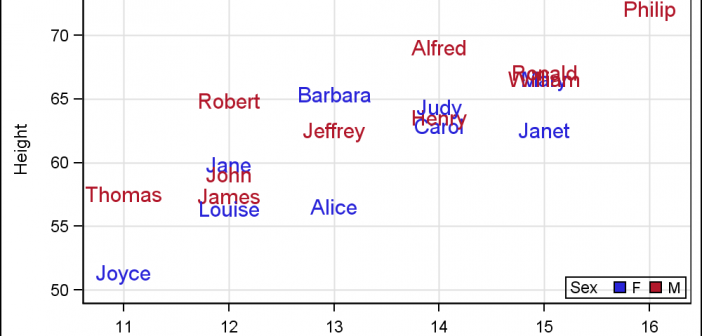
For far too long we have been using the venerable Scatter Plot to do the work of placing text strings in the graph. For far too long we have used the Scatter Plot or the Block Plot to place axis aligned text in the graphs. It is time to

For far too long we have been using the venerable Scatter Plot to do the work of placing text strings in the graph. For far too long we have used the Scatter Plot or the Block Plot to place axis aligned text in the graphs. It is time to
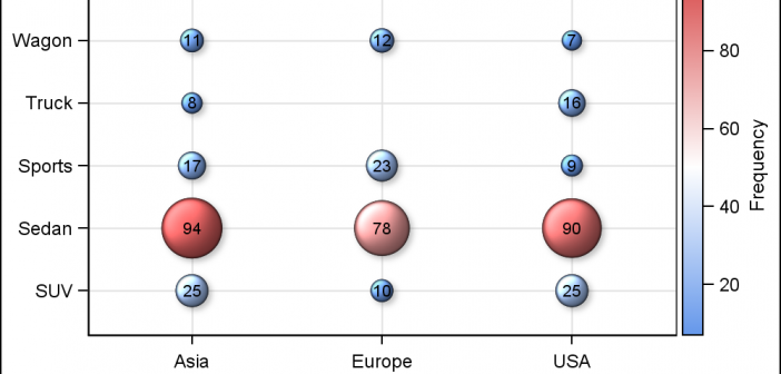
SAS 9.4 maintenance release M2 was released early in August. This release contains some exciting new features in GTL and SG Procedures. In this article, I will describe some of the new options added to the existing plot statements. Note, I will use the SG examples here, but these are
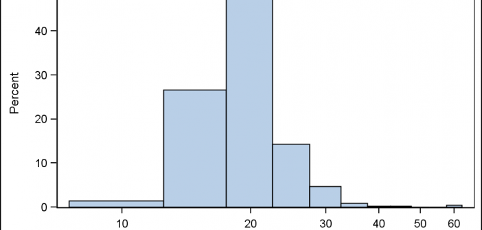
Often there are questions from users on creating histogram using a Log X axis. One such question came up this weekend, where a user wanted a histogram of her data using log axis. Before we get into her specific case, let us first clarify what we may want to see
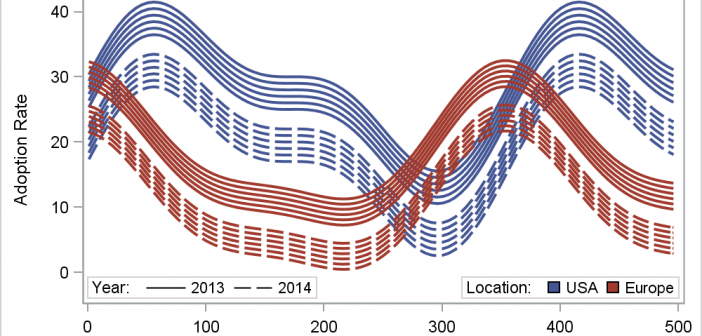
In her article Creating Spaghetti Plots Just got Easy, Lelia McConnell has provided us a glimpse into some new useful features in the SAS 9.4M2 release. The term Spaghetti plots generally refers to cases where time series plots have to be identified by multiple group classifications. The support for the
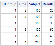
This article is by guest contributor Lelia McConnell, SAS Tech Support. Creating Spaghetti Plots Just Got Easy Sample 38076: “Response by patient and treatment group” illustrates how to generate a spaghetti plot using the SGPLOT procedure. Sample 40255: “Plot of study results by treatment group” illustrates how to generate a
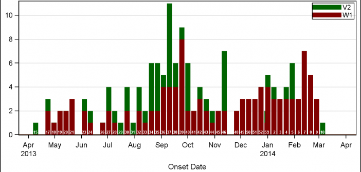
A few weeks back I wrote an article on Grouped Timeline for creating a stacked timeline for onset of different virus. The idea in that article was to display a stacked needle on a time axis using a HighLow plot. Such graphs are also referred to as EPI or Epidemic Curve
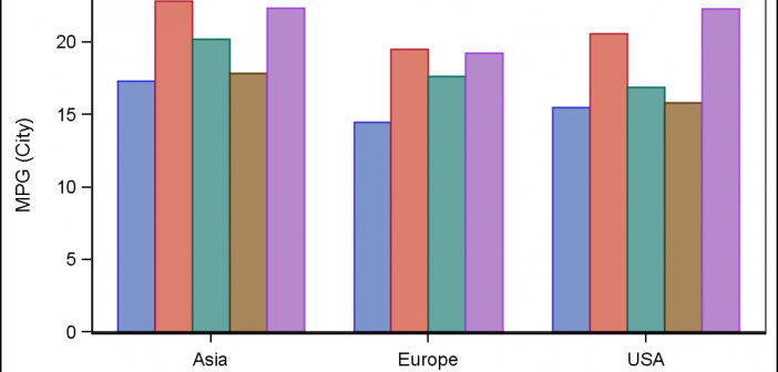
This article is by guest contributor Lelia McConnell, SAS Tech Support. Several users have called recently to ask the question, “Can I reorder the legend entries on the bar chart that I created with PROC SPLOT?” Although there is no option that does this directly in PROC SGPLOT, the answer
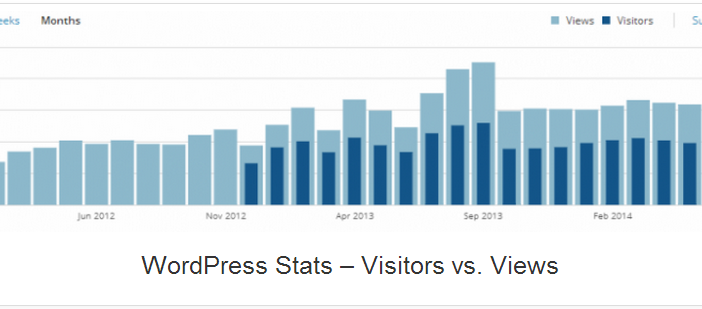
A couple of days back, Rick Wicklin forwarded me a link to an article on the BadHessian Blog on creating a Bar Chart using six different freeware packages in R, Python and Julia. The target bar chart was one produced by the Jetpack stat module with WordPress. The graph is shown below. The unique feature of
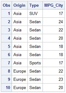
This post could be titled something like "Everything you wanted to know about Group Order in GTL - and more." The group ordering shows up in three different ways in your graph. Assignment of attributes (color, marker symbol) to group values. Position of group values in the graph. Display of the group
Spirals are cool. And useful. We use them every day without thinking about it. Every time the road turns from a straight line to a curve, we go through a transition spiral. Spirals allow us to change curvature in a steady increasing or decreasing fashion. Without a spiral, this