"With great power comes great responsibility." I'm not sure exactly where this quote comes from, but I think everyone should keep it in mind when creating graphs and maps!
There are many design decisions that can influence how the end user perceives the data in a graph. For example:
- The way you analyze or summarize the data before graphing it.
- The way the question is framed (the question that the graph answers).
- The way the titles and text are worded.
- The colors used.
- The ranges shown on the axes.
- And in this case, the way the data is split into color bins ...
Follow along as I take an example map, and show how subtle changes to the color binning can affect how the data is perceived.
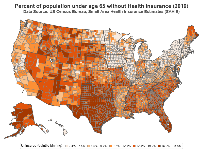
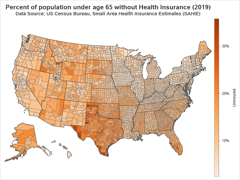
The Original Map
I first saw this example as part of a series of maps in a 'click bait' slide show. It was an interesting data topic, and the map seemed to show some geographical trends, therefore it caught my attention. I then did a Google Image Search, and found the original source of the map on the CDC website.
The first things I noticed in the map was that there seemed to be a lot of counties with the dark (bad) color, and also that most of the counties with the light (good) color are located in the northeast quadrant of the country.
After studying the map for a while, I noticed that the ranges of values in the legend seemed a bit 'odd'. They didn't seem to be evenly spaced, nor did they seem to be centered around certain 'round' target values. They seemed to be a bit arbitrary.

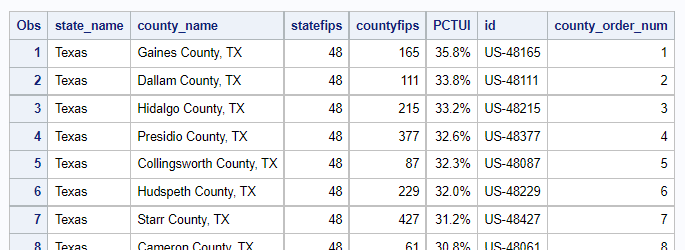
The Data
Well, being a Graph Guy, I decided to experiment with the data and create my own version of the graph, to see if it tells the same story as the original.
Using keywords from the footnote in the original graph, I soon found the data on the Census website. I wrote some code to import the data into SAS and process it a bit (adding an id variable to make it easier to plot on a map). I decided to use the 2019 data rather than the older 2018 data they had used in the original map. Here's what the data looked like once I finished processing it:
My Imitation of Their Map (Quantile Binning)
First, I decided to try and create a map "just like theirs". That would give me more insight into exactly how they created their map. After a few tries, I determined that they had probably used quantile binning, to get the ranges of values in their color legend. With quantile binning, an equal number of counties is assigned to each color bin. (In this specific case, with 5 bins, we can call it 'quintile' binning.)
In this case, there are about 3,143 counties, and therefore about ~629 counties in each of the bins. Here's a needle plot (basically a bar chart, but with bars that are only 1 pixel wide) of all the county values, sorted from smallest to largest, and then shaded by bin (using the same colors as the original map).
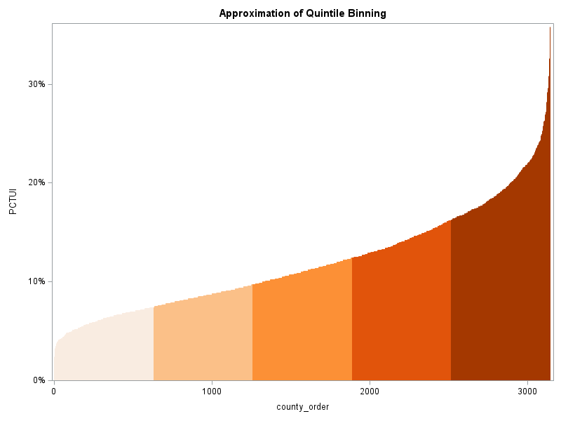
I used Proc SGMap's numlevels=5 and leveltype=quantile options to perform the binning, and the colormodel= option to specify the colors.
proc sgmap mapdata=my_map maprespdata=my_data plotdata=state_outlines;
choromap pctui / mapid=id id=id numlevels=5 leveltype=quantile
colormodel=(cxf9ece1 cxfbc088 cxfc9036 cxe1540b cxa43800)
lineattrs=(thickness=1 color=gray88) tip=none name='map';
series x=x y=y / lineattrs=(color=gray55); /* overlay state outlines */
keylegend 'map' / title='Uninsured (quintile binning)';
run;
This produces a map very similar to the original (but with slightly newer data). Notice that the darkest (worst) color bin goes from 16.2 to 35.8% uninsured. That's quite a wide range of values, compared to the other color ranges, eh?!? Are 1/5 of the counties actually considered in the worst category of 'bad' when it comes to health insurance?
A Different Approach (Interval Binning)
For this particular data, who's to say that the 1/5 of the counties with the highest values are 'bad' and should go in the darkest color bin? Those 'bad' counties span quite a wide range of values (16.2-35.8%), compared to the other four color ranges. Therefore I decided to experiment with something other than quantile binning.
What if, instead of putting an equal number of counties in each color range, we created the 5 color bins such that they each covered an ~equal range of values? That's basically what Proc SGMap's leveltype=interval does. Here's a needle/bar plot that approximates how the county values will be assigned to color bins using this option.
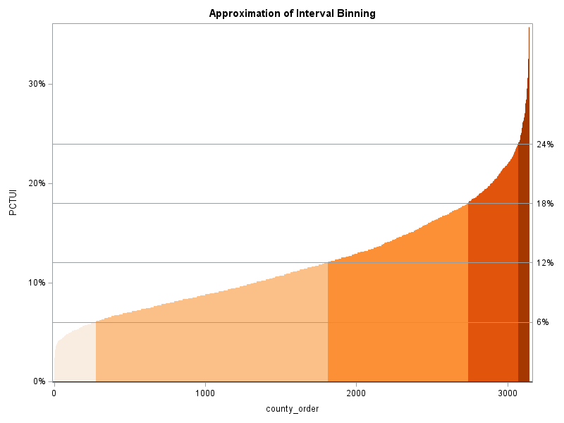
Here's the map using the interval binning option - notice how there are significantly fewer counties in the darkest color now (and also fewer in the lightest color). There are now more counties in the middle three colors ... which seems more appropriate for this data.
proc sgmap mapdata=my_map maprespdata=my_data plotdata=state_outlines;
choromap pctui / mapid=id id=id numlevels=5 leveltype=interval
colormodel=(cxf9ece1 cxfbc088 cxfc9036 cxe1540b cxa43800)
lineattrs=(thickness=1 color=gray88)
tip=none name='map';
series x=x y=y / lineattrs=(color=gray55);
keylegend 'map' / title='Uninsured (interval binning)';
run;

Another Approach (Gradient Shading)
I prefer using a specific number of discrete color bins (such as the maps above), but some users prefer continuous gradient shading. Using this approach, it appears there are even fewer counties in the darkest and lightest color (but it's difficult to tell exactly where the counties fall on the continuous gradient). Is this better or worse than the previous maps? - Who's to say...
To code this map, I don't specify the numlevels= and leveltype= options, and I use a gradlegend statement (instead of keylegend) to get the gradient legend.
proc sgmap mapdata=my_map maprespdata=my_data plotdata=state_outlines;
choromap pctui / mapid=id id=id /* numlevels= leveltype= */
colormodel=(cxf9ece1 cxfbc088 cxfc9036 cxe1540b cxa43800)
lineattrs=(thickness=1 color=gray88) tip=none name='map';
series x=x y=y / lineattrs=(color=gray55);
gradlegend 'map' / position=right;
run;
Summary / Discussion
With this particular data, quantile binning puts more counties in the darkest (worst) color bin, whereas interval binning assigns fewer counties to the darkest (worst) color bin. Either choice could bias how the user perceives the data. Which technique is a more true/correct representation of this data? Personally, I think interval binning 'fits' this data better ... but what do you think? (feel free to discuss in the comments)
Rather than assigning the colors arbitrarily based on the spread of the data values, it might be even better if there were certain goals, and we assigned the colors based on whether or not the counties had met the goal(s). For example, all counties with fewer than xx% uninsured could be colored 'green'. (But I don't know if any specific goals like that exist for this particular data.)
What are your thoughts/suggestions on how to best represent this data on a map? Would you use a different binning technique? Different colors/shades? Something other than a choropleth map? Feel free to discuss in the comments section!


3 Comments
Age adjustment of the data could be helpful as there may be differences in insurance coverage by age - ex Medicare.
I guess it is somewhat age adjusted(?) ... in that it is for "under age 65" (which is generally the age Medicare coverage starts).
This is a common ploy by propagandists and anyone attempting to push agendas. It has been done for years and years even back before visual tools. It's okay if you also publish the "adjustment" but if you don't then the information is paramount to propaganda.