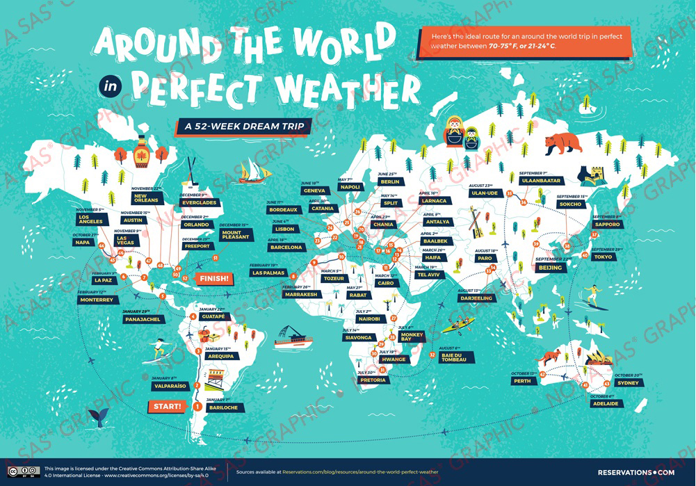
The guys over at reservations.com recently posted a really interesting idea, and a map to go along with it! They worked out an itinerary where you could spend one year traveling around the world (staying in a different place each week), and always be in a comfortable temperature around 70-75° F (21-24° C). Below is a screen-capture of their map - I encourage you to click it to see their full-size map page, which contains lots of great details and links. And if you're one of those lucky people with that kind of cash, go ahead and add this trip to your bucket list!
It's been really hot here in North Carolina this past week (like 95 to 100-ish), and when I saw their map I thought it would be cool (pun intended!) to try to create my own version using SAS software.
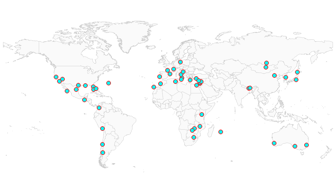
First I created a dataset containing all 52 of their locations, along with the latitude/longitude (this was probably the most time-consuming step). Next I got a copy of the mapsgfk.world map, projected it using the 'miller2' SAS projection, and saved the projection parameters. I then projected the 52 lat/long vacation locations, using proc gproject's parmin= option to utilize those same projection parameters (this way everything will be projected the same, and they will line up correctly). And finally, I created an annotate dataset to plot markers at each of the 52 locations. The markers consist of a solid cyan-colored dot, with a red circle around it. Here's the important part of the code to annotate the markers:
function='pie'; rotate=360; size=1.0;
style='psolid'; color='cyan'; output;
style='pempty'; color='red'; output;
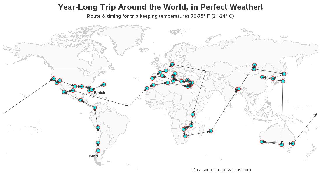
The order in which you visit the locations is important, therefore I wanted to also represent that on the map. In the original map, they added number labels on the markers. But I decided to take a slightly different approach, and added an arrow between each marker. I 'move' to the first marker, and then draw an 'arrow' to each marker after that.
color='gray33'; size=.01;
if _n_=1 then function='move';
else function='arrow'; line=2; style='filled';
![]()
And as a final iteration, I add some text... I annotate 'start' and 'finish' to the first and last markers. I added a descriptive title at the top of the page, and a footnote showing the data source. And although you can't see in the static image below, I also add HTML mouse-over text and drilldowns for each marker (click here to see the interactive version). Take some time to explore the map, and let us know in the comments how many of the locations you've been to!
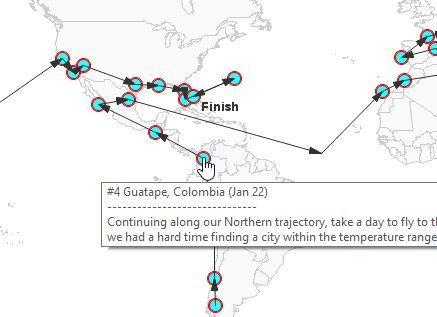
Here's a screen-capture of what the mouse-over text looks like:
Hopefully I've inspired you to do a bit of traveling this year, or maybe create some graphs & maps for traveling! Here's a link to the full SAS code, in case you'd like to experiment with it. And if you like this topic, you might also enjoy my 'endless summer' map animation.


1 Comment
That was a fascinating journey. Makes me think about it doing it. Austin has been over 100 for many days!
What about a similar map for the 50 states of the US and Canada?