I was sad to hear that one of my favorite singers, Prince, died last week. This blog post describes a graph I created to show his legacy. Prince was at the height of his popularity when I was in high school and college, which were the formative years for much of
Author
With more and more data available these days, and computers that can analyze that data, it's becoming feasible to look for fraud in events such as the Boston Marathon. So put on your detective hat, and follow along as I show you how to use SAS to be a data sleuth!
Are you afraid that if you take a ride in a taxi, you might get "taken for a ride"? If trying to figure out the reasonable price of a taxi is a bit voodoo/black-box to you, here is a SAS data analysis of over 12 million NYC Yellow Cab rides, that
Just like my hero Mike Rowe on the Dirty Jobs TV show, I'm finally diving into an area involving water quality ... and poop! Let's take a graphical look at just how clean (or dirty) the water is, at the lake where my Raleigh Dragon Boat Club practices... Before we get
While you're at SAS Global Forum (or any conference) in Las Vegas, you might have a bit of spare time to do some sightseeing. Therefore I've put together a list & map of interesting things you might want to experience! Below is a snapshot of my map - click it
Lately I've seen several articles about drug overdose deaths being on the increase. But I didn't really like the graphs in those articles, so I tried to create some better ones using SAS ... For example, here's a map from the National Center for Health Statistics website (see the 3rd dashboard/tab
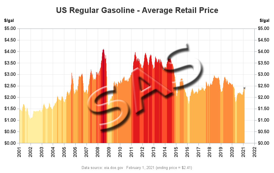
Gasoline prices are a lot lower than they've been the past few years, but the price fluctuates so much that it's difficult to tell whether you're getting a good deal. Perhaps these SAS graphs & maps will help you get a handle on it, so you'll know a good deal
I recently bought a vehicle that has FlexFuel capability and can use E85 (mostly ethanol) fuel. But can you guess whether it is more economical for me to use E85, or regular gasoline? Read the SAS analysis below to see if you guessed right! I've been the happy owner of
People have always been fascinated by sports statistics, and with the recent popularity of fantasy sports there is an increased demand for custom analyses of the sports data. With those folks in mind, I have created a simple example that SAS programmers can use as a starting point for analyzing NBA
We recently had a flooding event at Jordan Lake where the water rose almost 20 feet above normal. This blog details that flooding event in both photos and graphs. If you're intrigued by weather, boats, or lakes then this blog's for you! In NC's Research Triangle Park area, there are basically two
Have you ever found a graph of some interesting information, but the graph was difficult to understand (or even misleading). I strive to fix those graphs - this time it's a graph of US immigration data... I found the following immigration graph on the flowingdata website - it's a screen-capture of
With the upcoming appointment of a new Supreme Court Justice, I wondered just how liberal and conservative previous justices have been. I found some data, and tried my hand at creating a graph to help visualize it... In my quest for data, I came upon an article on the NYTimes
When I was a kid, I remember being fascinated by the first moon landing. I probably won't ever get to explore the moon in person, but perhaps creating an interactive moon map is the next best thing! Before we get started, I wanted to share a couple of photos my co-worker
If you're a worrier, you know there's a chance you could get bitten by a shark, or hit by a piece of falling satellite debris - these events are both possible, but not probable. Getting injured by a lawn mower, on the other hand, is something that could easily happen. With
With many names, it's difficult to know whether the person is male or female. Let's use the power of analytics to determine which names are the most unisex, based on the number of boys and girls with those names. But, before we get started, here's a picture of my friend
When the Toyota Prius first came out, the gas mileage claims astonished everyone. But now that almost every manufacturer offers their own hybrid, is the Prius mpg really all that great? Let's analyze the data ... But before we get to the analytics, let me tell you a little about
Did you ever wonder how much fuel all the jets in the world use? Perhaps these graphs will help you get a handle on it... Before we get started, here's a jet-fuel related picture to entertain you. This is a picture I took from the airplane when I went to
Did you know you could drive 74 million cars using the wasted natural gas that is flared from oil wells and refineries? Learn more details in this blog post! Flaring (burning) is commonly used to dispose of natural gas produced at oil and gas facilities that lack the infrastructure to capture it
Eating donuts, burning calories, and raising money for a good cause -- that's what the annual Krispy Kreme Challenge is all about. If this intrigues you, read on to find out more... But first, here's a picture of me eating a donut, preparing for a race. I bet you didn't
The World Health Organization recently declared the Zika virus a global public health emergency. This virus is spread by certain mosquitoes, and therefore if we know where those mosquitoes are located, then we've got a pretty good idea of where the virus might spread. Before we get to the numbers, here
A honey bee can live for 8 years ... but a black garden ant can live even 20 years longer than that! Learn more details, and other interesting trivia, in this blog on "the longevity of things." I recently found The Animal Ageing and Longevity Database, and was fascinated by
The East Coast of the US got quite a snowstorm this past weekend, but did your area get enough snow to brag about? Let's see what the data says... Before we get started, here are a couple pictures of the snow. The first one is from my driveway - we didn't
The East Coast is having lots of snow and ice storms today, and SAS headquarters is officially closed. But I thought it would be a great day to get a few things done! And among those few things is "write a snow-related blog". Hope you enjoy it! After 21 years of
Are you from Yankeedom, The Far West, or somewhere in between? In this blog, I use SAS maps to explore some fun data about regional cultures in the U.S. I recently ran across an interesting article about Colin Woodward's book "American Nations: A History of the Eleven Rival Regional Cultures
You probably heard the recent announcement this past Friday that Walmart will be closing 269 stores. Are any closing near where you live? This blog shows some really cool SAS maps to let you drill-down into the data! I've seen a few maps showing which Walmart stores are closing, but they
What strategy do you use to pick your lottery numbers? Do you suspect that the future winning numbers might be somehow related to the past winning numbers? If so, this blog's for you! The Powerball lottery jackpot is up to about $1.4 billion - the largest lottery jackpot there has
I was reading through Deloitte University Press' 2015 Holiday Spending survey - the results were interesting, but their graph made you jump through mental hoops to understand the data. So of course I used SAS to create a simpler version of the graph, so you'll have more time for holiday shopping!
If you're just a casual Star Wars fan, you might be confused about the order of the movies. Here's a SAS graph that will help you make sense of it all, before Episode VII comes out this week! If you'd like to see how I created this custom graph, here's a
Saturday Night Live has been on television for about as long as most of us have been old enough to stay up and watch it (since 1975). Therefore, when I saw that Rolling Stone had ranked all the cast members throughout the show's history, I knew this was going to
Here in the US, California is known as "wine country" - but I was wondering what other states make wine, and whether there have been any big changes in recent years. This seemed like a good excuse for some graphical analytics... My previous blog analyzed where various Thanksgiving foods were produced. I was