All Posts

The data lake is a great place to take a swim, but is the water clean? My colleague, Matthew Magne, compared big data to the Fire Swamp from The Princess Bride, and it can seem that foreboding. The questions we need to ask are: How was the data transformed and


The Internet of Things is coming fast and furious. We clearly know what these “things” are, and were able to see prototypes at last week’s Mobile World Congress (MWC) which hosted some 93,000 attendees. Things = connected life = cars, homes (thermostats, washer and dryers, vacuum cleaners, security systems, refrigerators, etc.),


El sector público se enfrenta actualmente a un periodo de gran tensión, hay intentos por reducir déficit presupuestal, se avecinan algunas recesiones y hay una necesidad de protegerse de la competitividad internacional, entre otras situaciones que hacen que el sector público se convierta en una prioridad número uno en cualquier


Innovation within hospitality drives awareness, service delivery, guest engagement, and brand differentiation. SAS asked a panel of experts to comment on how innovation is shaping the hospitality industry. According to many of our experts, analytics is at the heart of innovation. Learn more in this white paper on building


I just found out that Girl Scout cookies haven't changed from when I was a kid. I just moved to a different area, serviced by a different cookie maker! That's what I found out from the cool map in an article on latimes.com! The article explains that there are two different

Peg solitaire I love puzzles; I have a few of them in my office. I regularly use them at interviews: I ask the candidate either to solve a puzzle or to devise a (clever) mathematical algorithm that solves it. I'm sure a lot of readers are familiar with the standard


SAS FULLSTIMER is a SAS system option that takes operating system information that is being collected by SAS process runs and writes that information to the SAS log. Using it can add up to 10 lines additional lines to your SAS log for each SAS step in your SAS log—so why


Ole Man Winter has taken his sweet time getting out of here this year challenging even the most complacent weather watchers. But, last night I finally heard it - the beautiful trill of the Spring Peeper frogs. If you’re not from North Carolina or parts nearby, you may be unfamiliar


Sometimes I get contacted by SAS/IML programmers who discover that the SAS/IML language does not provide built-in support for multiplication of matrices that have missing values. (SAS/IML does support elementwise operations with missing values.) I usually respond by asking what they are trying to accomplish, because mathematically matrix multiplication with
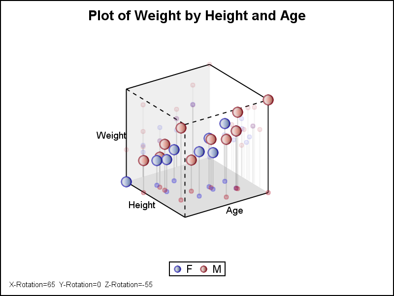

The SG Procedures do not support creating a 3D scatter plot. GTL has some support for 3D graphs, including a 3D Bi-variate Histogram and a 3D Surface, but still no 3D point cloud. The lack of such a feature is not due to any difficulty in doing this as

Today in manufacturing there has been a lot of investment in automation, supervisory controls, quality, and execution systems. The amount of data produced and now being captured is staggering. The data captured in industry will re-define what is “big” in big data. Yet, for all this investment: Equipment still fails. Scrap

In my last two posts, we concluded two things. First, because of the need for broadcasting data across the internal network to enable the complete execution of a JOIN query in Hadoop, there is a potential for performance degradation for JOINs on top of files distributed using HDFS. Second, there are


“When it comes to the Internet of Things, the future clearly belongs to the Things”. I made this brash statement in a previous post (“Cloud encounters of the Fifth Kind”) referring to machine-to-machine (M2M) being the fastest growing component of non-human traffic on the Web. I say “brash” because that

In my previous post, I talked about how a bank realized that data quality was central to some very basic elements of its initiatives, such as know your customer (KYC), customer on-boarding and others. In this blog, let’s explore what this organization did to foster an environment of data quality
I often blog about the usefulness of vectorization in the SAS/IML language. A one-sentence summary of vectorization is "execute a small number of statements that each analyze a lot of data." In general, for matrix languages (SAS/IML, MATLAB, R, ...) vectorization is more efficient than the alternative, which is to