All Posts
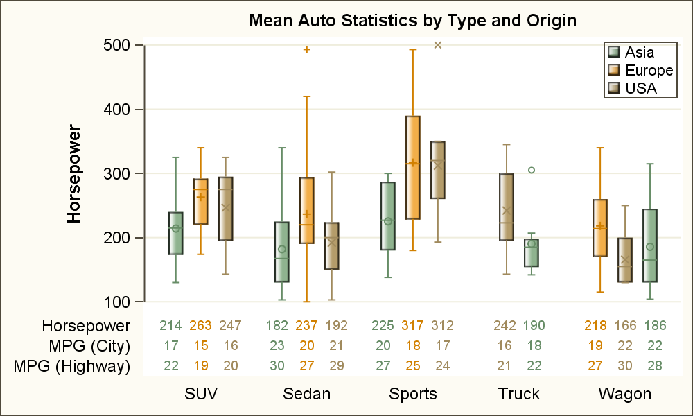

As often is the case, this article is prompted by a recent post on the SAS/GRAPH and ODS Graphics page communities page. A user wanted to create a Graph Table showing a bar chart with tabular data for each of the category values along the x-axis. The user was creatively using


When you work out, you probably have a routine set of exercises that you do. But if you read health-and-fitness websites or talk to a personal trainer, you know that for optimal fitness, you should vary your workout routine. Not only does adding variety to your fitness regime help you
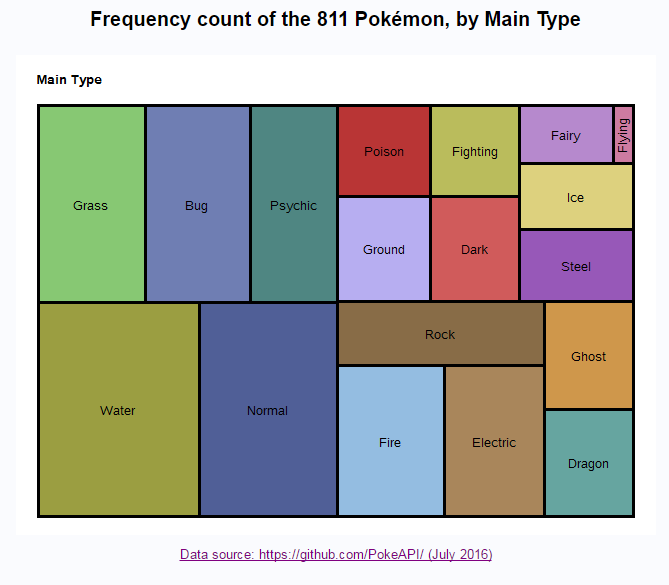

So, how many different Pokémon have you caught - and more importantly, how many different kinds are still out there that you haven't caught yet? I've created some graphs that might help you figure it out! I think my previous blog post might have irritated some of the hardcore Pokémon players out there


Powered in equal parts by data, mobility and innovation, the collaborative economy has changed the way we think about automobiles, travel accommodations, office space, living space – and so much more. When anyone can open an app to borrow money from a crowd, order a gourmet dinner from a neighbor, or rent an


We all find change easier when it starts with something we’re familiar with. That’s why I think sports analytics examples are popular – most of us are sports fans, so we get it more easily. It’s also why automotive examples that illustrate the potential reach of the Internet of Things


Under-utilized technology creates a drag on an organization. The ability to get more out of the tools you already use can increase the value of an existing investment, and that value grows as processes become more efficient and decisions are based on firmer foundations. Consider the facilities engineer at an

Are you caught up in the recent Pokémon Go craze? Or maybe just trying to figure out what all the fuss is about? In this blog post, I try to analyze all the important Pokémon-related data in one graph! When the original Pokémon game first came out around 1995, you needed


Today is #EmbraceYourGeekness day, and you are either reveling in this new crazy town inhabited by Pokémon GO, or you are hiding in your house trying to avoid all of the Pokémon GO zombies wandering around. But since I'm living in SAS these days -- not just the place (at


In my last post, I started to look at the use of Hadoop in general and the data lake concept in particular as part of a plan for modernizing the data environment. There are surely benefits to the data lake, especially when it's deployed using a low-cost, scalable hardware platform.


Las estrategias para cometer fraude se están volviendo cada vez más sofisticadas, al punto de hacerlo más difícil de detectar. Según la Agencia Fiscal Belga, se calcula que los delincuentes roban 100.000 millones de euros (132.000 millones de dólares estadounidenses) al año a los Gobiernos de toda Europa mediante un


Reporting can reveal last year’s graduation rates or this semester’s completion rates at a local community college. But drilling further into that data to ask why students aren’t graduating or why they aren’t enrolling requires more complex analysis. At Sinclair Community College in Dayton, Ohio, college administrators and professors are


Smoothies are a great way to pack a ton of nutrition into a refreshing, on-the-go glass. However, many “healthy” smoothies in reality are loaded with carbohydrates and sugar from tons of fruit as well as juice, honey, agave or possibly even sherbet or sorbet! Of course these smoothies taste fantastic

I've been working on a SAS program that can add content to the SAS Support Communities (more on that in a future post). Despite my 20+ years of SAS experience, there are a lot of SAS programming tricks that I don't know. Or that I use so infrequently that I
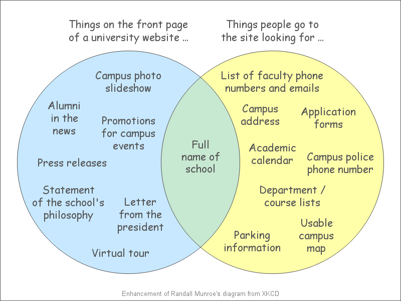
What information should you make easily available from the top page of your website? This Venn diagram might help you decide! Have you ever gone to a website to try to find some information, and had a (expletive) difficult time trying to find that info? I think there is often a
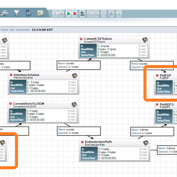

Do you have a need for real-time, streaming analytics? What technology are you considering? How are you going to enable rapid development and deployment of your analytical models all in real-time? SAS has partnered the the Hortonworks HDF team to develop a nifi processor that allows SAS machine learning models and