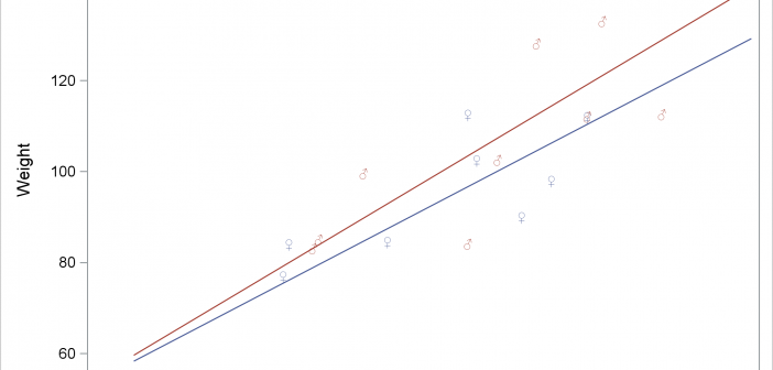
You can use Unicode to display special characters in SAS output including tables and graphs. With graphs that analytical procedures produce, you might need additional steps.

You can use Unicode to display special characters in SAS output including tables and graphs. With graphs that analytical procedures produce, you might need additional steps.
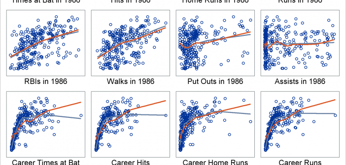
Marginal model plots display the marginal relationship between the response and each predictor. You can use a SAS autocall macro, %Marginal, to display marginal model plots.
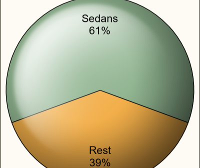
It seems only a few months back I posted an article on creating Pie Charts using a GTL based macro. Well, looking back, that was almost 6 years ago!! Recently, a colleague here at SAS needed to create Pie Charts in his report along with other plots created using SGPLOT
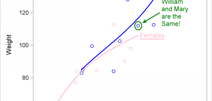
This post provides examples of DRAW statement syntax and links to the documentation.
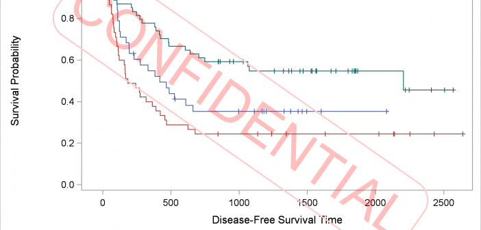
DRAW statements provide to GTL what SG annotation provides to the SG procedures--a way to add text, shapes, lines, and arrows to graphs.
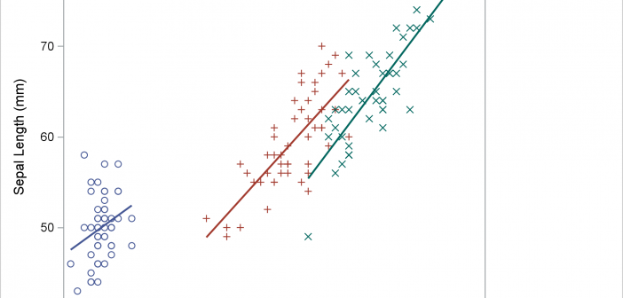
PROC SGPLOT looks at the PROC statements, it looks at the data, and it writes a template that might depend on the data. If you want to understand how the graph is created, you need to look at the PROC SGPLOT code, the graph template and data objects that it constructs, and the final graph.
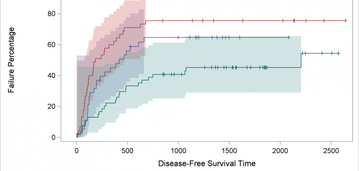
We'll take a deeper dive into understanding item stores--the files in which compiled templates are stored--and ways in which you can access them. At the end, I will show you one of my new examples: displaying percentages in the Kaplan-Meier failure plot.
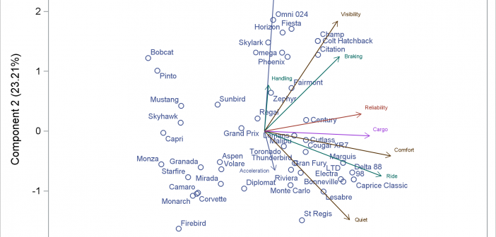
You can modify all of the components of the graphs that analytical procedures produce: the data object, graph template, and the dynamic variables. This post takes a closer look at dynamic variables (which you can see by using PROC DOCUMENT) and data objects and explores graphs that are constructed from more than one data object.
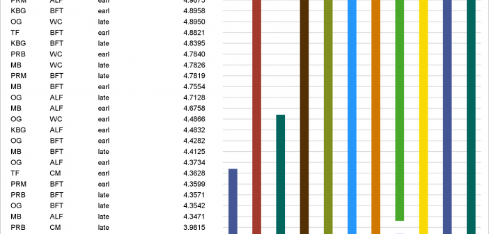
In PROC GLM and most other procedures that compute LS-means, mean comparisons are now displayed graphically. This makes comparisons between a large number of groups easier to interpret.
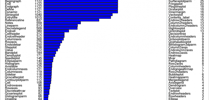
This post shows a variety of techniques including how to use PROC TEMPLATE and the SOURCE statement, PROC SGPLOT with multiple Y-axis tables, create comparable axes in two side-by-side graphs, create a broken axis, write and use a table template that wraps text, and find and display examples of certain statements in graph templates and fonts in style templates.