Search Results: scatter markerchar (59)

Data Visualization
Sanjay Matange 1
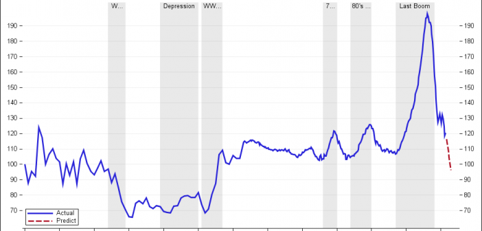
Timeseries plots with regimes

Recently we discussed the features of the Shiller Graph, showing long term housing values in the USA.  To understand the features necesary in the SGPLOT procedure to create such graph easily, it was useful to see how far we can go using GTL as released with SAS 9.2(M3). I got the data Shiller Housing index data

Data Visualization
Sanjay Matange 4
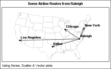
Map overlays

In Simple maps can go a long way, we discussed some techniques to create simple outline maps from map datasets in the MAPS library using GTL.  Now, let us take this a step further to do something more useful with this feature. For some graphs, the map information is an essential part of the

Data Visualization
Sanjay Matange 5
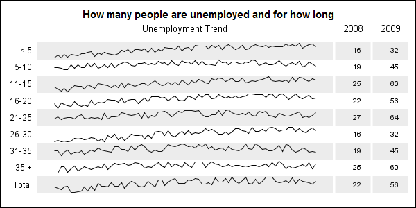
Adding a spark to your data

When viewing time series data, often we only want to see the trend in the data over time and we are not so concerned about the actual data values.  With multiple time series plots, forecasting software can find clusters to help us view series with similar trends. Recently I saw a graph showing the trend of unemployment

Data Visualization
Sanjay Matange 0
SGPLOT procedure - the basics

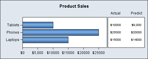
In this blog we will discuss many aspects of the SG Procedures.  This article will cover some basic features and workings of the SGPLOT procedure to establish a baseline. The single-cell graph is the work horse for data visualization.  From the simple bar chart to the complex patient profiles for clinical

1 4 5 6