Search Results: panel (76)

Data Visualization
Sanjay Matange 0
Report from SCSUG 2012

Last week I attended my first SCSUG conference, this one in Houston.  Houston, the fourth most populous city in USA, is the world's capitol of the Oil and Gas industry.  So it was no surprise I met many attendees from local oil and gas related companies.  But, I also met many

Data Visualization
Sanjay Matange 16
Violin Plots

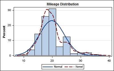
Over the past month or more, I have been in a conversation with SAS user James Marcus, on creation of some new displays for visual communication of uncertainty.  These include display of densities using a "Violin" plot, "Density Strips" and more.   With his permission, I can share some of the

Data Visualization
Sanjay Matange 0
Broken Y-Axis with SAS 9.2

In the previous post on Broken Y-Axis, I reviewed different ways to display data as a Bar Chart, where the response values for some categories are many orders of magnitude larger than the other values.  These tall bars force  the display of other values to be squeezed down thus making it harder to compare

Data Visualization
Sanjay Matange 4
Broken Y-Axis

Often we want to display data as a bar chart where a few observations have large values compared to the rest.  Comparison between the smaller values becomes hard as the small bars are squeezed by the tall bars.  Here is an example data, and a bar chart showing the data. The large values

Data Visualization
Sanjay Matange 0
Cluster groups

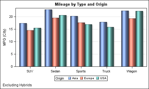
The topic of cluster groups comes up often.  By cluster group I am referring to the feature in bar charts where the group values are displayed side by side. With SAS 9.3, SG Procedures support stack or cluster grouping for Bar Charts and overlay or cluster grouping for all other

Data Visualization
Sanjay Matange 6
Graphs with class

When the data is classified by multiple class variables, you can certainly create graphs using BY variables.  This results in separate graphs, one for each level of the BY variable crossings.  Each graph is scaled by its own data subset, and comparisons across BY levels is harder. When comparisons need to be

Data Visualization
Sanjay Matange 7
Dashboard graphs revisited

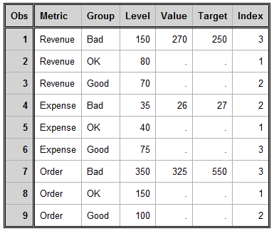
Here is the promised follow up on the Dashboard graph.  In the previous article, I posted the code to create a panel of bullet KPIs displaying three different metrics.  For each KPI, I used 5 columns of data which resulted in a wide and inconvenient structure. A more convenient data structure is

Data Visualization
Sanjay Matange 1
Dashboard graphs

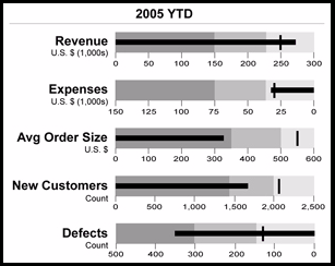
In this blog we have been discussing graphs useful for analysis of data for many domains such as clinical research, forecasting and more.  SG Procedures and GTL are particularly suited for these use cases.  So, when I came upon a dashboard image from Steven Few's Visual Business Intelligence blog, showing the

1 5 6 7 8