Tag: Statistical Graphics

Rick Wicklin 0
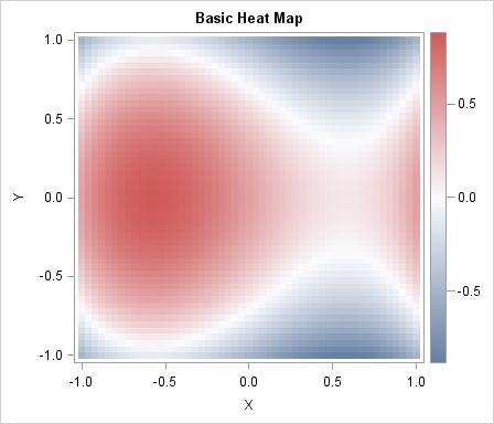
Creating a basic heat map in SAS

Heat maps have many uses. In a previous article, I showed how to use heat maps with a discrete color ramp to visualize matrices that have a small number of unique values, such as certain covariance matrices and sparse matrices. You can also use heat maps with a continuous color

Rick Wicklin 0
Add a prediction ellipse to a scatter plot in SAS

It is common in statistical graphics to overlay a prediction ellipse on a scatter plot. This article describes two easy ways to overlay prediction ellipses on a scatter plot by using SAS software. It also describes how to overlay multiple prediction ellipses for subpopulations. What is a prediction ellipse? A

1 80 81 82 83 84 103