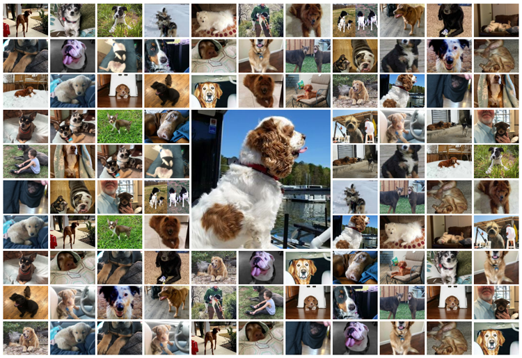
How long do dogs live? ... That's a good/tough question. Some live longer than others, but what are the determining factors? Let's throw some data to this problem, and see if we can fetch some answers! But before we get started, how about a random picture to get you into
Tag: HIGHLOW
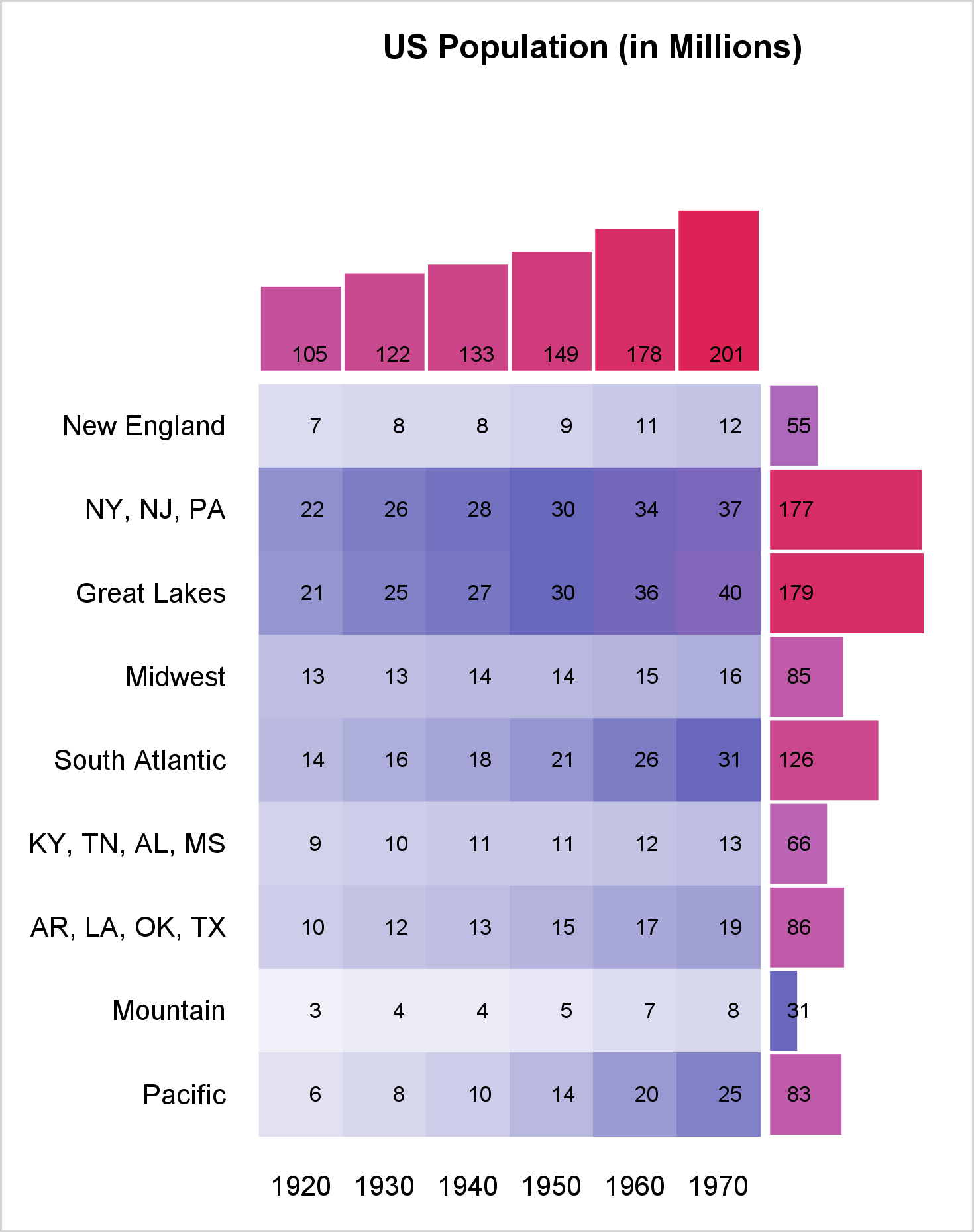
You can use a range attribute map to control the mapping of values in a continuous variable to colors. This post shows you how to use PROC SGPLOT to display multiple plots in the same graph and use range attribute maps.
This article is motivated by a recent question on the Communities Web Site on creating a scatter plot with additional summary information. Recently, I described how to create a scatter plot with a box overlay. While such graphs have been discussed in earlier posts, this article provided a visual benefit
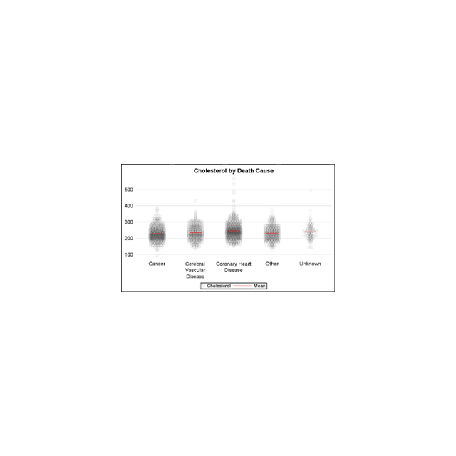
A Turnip Graph displays the distribution of an analysis variable. The graph displays markers with the same (or close) y coordinate by displaying the markers spread out over the x-axis range in a symmetric pattern. Recently, a question was posted on the SAS Communities page regarding such a graph. Here is an example of
Sankey Diagrams have found increasing favor for visualization of data. This visualization tool has been around for a long time, traditionally used to visualize the flow of energy, or materials. . Now to be sure, GTL does have a statement design for a Sankey Diagram which was implemented only in Flex for use
Significant progress in reduction of Cancer mortality is shown in a graph that I noticed recently on the Cancer Network web site. This graph showed the actual and projected cancer mortality by year for males. The graph is shown on the right. The graph plots the projected and actual numbers
Last week a user expressed the need to create a graph like the one shown on the right using SAS. This seems eminently doable using GTL and I thought I would undertake making this graph using SAS 9.3. The source data required to create this graph is only the
Just this morning I received a request for a brief survey from Apple on my feedback about the new iPhone6+. Yes, I finally got one, dead last in the family. The survey followed the usual format, with a number of questions on what I like or dislike about it, with
Often we need to plot the response values for binary cases of a classifier. The graph below is created to simulate one seen at http://www.people.vcu.edu/ web site of the shock index for subjects with or without a pulmonary embolism. In this case, the data is simulated for illustration purposes only. There
SG Procedures and GTL provide you with a large set of plot statements, such as BarChart, ScatterPlot, BoxPlot and more. You can use them for the intended purpose, and all is well and good. However, the real fun starts when you leverage a plot to do something that was not
The GCHART procedure has a popular option called G100 to display all the subgroups in % format such that all the subgroup values add up to 100% for each group. Each subgroup is labeled with its own % values. SGPLOT procedure does not such an option, but with a little bit of
Browsing graphs on the web, this graph caught my eye: The Arctic Sea Ice Volume Graph. My interest is not so much in the debate on Climate Change or Global Warming. To me, this graph has some interesting features that can help show the benefits of plot layering to
The SAS Global Forum conference last week was awesome. From the perspective of graphics, there were more papers from uses on graphics and ODS graphics then in recent times. I will post a summary shortly. One of the interesting papers was "#113-2013 - Creating Clark Error Grid using SAS/GRAPH and Annotate..."
A frequent question we get from users is how to create a box plot with custom whiskers lengths. Some want to plot the 10th and 90th percentile, while other want the 5th and 95th percentiles. The VBOX statement in the SGPLOT procedure does not provide for custom whiskers. Also, unlike GTL,