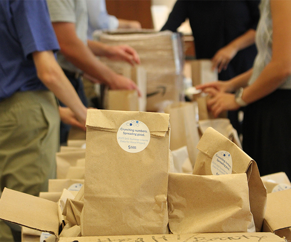
Tag: data literacy

Analytics | Data for Good | Students & Educators
Jen Sabourin 0
Is data cited in the news accurate? It depends on how it was collected.

Editor's note: This blog post is part of a series of posts, originally published here by our partner News Literacy Project, exploring the role of data in understanding our world. As discussed in previous posts, statistics and visual representations of data can be misleading. But what happens when the data itself is misleading? And if data is

Analytics | Data for Good | Students & Educators
Jen Sabourin 0
Data visualizations: What are they really communicating?

Editor's note: This blog post is the first in a series of posts, originally published here by our partner News Literacy Project, exploring the role of data in understanding our world. Charts and graphs are useful tools for communicating complex information. They allow consumers to see — rather than read or calculate — differences

Analytics | Data Visualization | Students & Educators
Lee Ellen Harmer 0
Sanitize before you share: thinking critically about COVID-19 data

Being overwhelmed by the volume of news isn’t a new phenomenon. But today, our sense of being overwhelmed has increased and triggered feelings of fear, frustration and anxiety, given the ongoing developments and research tied to COVID-19. How do we sift through the volume of information facing us and truly understand whether the news we consume is factual or based on

Analytics | Data Visualization
SAS Japan 0
指数関数的成長の倍加時間を推計する

この記事はSAS Institute Japanが翻訳および編集したもので、もともとはRick Wicklinによって執筆されました。元記事はこちらです(英語)。 2020年における新型コロナウイルスの世界的流行のようなエピデミック状況下では、各国の感染確認者の累計数を示すグラフがメディアによって頻繁に示されます。多くの場合、これらのグラフは縦軸に対数スケール(対数目盛)を使います。このタイプのグラフにおける直線は、新たなケースが指数関数的ペースで急増していることを示します。直線の勾配はケースがどれほど急速に倍加するかの程度を示し、急勾配の直線ほど倍加時間が短いことを示します。ここでの「倍加時間」とは、「関連状況が何も変わらないと仮定した場合に、累計の感染確認者数が倍増するまでに要する時間の長さ」のことです。 本稿では、直近のデータを用いて倍加時間を推計する一つの方法を紹介します。この手法は、線形回帰を用いて曲線の勾配(m)を推計し、その後、倍加時間を log(2) / m として推計します。 本稿で使用しているデータは、2020年3月3日~3月27日の間の、4つの国(イタリア、米国、カナダ、韓国)における新型コロナウイルス感染症(以下、COVID-19)の感染確認者の累計数です。読者の皆さんは、本稿で使用しているデータとSASプログラムをダウンロードすることができます。 累計感染者数の対数スケール・ビジュアライゼーション このデータセットには4つの変数が含まれています。 変数Region: 国を示します。 変数Day: 2020年3月3日からの経過日数を示します。 変数Cumul: COVID-19の感染確認者の累計数を示します。 変数Log10Cumul: 感染確認累計数の「10を底とする対数」(=常用対数)を示します。SASでは、LOG10関数を用いて常用対数を計算することができます。 これらのデータをビジュアル化する目的には、PROC SGPLOTを使用できます。下図のグラフは感染確認者の総数をプロットしていますが、総数の縦軸に常用対数を指定するために「type=LOG」と「logbase=10」というオプションを使用しています。 title "Cumulative Counts (log scale)"; proc sgplot data=Virus; where Cumul > 0; series x=Day y=Cumul / group=Region curvelabel; xaxis grid; yaxis type=LOG logbase=10 grid values=(100 500 1000

Analytics | Students & Educators
Lisa Morton 0
College-bound students with visual impairments learn to independently analyze data

This summer the Accessibility and Applied Assistive Technology team at SAS launched a new course that teaches students with visual impairments how to independently analyze data, which is a critical skill that all students need for success in college and their careers. However, many students with visual impairments don’t have