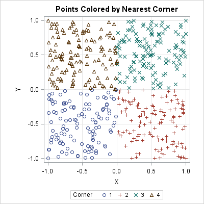
Tag: Data Analysis

Rick Wicklin 0
Weighted percentiles

Many univariate descriptive statistics are intuitive. However, weighted statistic are less intuitive. A weight variable changes the computation of a statistic by giving more weight to some observations than to others. This article shows how to compute and visualize weighted percentiles, also known as a weighted quantiles, as computed by

Rick Wicklin 0
Compute highest density regions in SAS

In a scatter plot, the regions where observations are packed tightly are areas of high density. A contour plot or heat map of a bivariate kernel density estimate (KDE) is one way to visualize regions of high density. A SAS customer asked whether it is possible to use SAS to

1 99 100 101 102 103 169