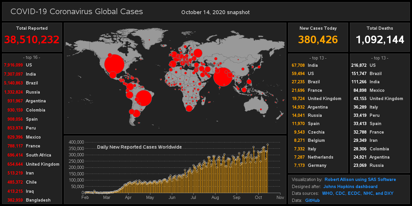
Improving the Wuhan Coronavirus dashboard

The COVID-19 Coronavirus outbreak has been in the news a lot lately, and everyone is probably looking for a quick/easy way to see the data. The best visualization I've seen so far is this dashboard by Johns Hopkins. Here's a screen-capture: But before we dive into the data analysis, let's