Get the right information, with visual impact, to the people who need it
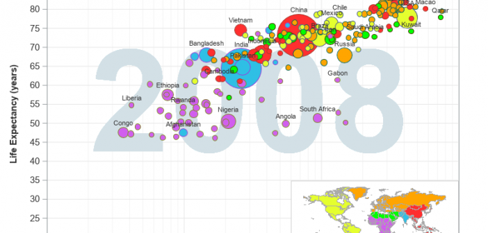
As we're approaching the anniversary of Hans Rosling's passing, I fondly remember his spectacular graphical presentations comparing the wealth and health of nations around the world. He certainly raised the bar for data visualization, and his animated charts inspired me to work even harder to create similar visualizations! What better way

