We got our first 'big' snow of the season here at the SAS headquarters in Cary, NC ... therefore I thought this would be a great time to dig into some snow data! Follow along and pick up some tips & tricks as I plot our snow data - and then learn how to download similar data for your area, so you can try your hand at plotting it.
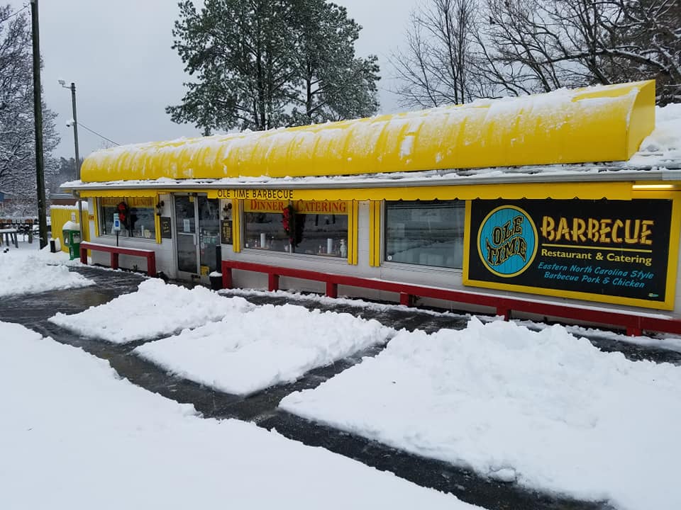
But before we get started, here's a snow picture to get you in the mood. This is my favorite barbecue restaurant Ole Time Barbecue, just down the road from SAS. A little snow can't stop great barbecue!
The first step is to import the National Oceanic and Atmospheric Administration (NOAA) data. I have the data for my area in a csv file, and used the following code to import it into a SAS dataset:
data my_data;
infile 'rdu_snow.csv' delimiter = ',' MISSOVER DSD lrecl=32767 firstobs=2;
informat STATION $13.;
informat NAME $24.;
informat DATE yymmdd10.;
format date date9.;
input STATION NAME DATE PRCP SNOW SNWD TAVG TMAX TMIN;
run;

The values are daily totals, and I would naturally like to compare the data from each day, in a way that lets me easily compare the values proportionally (ie, if a certain day has twice as much snow as some other day, I would like for the visual representation of that day to be twice as big/tall/much). The natural solution would be a bar chart, but there would be too many bars. I also want to show the data on a time axis, and to keep the dates proportionally spaced. Therefore I decided to use a needle plot - this is like a scatter plot with a line drawn from the data markers to the horizontal axis (which I will start at zero). It's basically like a bar chart with very skinny bars, and a proportional time axis.
Here's the symbol statement I used to create the 'needle' markers:
symbol1 value=none interpol=needle color=dodgerblue;
And this is what my preliminary plot of the data looks like. (Note that these skinny bars might not be easily visible if you're viewing the blog post in a small size - therefore you might need to click on the graphs and view them full-size to see the details!)
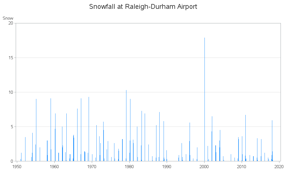
It's a decent plot, but it still lacks a few important bits of information a data analyst would like to see. For example:
- Is this daily, weekly, monthly (or other?) snowfall amounts?
- What are the units for the snow depth? (inches, cm, feet, other?)
- The date axis goes out to year 2020, but we know the data values don't go out that far yet (since it is currently December 2018). So, what is the latest data shown in the graph?
- What is the source of the data?
This next version fixes those problems:
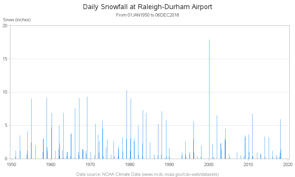
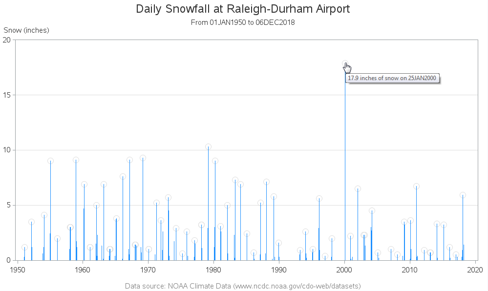
That plot (above) is better, but if you're really going to analyze the data, you might want even more information. For example, what dates were those tall bars? (you might could guess the year just looking at the plot, but probably not a specific date) Wouldn't it be nice to be able to hover your mouse over the bars and see some mouse-over text with the date & snow amount?
Since these 'bars' are actually lines, and you can't have HTML mouse-over text for line segments in SAS/Graph output, I had to use a little trick. I annotated a circular marker at the top of the bars, and added mouse-over text to those markers. There are so many tiny bars that these markers would overlap ... therefore I limited it to just a marker for the tallest bar from each year. I made the markers light gray so they don't stand out too much - but visible enough to let you know which bars have mouse-over text.
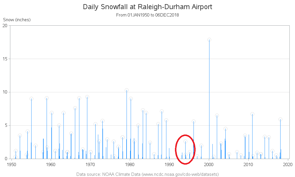
Now you have markers to mouse-over and see more details ... but upon closer examination it appears there are sometimes more than one marker in a visual group of snow measurements. That's because there's one value per year ... and the visual groupings are winters (which span across two calendar years).
Therefore I made one more refinement. I calculated a 'winter' variable (for example, the winter including December 2017 and January 2018 is winter='2017/18'), and placed the markers at the maximum snow day in each winter (rather than each year). Here's the final version (click the image to see the interactive version, with HTML mouse-over text):
If you'd like to experiment with this graph (and maybe enhance it?), here's a link to the SAS code. And below is a detailed tutorial on downloading the snowfall data for your area.
If you'd like to see more SAS blog posts about snow, follow this link!
OPTIONAL
Downloading Data for Your Area
Seeing graphs of the Raleigh data is all well and good, but if you're a Data Guy (or Gal) you're probably wanting to graph the data for your own area. Luckily you can download that data from the web! The process has quite a few steps though - therefore I screen-captured each step along the way to give you a little tutorial...
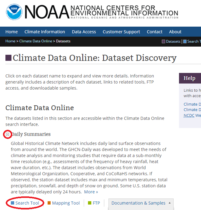
First, go to the NOAA dataset discovery page (https://www.ncdc.noaa.gov/cdo-web/datasets), click the '+' to expand 'Daily Summaries', and click the 'Search Tool' link.
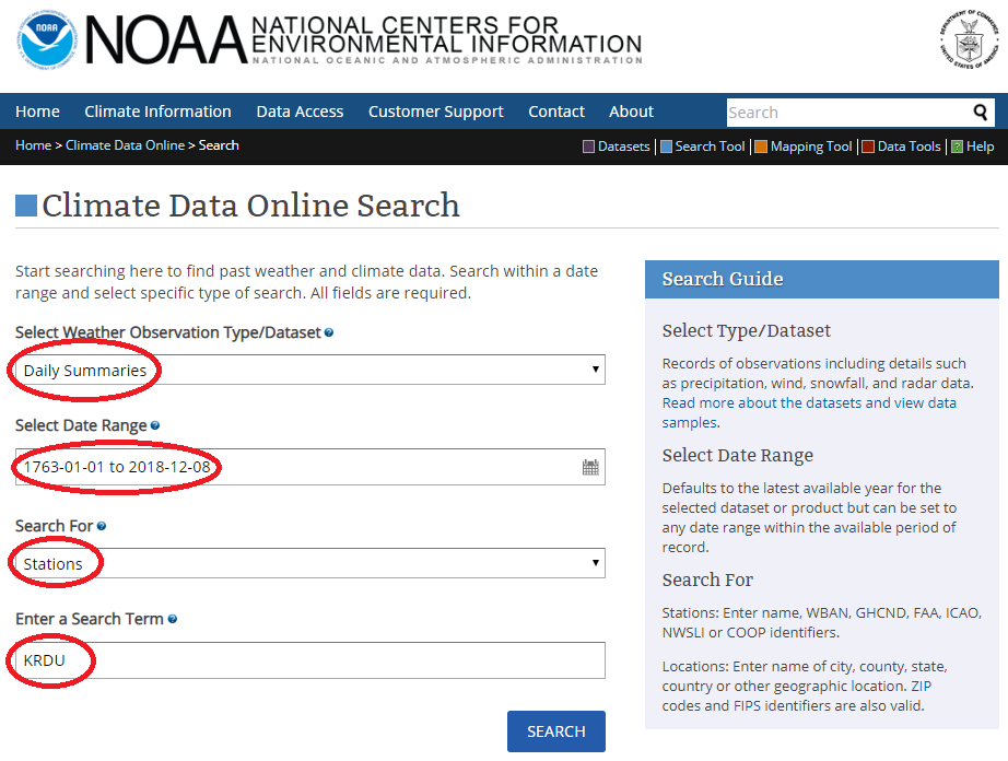
Change the 'Date Range' so that it goes back to the minimum possible date (don't worry about data not being available back that far - this will allow you to get all the data that is available), let it know what area you're wanting. Note that once you select a year & month in the calendar, you also have to click on a specific day. You can search by city or zip code, but I happen to know there's a weather station at the airport near my house, therefore in my case I'm searching for that - station KRDU (the one at the Raleigh-Durham airport).
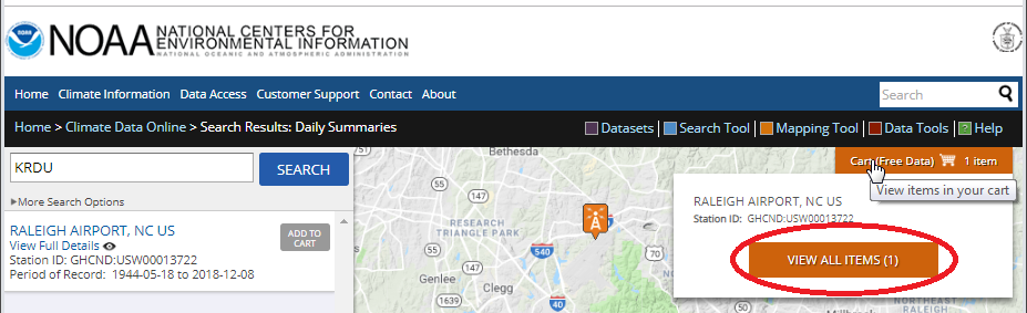
It will then show you the selected area on a map, and you can 'Add to Cart'.

And then, 'View All Items' in your cart.
Select 'Daily CSV', and the desired date range, and then click 'Continue'.

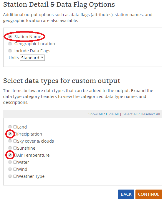
Select Precipitation (which includes variables for both rain and snow). I also selected Air Temperature - it might be interesting to also have! And click 'Continue'.
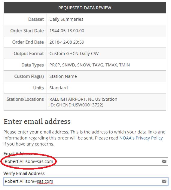
Enter your email address, and then click 'Submit Order'.
You'll get an email that your order was submitted, and then a while later (maybe minutes, maybe hours) you'll get a 2nd email that your order was complete. Click the 'Download' link in the 2nd email, and the csv will be downloaded. Move it to the location where you work with your data, and I recommend renaming it from {order number}.csv to some name that will help you remember what the data is (I renamed my data file rdu_snow.csv).
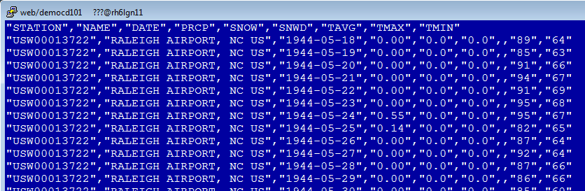
Here's what the csv file looks like in an editor:

4 Comments
Thanks Robert, great post. I appreciate the reason(s) you list that led you to your graph selection (needle), as well listing the enhancements & challenges and then solutions to arriving at your final product. Thanks!
Glad you liked it! I'm thinking to start sharing more of the reasoning & technical-decision-process I go through, for my graphs. :)
Awesome! I like that you show all the steps on how to get the data. Lots of screenshots, nice. Didn't think Cary got that much snow. And I've dined at the Ole Time shown in the photo, good stuff.
Thanks for checking in! :)