When I fill up my daily-driver Prius, the price of gasoline isn't that important. But when I occasionally take a trip in my V8 Suburban, I pay a lot more attention! Therefore I was pleasantly surprised when I noticed that gasoline prices have been falling. How much have they fallen, and how do the current prices compare with the past prices? ... Let's graph some data, and find out!
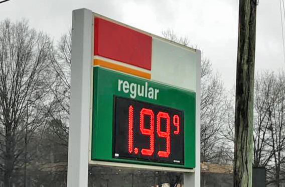
But before we get into the data analysis, here's a picture to get you into the right mood... My friend David recently took this picture at a gas station just north of Raleigh, NC. Did you ever think you'd see gasoline prices less than $2/gallon again?!? What's the lowest price you've seen in your area? (feel free to post your price in the comments!)
Now, let's analyze that price data! Fortunately, the Energy Information Administration tracks the average price of gasoline in the US on a weekly basis, and has that data available on their web page. I downloaded their Excel spreadsheet, imported it into SAS, and created a preliminary plot.
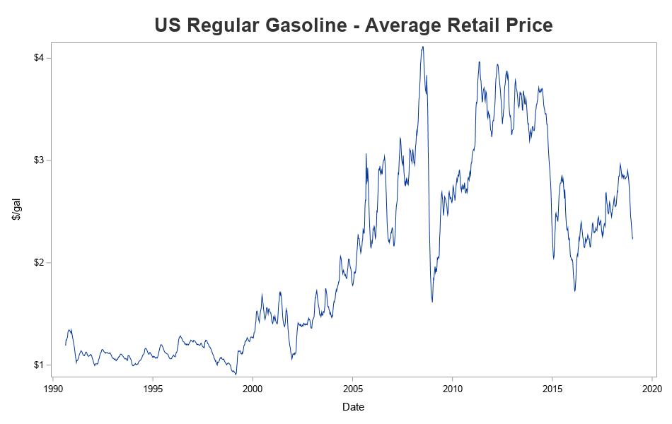
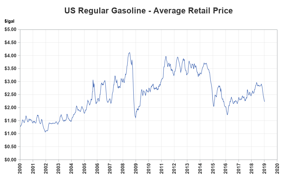
That's a fine starting place, but let's make a few improvements. Series/line plots typically auto-scale the y-axis, so that you can see as much detail as possible. But in this case I'd like the axis to start at zero, so the values are plotted in such a way that you can visually compare them proportionally (for example, a price of $2 is twice as 'high' in the y-direction as a price of $1). Also, I don't want to go too far back in time, because inflation makes it difficult to compare the prices (unless you apply a price index to convert all values to a certain year). I decided that the year 2000 seemed to make a good starting point. I also added grid lines, so it is easier to compare values over time. Here's the slightly improved version of the graph:
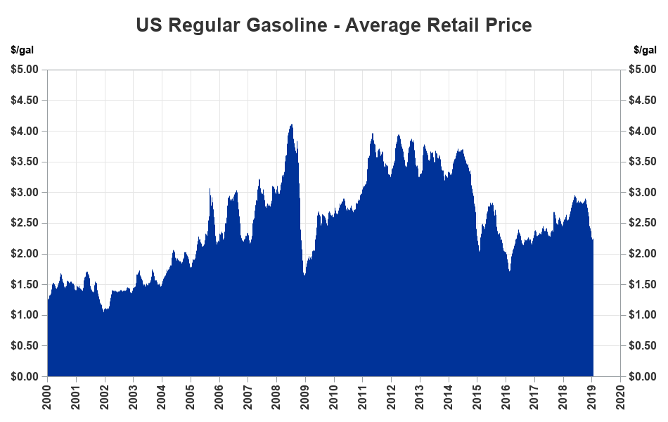
Now that my y-axis starts at zero, it becomes more evident that what I'm really wanting to show & compare is the value under the line. A bar chart is typically used for such comparisons, but in this case there are way to many weekly values to plot using bars - or are there?... What's the skinniest 'bar' we could use? How about using a bar that's 1 pixel wide ... which we call a 'needle'! A needle plot simply draws a line from the data point to the horizontal axis, and functions like a bar chart with very skinny bars. Below I have changed from a series plot to a needle plot, and also added a second y-axis on the right (to make it easier to see the prices, for the most recent data).
Although the graph has grid lines and two y-axes, it's still a bit of mental work to 'see' when the gasoline prices crossed certain milestones. Why not add another visual dimension to help - lets add color! I assigned a different color for each needle line, with the color getting darker at every 50-cent increment (which corresponds to my grid lines). I think this color dimension is what makes the graph!
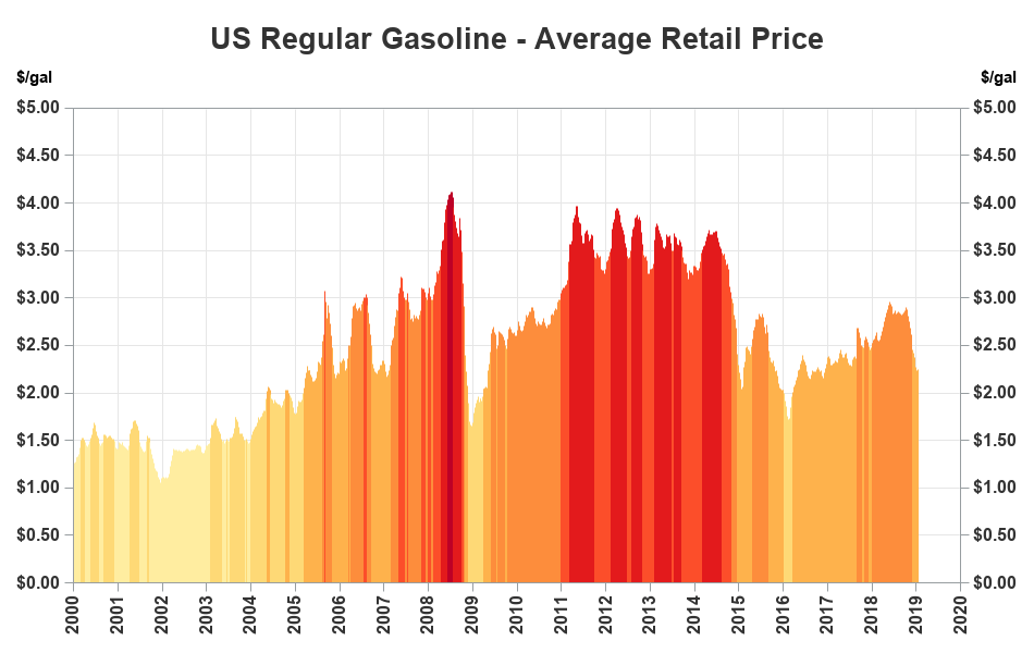
You might think we're done ... but let's add two more finishing touches. Often when the price in a graph is dropping or climbing very quickly, it's difficult to see where the final data point is located. Therefore I like to add a marker on the final price (in this case, I add an 'x' marker). And I also like to add a footnote, indicating where and when the data is from. Here is my final graph:
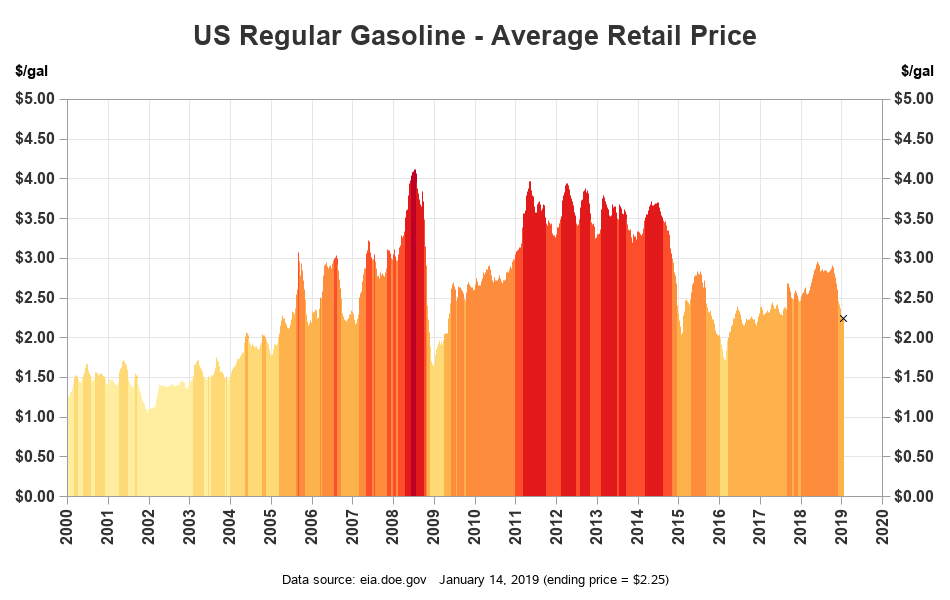
From this graph, you can see that average US gasoline prices peaked in 2008 (just before the big worldwide recession) at over $4/gallon. The current price is $2.25, which is fairly low, but not as low as it dipped in 2016. What are your predictions for gasoline prices this year (feel free to discuss in the comments section).
Here's a link to the SAS code used to create all these graphs, if you'd like to see all the tricks used!

14 Comments
I feel you Robert, I have a shorter version of the Suburban (Tahoe), lol
I really enjoyed this post, Robert! The progression, with steps, of the initial data load to your "final product", was really helpful.
In The Bahamas, where I am from, gas was around $4.95 cents a gallon when it was at it's lowest here in the USA over the last month.
Hopefully people don't generally drive too long of distances in the Bahamas, so they probably don't have to buy too much of that expensive gasoline(?) :)
This might be an off topic question—but any specific reason you used sgplot and not gplot for this one? I ask because you usually favor gplot.
Chris Hemedinger wants me to use sgplot (ods graphics) instead of sas/graph, in my blogs from now on, since it's a more modern SAS offering.
Oooookay. To be honest what has always kept me away from sgplot is the look of the SAS samples I’ve seen so far. They look like something from an alternate universe where Lotus 1-2-3 is still a thing.
Version is also an issue. We’re currently on SAS9.4 M2 (this sample requires M3)— updating our production server is usually a big ordeal involving lots of red tape.
Here's a SAS/Graph version of the same plot (almost identical), that I "just happened" to have ... :)
http://robslink.com/SAS/democd74/gasoline_prices_plot_info.htm
I saw a $1.94 in Cary, NC today 1/16/19. Does diesel#2 follow the same comparison as well as any other intermodal or commercial fuels like CNG or coal for power generation or commodity fuels for trains, planes, and ships? Would be insightful to see those patterns? If you forecasted this, what would it look like?
Always love seeing our data work. Looking ahead though usually what goes up must go down, and vice versa. Even if not this year my bet is that gas prices will go up again which is why I bought a hybrid that gives me 600m per gallon on regular gas. :-)
Graph guy is back!!! Good to see your posts again Robert.
Interesting trends and graph annotations. I wonder if the trend is similar in other countries too? Last week fuel prices in Brisbane was a remarkable $1.13 per litre and is now increasing... https://www.accc.gov.au/consumers/petrol-diesel-lpg/petrol-price-cycles
Interesting! If you can find a good source of gasoline (petrol) prices in Australia going back to ~2000, I'll be happy to create an Australia graph! :)
Well, the French government's taxation of gas isn't really leading to lower prices...
Gas price today in Austin, Texas is 1.85$ :-)
Cool plots!
Hmm ... low gas prices, and no state income tax(?) ... I might have to move back to Texas! ;)