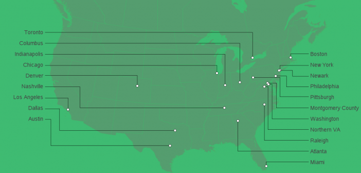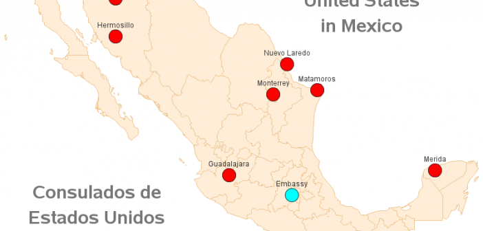
One of my favorite Eddie Murphy movies when I was growing up was Coming to America. And speaking of coming to America, there's been a lot in the news recently about people doing just that. So I thought I'd use my SAS skills to help people wanting to come to
Tag: maps
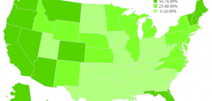
I recently read an interesting article that claims "a single cremation emits as much carbon dioxide as a 1,000-mile car trip." This got me wondering about cremation data, and I ended up on the Wikipedia page about cremation rates. They had a map of the US cremation rates by state ... but the more
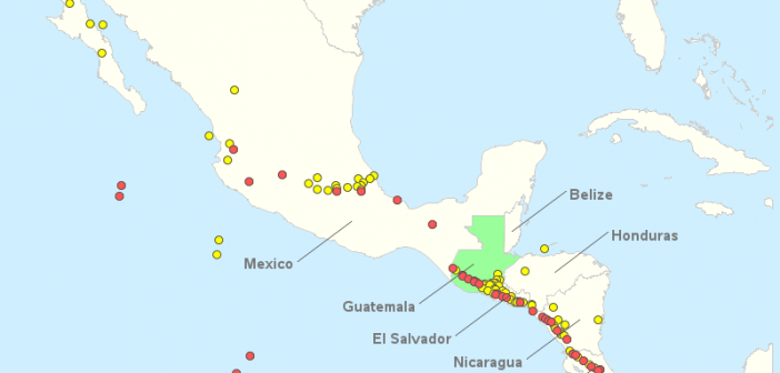
You've probably seen in the news that a volcano erupted in Guatemala recently. But do you really know much about this volcano, or even where it's located? Hopefully this blog post will get you up to speed on your volcanology! Pictures of a recent volcano erupting in Hawaii show slow-moving
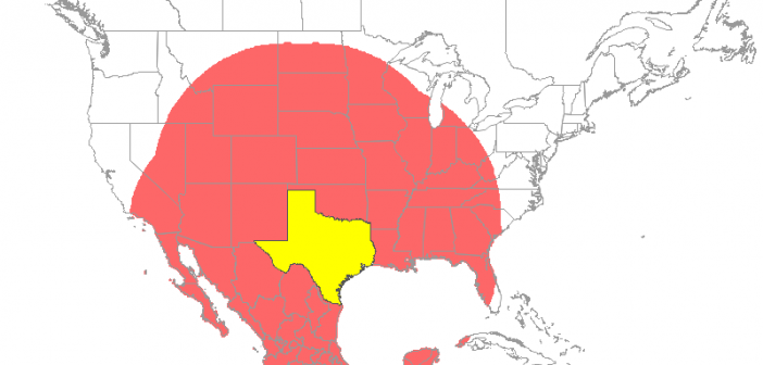
Everything's big in Texas - at least that's what they say! Therefore let's have a bit of graphical fun, and use Texas as a unit of measure (let's call it a 'tex'). More on that later - but first, here's a picture of my friend Jennifer posing beside a rather
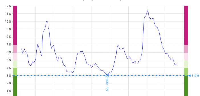
It looks like we've finally recovered from the Great Recession, and there are even claims of record-low unemployment in several U.S. states. Of course claims like that make my data-radar go off, and I wanted to see the numbers for myself. And it's a great excuse for me to create
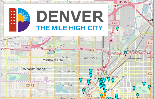
Are you going to Denver, Colorado, and wondering what fun/interesting/eclectic things you can do there? Then this is the map for you! For the past couple of years, I've made maps of the city SAS Global Forum is in, pointing out some of the attractions that conference attendees might want
Do you procrastinate and find excuses to delay doing certain things, even when you know they really ought to be done? And you probably realize that starting those projects is usually the hardest part, eh? Well, I finally started converting hundreds of my SAS examples to use the new GfK maps,
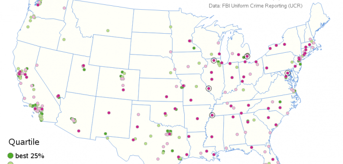
For the past few years, I've been hearing from many news sources that Detroit is the most violent large city in the US. If the news is saying this, then the data should corroborate it, eh? Well, of course I decided to check for myself... When comparing crime data across
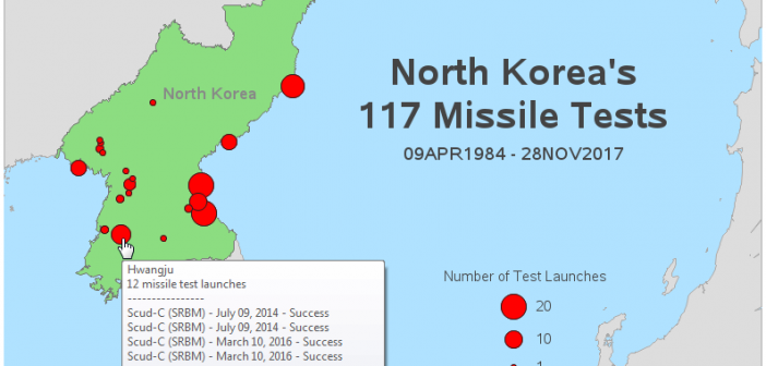
Data doesn't always have to be 'big data' to be interesting. For example, I recently ran across a small, but very interesting, database containing all of North Korea's missile tests. The data was a bit difficult to digest in the formats provided, therefore I decided to try my hand at
Amazon recently announced the 20 finalists in their search for a location to house their new 2nd headquarters (nicknamed 'hq2'). They showed a map on their web page, but I wanted to create my own map, with a few improvements ... Here's their official map. It's not terrible, but it