It looks like we've finally recovered from the Great Recession, and there are even claims of record-low unemployment in several U.S. states. Of course claims like that make my data-radar go off, and I wanted to see the numbers for myself. And it's a great excuse for me to create some graphs! ...
I did a little digging, and found the Bureau of Labor Statistics page where they track state unemployment. They even had a map, which of course caught my attention:
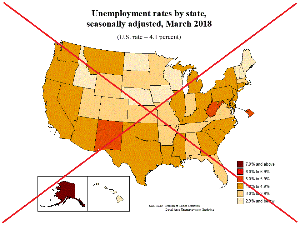
I decided to start by creating my own version of their map - this would help me verify that I was using the correct data, and importing it correctly. Their data was in a text file, but in more of a report format than rows and columns of data - so it took a little extra effort in a custom data step to read the values into a SAS dataset. Once the values were in, I plotted the most recent month's data on a map, using the same colors and legend-binning as the BLS map.
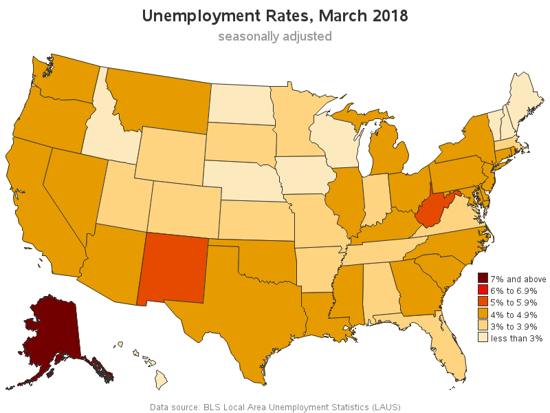
As I was imitating the BLS map, I realized I didn't like their color selection. It was difficult to distinguish their colors (such as the 2 similar shades of red), and none of the colors let me know at a glance that most of these unemployment values were actually *good*. Therefore I created a new version of the map, using a diverging color scheme such that unemployment below 5% is represented by shades of green (which is more intuitive for good). I also added HTML mouse-over text so you can see the actual values for each state - click the image below to see the interactive version.
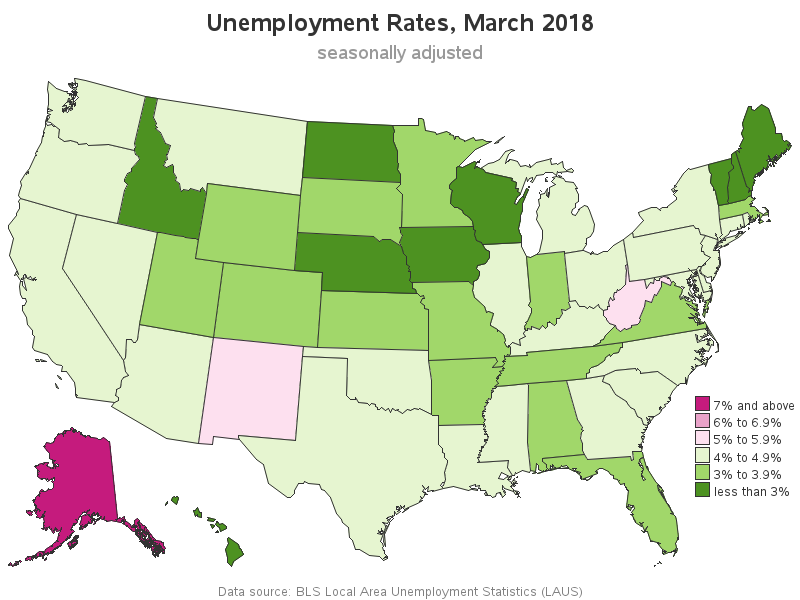
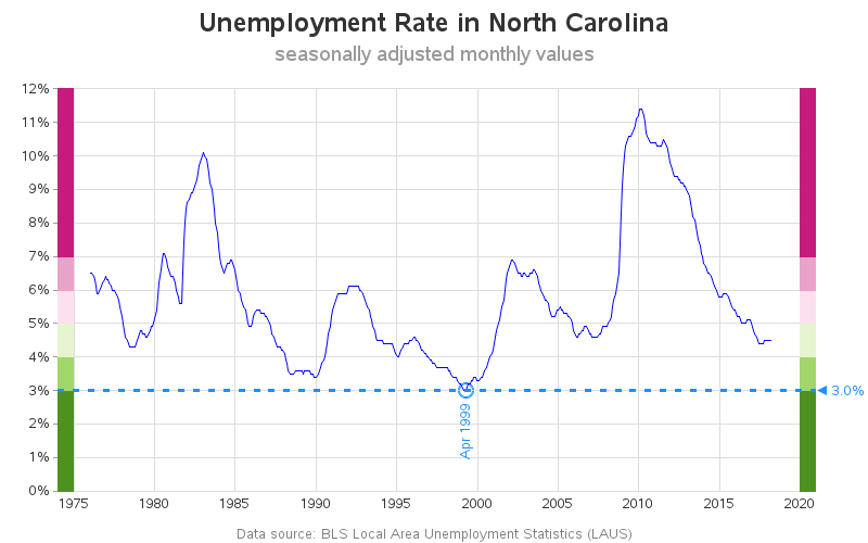
The map only shows the latest monthly unemployment values - how am I going to use it to see the lowest values since 1976? With a second level of graphs, of course! I set up drilldowns, so you can click each state to see a time series plot of the past unemployment values. It's a highly customized graph, with color scales that match the color binning in the map, and indicators to point out the lowest value. Below is the plot for North Carolina, showing that the lowest unemployment value since 1976 was 3.0% in December 1998.
I invite you to play around with my map (click the states to see their graph, and click your browser's "back" button to get back to the map again), and check out all the states that interest you. California might be of interest, since it's one of those states with the "lowest unemployment since 1976". Which other states are at (or near) record low unemployment? How is your state doing? Feel free to leave a comment with interesting things you find, and ideas about factors that might explain odd trends you see in the data!
Update 5/4/2018: I had originally created my map and graphs using the not-seasonally adjusted values. David Waldron (on reddit) pointed out my mistake, and I re-generated them using the seasonally adjusted values, and updated the images in the blog post. Thanks David!


6 Comments
So interesting! Great graphs, Robert. I am guessing those wacky peaks following 2005 in Louisiana and Mississippi have to do with Hurricane Katrina. Your pictures are indeed worth a thousand words!
I bet you're right about the hurricane!
These are very useful graphs. What would you think of fixing the y-axis from 0 to max(rate) across all states? That might make it easier to compare peaks and troughs between states. For example, if you compare Alabama to Arizona around 2010, it appears that Arizona had a worse unemployment rate, but both values are close to another and that is because Alabama had a rate close to 16% at one time, whereas Arizona never crossed 12%.
In any case, thank you for sharing!
Dhrumil
Good observation Dhrumil! I guess it depends on what questions you're wanting to answer with the graphs. My original goal was to allow each state to see their historical values, and therefore I let the y-axis autoscale based on that state's maximum value. But yes, if you're wanting to compare states, it would be useful to plot them all to the same scale (or, even better yet, it might be even more useful to plot the two states being compared in the same graph!)
A lot of people claim that the point of graphics is to tell a story, and of course that is baloney. A story has a beginning, middle and end, but you can have a fantastic graph without having time as an element. However, these graphs DO tell a story, and they tell it well. Nicely done!
Thanks! - Your kind words made my Friday! :)