The DO Loop
Statistical programming in SAS with an emphasis on SAS/IML programs
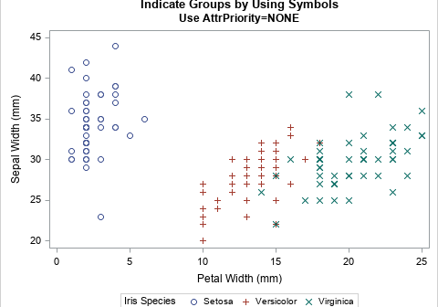
The ODS GRAPHICS statement in SAS supports more than 30 options that enable you to configure the attributes of graphs that you create in SAS. Did you know that you can display the current set of graphical options? Furthermore, did you know that you can temporarily set certain options and

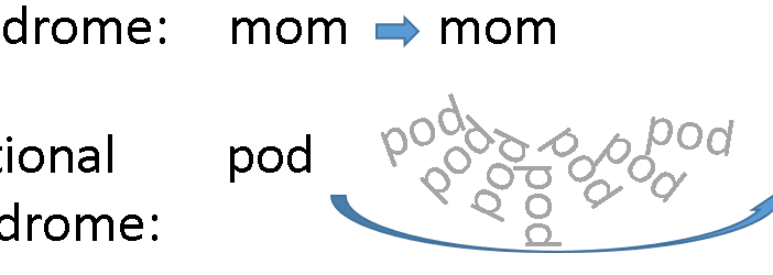
A palindrome is a sequence of letters that is the same when read forward and backward. In brief, if you reverse the sequence of letters, the word is unchanged. For example, 'mom' and 'racecar' are palindromes. You can extend the definition to phrases by removing all spaces and punctuation marks

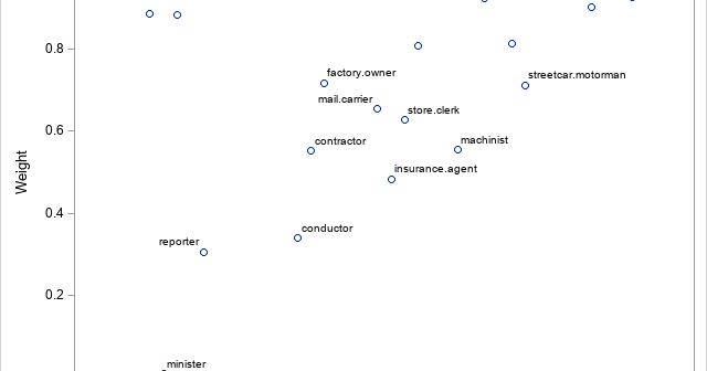
M estimation is a robust regression technique that assigns a weight to each observation based on the magnitude of the residual for that observation. Large residuals are downweighted (assigned weights less than 1) whereas observations with small residuals are given weights close to 1. By iterating the reweighting and fitting
