The DO Loop
Statistical programming in SAS with an emphasis on SAS/IML programs
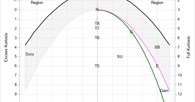
In my book Simulating Data with SAS, I show how to use a graphical tool, called the moment-ratio diagram, to characterize and compare continuous probability distributions based on their skewness and kurtosis (Wicklin, 2013, Chapter 16). The idea behind the moment-ratio diagram is that skewness and kurtosis are essential for

Did you add "learn something new" to your list of New Year's resolutions? Last week, I wrote about the most popular articles from The DO Loop in 2019. The most popular articles are about elementary topics in SAS programming or univariate statistics because those topics have broad appeal. Advanced topics

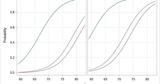
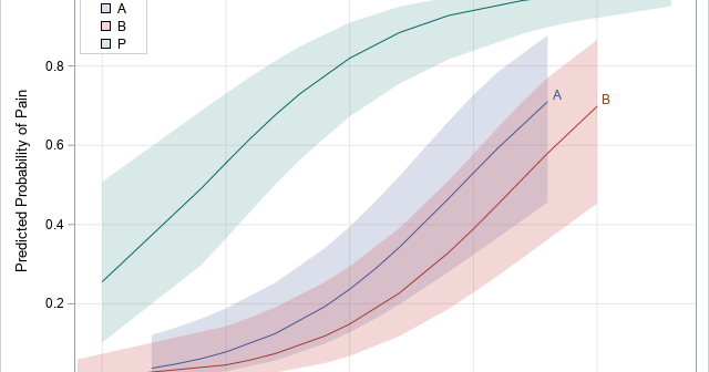
Many SAS procedures can automatically create a graph that overlays multiple prediction curves and their prediction limits. This graph (sometimes called a "fit plot" or a "sliced fit plot") is useful when you want to visualize a model in which a continuous response variable depends on one continuous explanatory variable
