The DO Loop
Statistical programming in SAS with an emphasis on SAS/IML programs
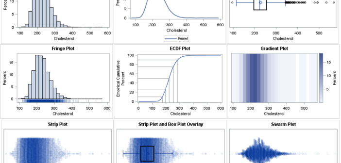
There are many ways to visualize the distribution of univariate data. A previous article presents an overview and shows how to use SAS to create histograms, kernel density estimates, box plots, and cumulative distribution plots. This article continues the visualization journey, with an emphasis on dot plots and heat maps.

In a previous article, I presented some of the most popular blog posts from The DO Loop in 2025. In general, popular articles deal with elementary topics that have broad appeal. However, I also write technical articles about advanced topics, which typically do not make it onto a Top 10

There are many ways to visualize the distribution of univariate data: histograms, kernel density estimates, box plots, and more. Visualizing a distribution leads to better insights than merely displaying statistics such as the sample mean, standard deviation, and quantiles. In fact, there are many well-known examples of data sets that
