The DO Loop
Statistical programming in SAS with an emphasis on SAS/IML programs
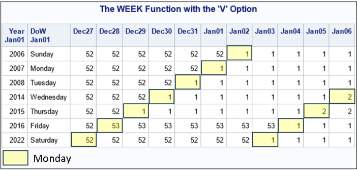
Dating can be a challenge. No, I'm not talking about the process of finding a soulmate. I'm talking about managing days, weeks, months, and years in statistical analyses and reports! One challenge is how to number the weeks of the year. Because there are seven days in a week, 52

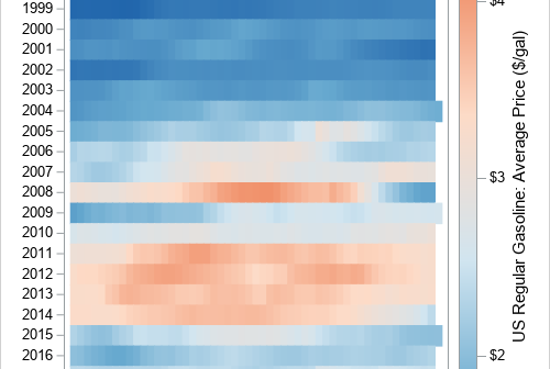
I follow several data visualization experts on social media. Sometimes, I see a graph that I struggle to interpret. When that happens, I ask myself whether there is a simpler and more effective way to visualize the data. Recently, I saw an example of using a "horizon plot" to visualize

While researching a topic on effect sizes, I learned about a SAS function that is related to noncentrality parameters. I previously wrote an article about the noncentral t distribution, which is one of several well-known distributions that contains an optional noncentrality parameter. I mentioned that the PDF, CDF, and QUANTILE
