Get the right information, with visual impact, to the people who need it
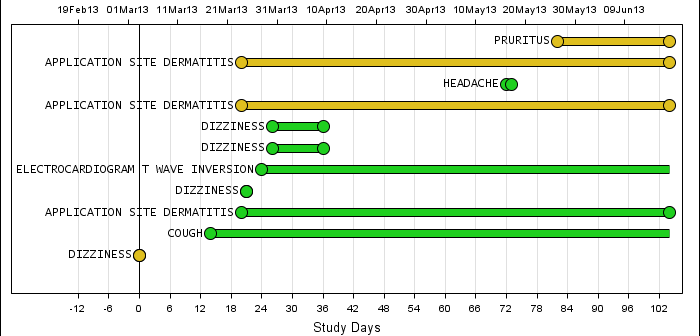
Back in February, I posted an article on creating Adverse Event Timeline Graph. In the SAS 9.2 version (first one), one item that was less than ideal was the way to position the AE names to the left of the event. The AE names are displayed using the scatter plot statement


