Tag: Histogram

Data Visualization
Sanjay Matange 9
R U Graphing with SAS?

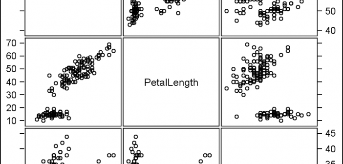
In recent conversations with many SAS users at NESUG, SESUG and WUSS, a pattern emerges on the question of creating graphs with SAS or R.  Many SAS users are aware of the new graph features in SAS that create high quality graphs with minimum fuss.  But, many have not actually used

Data Visualization
Sanjay Matange 8
Comparative Histograms

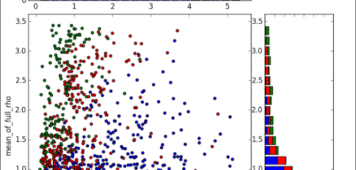
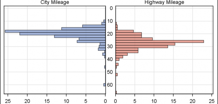
In reference to a previous article on Violin Plots, a reader asked about creating comparative mirrored histograms to compare propensity scores.  While I had my own understanding of "Mirrored Histograms", I also looked this up on the web.  Google showed many cases of two histograms back to back, either horizontally or vertically. 

Data Visualization
Sanjay Matange 4
Comparative density plots

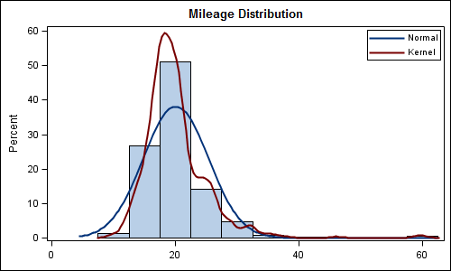
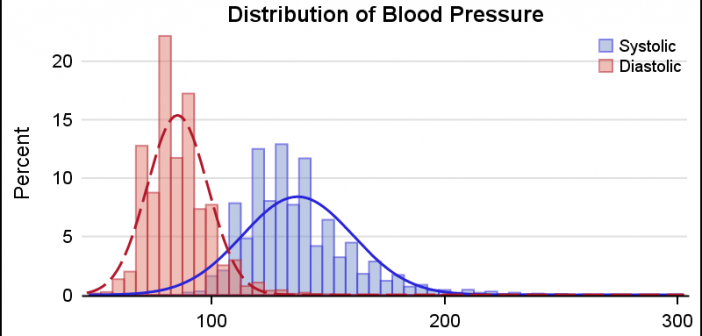
Recently a user posted a question on the SAS/GRAPH and ODS Graphics Communities page on how to plot the normal density curves for two classification levels in the same graph. We have often seen examples of a  distribution plot of one variable using a histogram with normal and kernel density curves.  Here is a simple example: Code Snippet:

Data Visualization
Sanjay Matange 7
Nested graphs

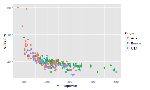
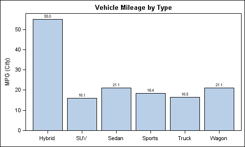
Here are a couple of bar charts showing the city mileage of cars by Type and Origin using the SGPLOT procedure from the sashelp.cars dataset. title 'Vehicle Mileage by Type'; proc sgplot data=cars; format mpg_city 4.1; vbar type / response=mpg_city stat=mean datalabel; xaxis display=(nolabel); run; title 'Counts by Country'; proc sgplot