Graphically Speaking
Data Visualization with a focus on SAS ODS Graphics
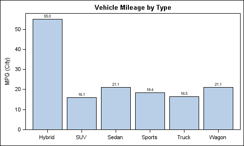
Here are a couple of bar charts showing the city mileage of cars by Type and Origin using the SGPLOT procedure from the sashelp.cars dataset. title 'Vehicle Mileage by Type'; proc sgplot data=cars; format mpg_city 4.1; vbar type / response=mpg_city stat=mean datalabel; xaxis display=(nolabel); run; title 'Counts by Country'; proc sgplot

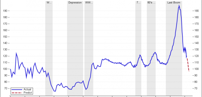
Recently we discussed the features of the Shiller Graph, showing long term housing values in the USA. To understand the features necesary in the SGPLOT procedure to create such graph easily, it was useful to see how far we can go using GTL as released with SAS 9.2(M3). I got the data Shiller Housing index data

An issue that SAS/GRAPH users have wrestled with in the past has been how to put tick marks at irregular intervals on their axes. In PROC GPLOT, if you specify irregular intervals using the ORDER option on the AXIS statement, the procedure’s axis kicks into a “discrete” mode, where the

