Graphically Speaking
Data Visualization with a focus on SAS ODS Graphics
SAS Global Forum 2012 at Orlando, Florida is just round the corner and we are excited to see so many presentations offered by users on SG procedures and GTL. We'll add a few more on new SAS 9.3 features of SG procedures and GTL. These include cluster groups for discrete and interval axes, cluster

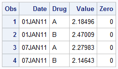
Recently, a user asked about creating a Bar Chart of Value by Date, where the dates are displayed on a scaled interval axis. Consider this simulated data set of value by date and treatment shown below. This data set only has one value for each date and treatment combination. We can use the VBAR statement

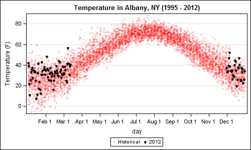
A recent article in the SAS and R blog was about current winter temperatures in Albany, NY. The temperature data for the recent winter (Dec 2011 - Mar 2012) was plotted on a polar graph. Robert Allison posted an article on displaying the same data as a Polar Graph using SAS/GRAPH . Here is his
