Graphically Speaking
Data Visualization with a focus on SAS ODS Graphics
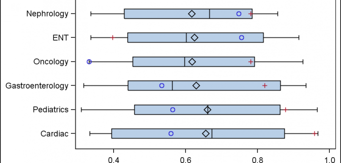
A common request we have been often hearing is for display of the distribution of data as a box plot, along with some detailed information overlaid. For example, one may have ratings data of all the hospitals in a region by different specialty, and you want to view this distribution

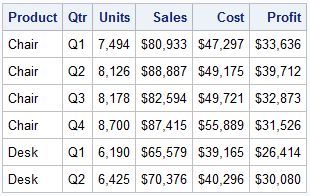
A parametric bar chart in SG Procedure and GTL parlance is a simplified version of the regular bar chart, where the data is assumed to be summarized prior to its usage inside the SG procedures or GTL. So, multiple occurrences of the same category and / or group combination is

Last week I was out to the 2nd Conference on Statistical Practice in New Orleans. It was a great opportunity to meet many users of SAS, R and other software and hear about their projects in applied statistics. I will write up my feedback on this conference soon. In the
