Graphically Speaking
Data Visualization with a focus on SAS ODS Graphics
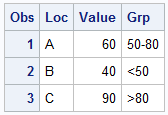
Getting consistent group colors across different data sets for a graph is a common topic of interest. Recently a user wrote in to ask how to ensure that specific groups "values" for a bar chart get specific colors. The group values may arrive in different order, or some may

The Mid-West SAS Users' Group conference in Chicago was a great success, with over 400 attendees and great weather. The conference hotel was in downtown with nice view of the river and a stroll down "Magnificent Mile". The city does a great job with the flower beds down Michigan Ave., along

A HighLow plot is very popular in the financial industry, often used to track the periodic movement of a stock or some instrument or commodity. The CandleStick Chart is one specific type of high low plot, purportedly originating in Japan for tracking of financial instruments in the rice trade. Creating a
