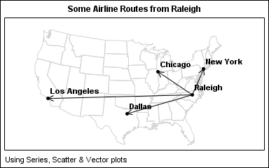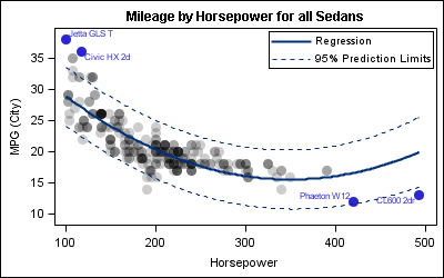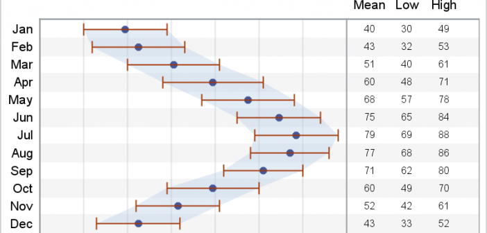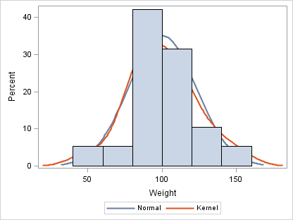
When I give presentations on using the SG procedures, I try to describe how you can take simple plots and layer them to create more complex graphs. I also emphasize how you must consider the output of each plot type so that, as you overlay them, you do not obscure
English
In Simple maps can go a long way, we discussed some techniques to create simple outline maps from map datasets in the MAPS library using GTL. Now, let us take this a step further to do something more useful with this feature. For some graphs, the map information is an essential part of the
A new book from SAS Press, "Statistical Graphics Procedures by Example" co-authored by Dan Heath and I has now been published (phew!). For both Dan and I, this was our first foray into writing a book, so it was highly educational to say the least. The key idea behind the presentation
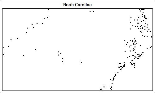
Charlie Huang recently posted an article on a new way to draw maps using SGPlot procedure. The basic idea is simple, just use the SCATTER statement to plot the (x, y) points from the data sets in the MAPS library. The GROUP option can be used to color the markers for each
Calendar Heatmaps are an interesting alternative view of time-series data. The measured value is displayed as color mapped cells in a calendar. Calendar Heatmaps can be easily created with SAS 9.3 using just the HEATMAPPARM, SERIESPLOT and BLOCKPLOT statements in GTL and some simple data manipulation. The example below shows
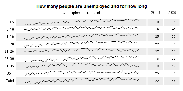
When viewing time series data, often we only want to see the trend in the data over time and we are not so concerned about the actual data values. With multiple time series plots, forecasting software can find clusters to help us view series with similar trends. Recently I saw a graph showing the trend of unemployment
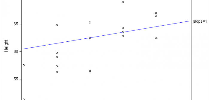
The dimensions of your graph can affect the aspect ratio, which in turn, can subtly affect the perception of your viewers. When visual perception is of prime importance, the aspect ratio of the graph needs to be adjusted with care. This technique is known as ‘banking’, was introduced by William
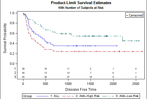
A frequently asked question about the Survival Plot is: "How can I display the 'At Risk' data outside the plot area?". The survival plot rendered by the LIFETEST procedure displays the at risk data inside the plot data area. The reason for this is the potential for varying number of treatment groups. Here
In a previous article we discussed how to add axis aligned statistics table to a Lipid graph using GTL. Other graphs such as the Survival Plot also utilize the same technique to display the "at risk" statistics aligned by time or visits along the X axis. Often, we also need to display
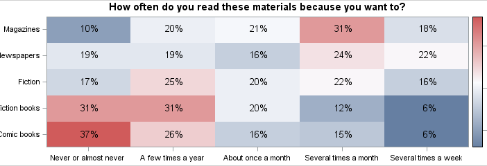
The heatmap is a graphical representation of a table where colors are used to represent the values in the table. This is an effective graphic for finding the minimum and maximum values across the table and may surface patterns in the data. With the addition of the HEATMAPPARM statement to