SGF 2015 was a blast with a focus on Visual Analytics, SAS Studio, Hadoop and more. Graphs were everywhere, and it was a banner year for ODS Graphics with over 15 papers and presentations by users on creating graphs using SG Procedures, GTL and Designer. Dan Heath, Prashant Hebbar, Scott
English
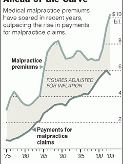
A very common type of graph contains two series plot, where the user is expected to evaluate the difference visually. I saw one such plot on the web today shown on the right. This graph has two curves, one for malpractice premiums and one for claims, with a shaded band
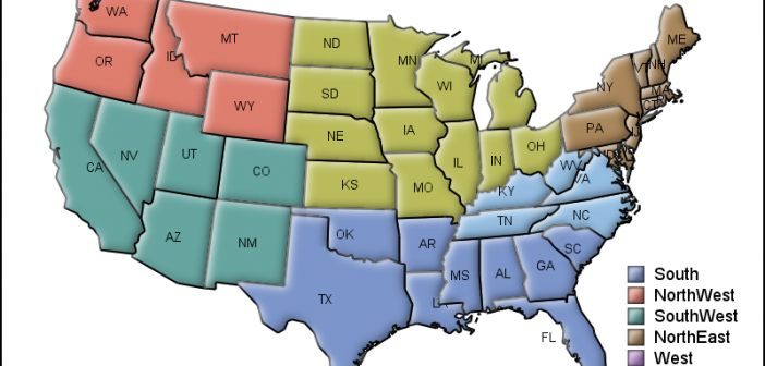
MicroMaps are a powerful way to display data where the display includes small, lightweight maps to provide geographical information regarding the data. This geographical information gives clues to the relationship between the data that could lead to more insight. The SAS SG Procedures and GTL do not currently have built-in
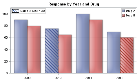
Back in late 2012 I discussed a technique for Conditional Highlighting, where additional attributes can be displayed in a graph. In the previous article the goal was to display a graph of Response by Year by Drug. We used a cluster grouped bar chart to create the bar chart. We
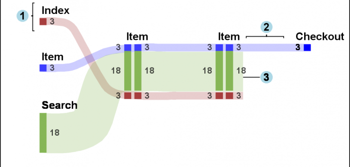
Sankey Diagrams have found increasing favor for visualization of data. This visualization tool has been around for a long time, traditionally used to visualize the flow of energy, or materials. . Now to be sure, GTL does have a statement design for a Sankey Diagram which was implemented only in Flex for use
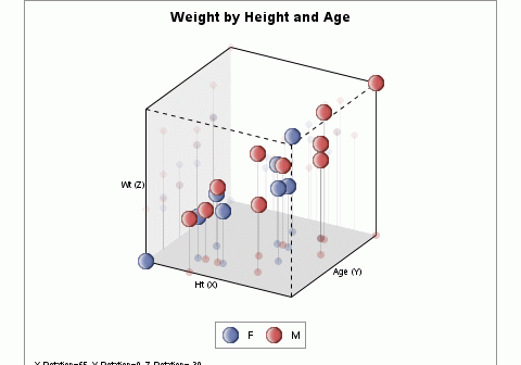
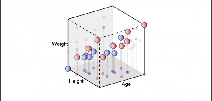
In the previous article, I described the process to create a 3D Scatter Plot using a 3D Orthographic View matrix and the SGPLOT procedure. I posted a macro that can be used to create a 3D scatter plot from any SAS data set, using 3 numeric columns, one each for
The SG Procedures do not support creating a 3D scatter plot. GTL has some support for 3D graphs, including a 3D Bi-variate Histogram and a 3D Surface, but still no 3D point cloud. The lack of such a feature is not due to any difficulty in doing this as
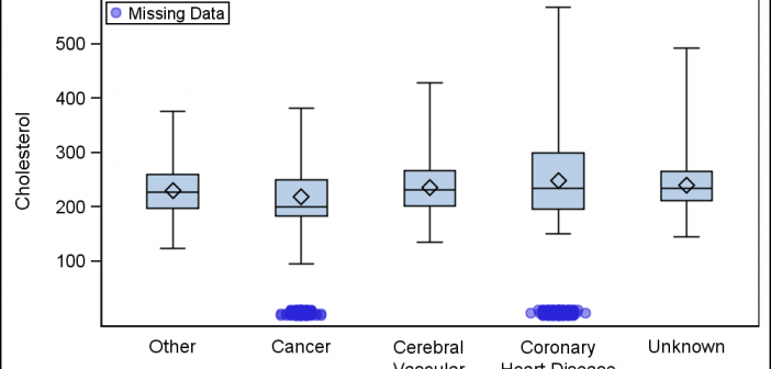
Last week a user wanted to view the distribution of data using a Box Plot. The issue was the presence of a lot of "bad" data. I got to thinking of ways such data can be visualized. I also discussed the matter with our resident expert Rick Wicklin who pointed
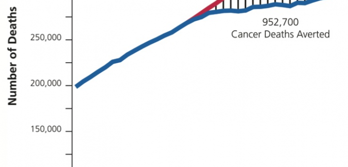
Significant progress in reduction of Cancer mortality is shown in a graph that I noticed recently on the Cancer Network web site. This graph showed the actual and projected cancer mortality by year for males. The graph is shown on the right. The graph plots the projected and actual numbers
Including special Unicode symbols into the graph is getting more popular. In general, SG procedures support Unicode strings in places where these strings are coded into the syntax such as TITLE, FOOTNOTE. These support Unicode characters and also the special {SUP} and {SUB} commands. This is because these statements are rendered