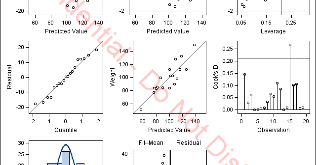
There are many ways to modify the graphs that SAS creates. Standard graph customization methods include template modification (which most people use to modify graphs that analytical procedures produce) and SG annotation (which most people use to modify graphs that procedures such as PROC SGPLOT produce). However, you can also
English
We all want to customize our graphs just so, and have our personal preferences. Over the past few releases SG Procedures and GTL have added options to customize the look and feel of our graphs. In this article, I will describe new ways in which you can customize your legends. We will also see some
If you are familiar with the output delivery system (ODS), then you know that you can modify the tables and graphs that analytical procedures display by modifying table and graph templates. Perhaps less familiar is the fact that you can also modify dynamic variables. Tables and graphs are constructed from
SAS 9.4 Maintenance release 3 was released on July 14. The ODS Graphics procedures include many important, useful and cool features in this release, some that have been requested by you for a while. In the next few articles, I will cover some of these features. Last time I covered
Big data is a popular topic, with multiple articles about the analysis of the same. Today, "Big Data" is measured in multiple of Tera Bytes, and SAS provides special software for analysis and visualization of Big Data - Visual Analytics. When data is very big, it may be meaningless, let alone inefficient, to plot
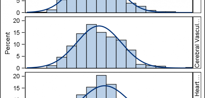
The SGPANEL procedure makes it easy to create graph panels that are classified by one or more classifiers. The "Panel" layout is the default and it places the classifier values in cell headers at the top of each cell. When using LAYOUT=Latice or RowLattice, the row headers are placed at
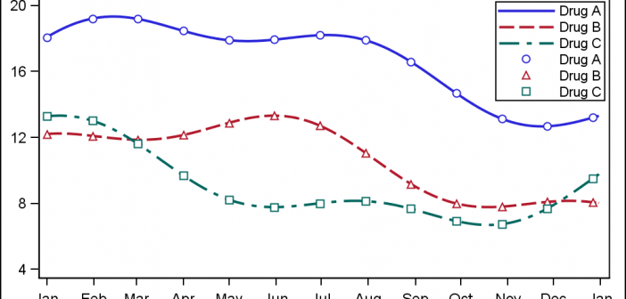
When ODS Graphics was first released with SAS 9.2 in 2008, a conscious effort was made to create graphs that were consistent and aesthetically pleasing out of the box. Features in the graph derive their visual attributes from the active Style. When Group classifications are in effect, the different classification
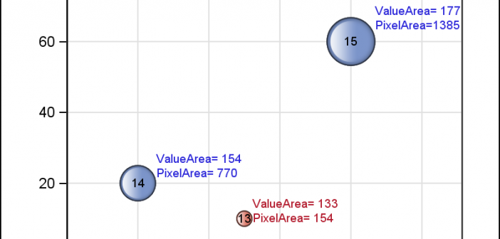
Bubble Plots provide additional ways to visualize your data. The plot supports display of multiple response characteristics of the data in one graph. Bubble plots were introduced with SAS 9.3 in GTL and SG Procedures. A bubble is drawn at each (x, y) point in the graph, and each bubble is
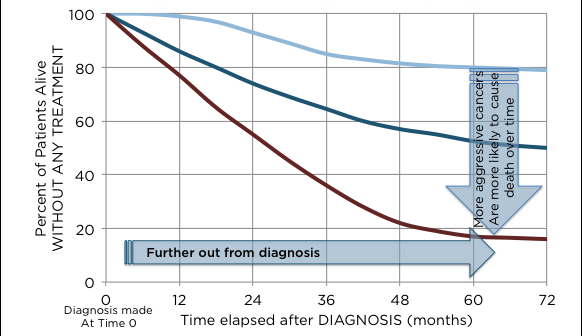
The SGPLOT procedures includes features to add annotations to your graph in many different ways. Annotations provide you a flexible way to add features to your graph that are not available through the standard plot statements. Recently, I saw this graph on the web that caught my attention. Clearly, this looks like
PharmaSUG 2015 in Orlando was held at the Renaissance had a record breaking attendance of over 650. Weather was great, except for a huge downpour on the evening of the last day. All the popular presenters were in attendance including Art Carpenter, Kirk Lafler, Arthur Li and many others. Presentations