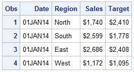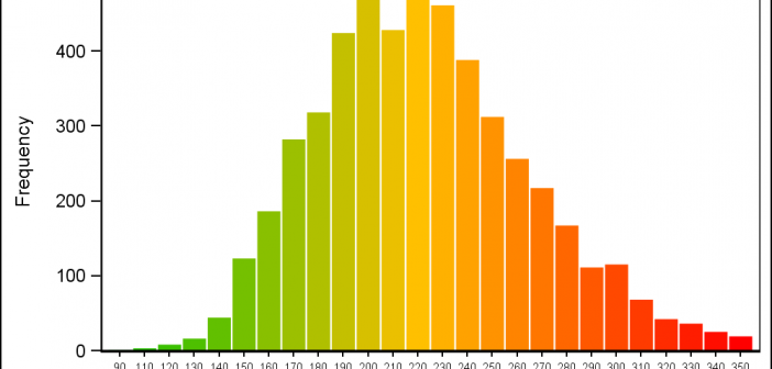
Recently a user posted a query on the SAS Communities page asking on how to create a histogram where the bins of the histogram are colored by the analysis variable using a three color ramp. Essentially, he wanted the bins to be colored from "Low" to "High" along the horizontal
English
I have written a new book on advanced ODS Graphics examples. It is available as a free PDF file on the web. It is in color, and all of the SAS code is available by double clicking a link at the beginning of each example. Advanced ODS Graphics Examples Update:
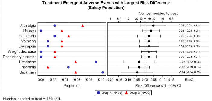
Early last year I wrote an article on how to create the "Most Frequent Adverse Events Sorted by Relative Risk" graph using the SGPLOT procedure. The key issue here is that such a graph normally displays two plots side by side, a scatter plot of the proportion values by treatment
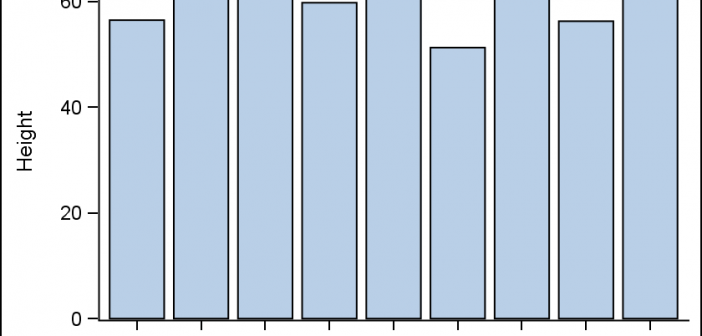
All axis customization features are always welcome. Especially since SGPLOT statements can often be used to create non standard graphs, having the ability to customize the axes is important. This article presents ways in which you can customize the discrete axes. By default, the x axis will try to display the
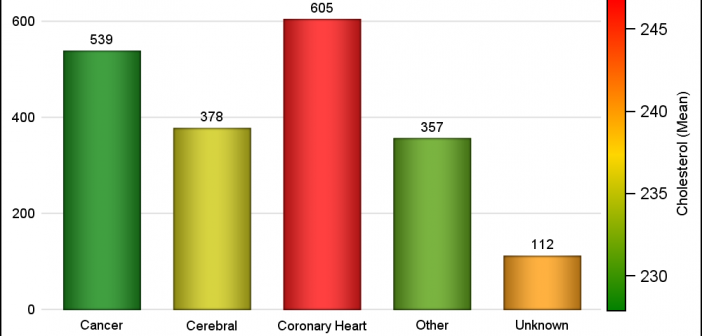
Often there is a need to display more than one response simultaneously for a bar chart, series plot or a vector plot. SAS 9.40M3 adds the options you need to get such results using two new options COLORRESPONSE and THICKRESPONSE where applicable. The Bar Chart on the right shows the frequency
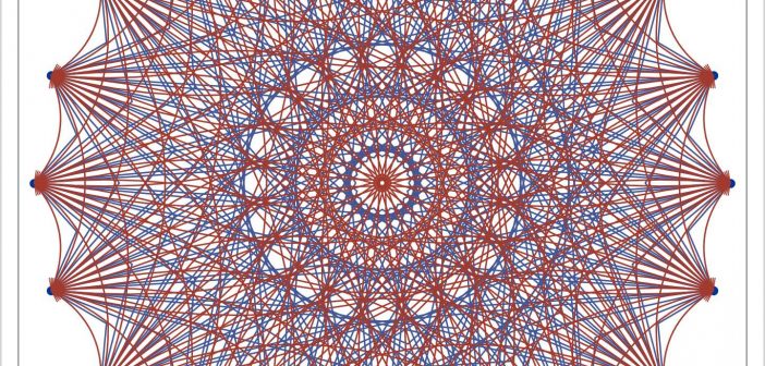
The SGPLOT procedure provides great tools to create all kinds of graphs for all domains from business to clinical. However, every so often, we need to create visuals that are not exactly graphs, but more like flow or network diagrams, or something entirely unique. Some users may have tools to
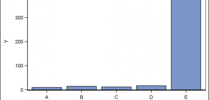
Often when the data includes some extreme difference in measures or some outliers, the plot of the data points can get skewed due to the need to accommodate the extreme outliers. The bulk of the observations get squeezed into a smaller region of the plot. While this may be useful
A few weeks back I saw a couple of posts on the Communities page from users wanting to find ways to compute the area of an general polygon and also the center of the area. I felt such features likely existed somewhere in the SAS/GRAPH set of procedures, so I asked our resident
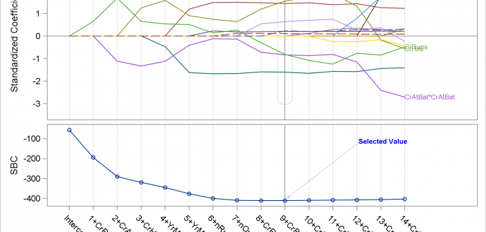
In the past few weeks, I have written two posts on SG annotation and on saving and then modifying the graphs that analytical procedures produce: Modifying dynamic variables in ODS Graphics Annotating graphs from analytical PROCs Today, I finish this series with one more post. This one shows how you
When we first released GTL and SG Procedures back with SAS 9.2, Box Plots and Bar Charts would always treat the category axis as discrete. We realized soon enough that we need to support box plots on scaled interval axes for many clinical applications, and this was added in SAS