I think it's time to replace my 2008 Prius. It has served me well, been basically maintenance-free, and gotten good gas mileage ... so, why not just get a newer Prius? Well, I've got the itch to get back into an SUV for my daily driver (I had a Bronco
English
Cases of the measles have certainly been making headlines in the news recently. And with all the data at our disposal these days, it seems like we should be able to predict which areas in the US are most likely to have measles outbreaks, eh? A group of independent researchers
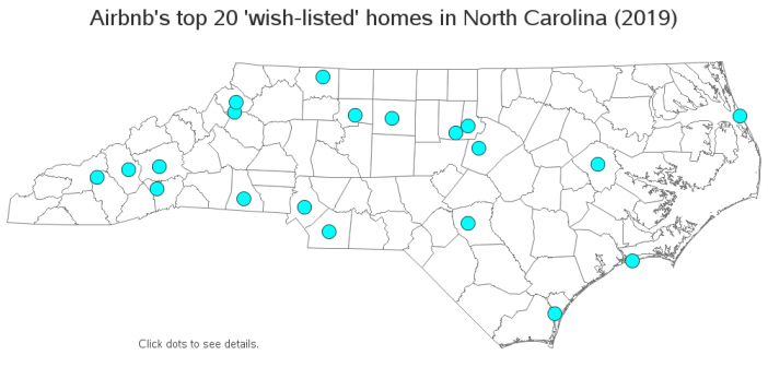
As the sharing economy grows, you can catch a ride on Uber, have meals delivered by Grubhub ... and even stay in someone else's house (rather than a hotel) via sites like Airbnb. And speaking of that last one, I recently read an article listing Airbnb's top 20 'wish-listed' homes
In these modern times, my utility bill has a bar chart so I can see how my current consumption compares to my historical usage. I decided to create my own version of this utility bill bar chart, and make a few improvements along the way. If you're into SGplot bar
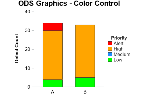
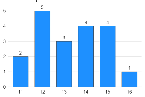
In this 'Rosetta Graph' example, I demonstrate how to control bar chart colors in Gchart and SGplot. But first, here's a little diversion... some artwork in my office here at SAS. There's a *lot* of artwork hanging around at SAS, but this particular painting wasn't created by the SAS artists
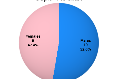
For my third 'Rosetta Graph' example, I will focus on a simple pie chart. Hopefully this example will show you how to convert your SAS/Graph Proc Gchart pies into almost-identical Proc SGpie pies. And speaking of almost-identical pies, here are two beautiful pies my friend Beth made - which one
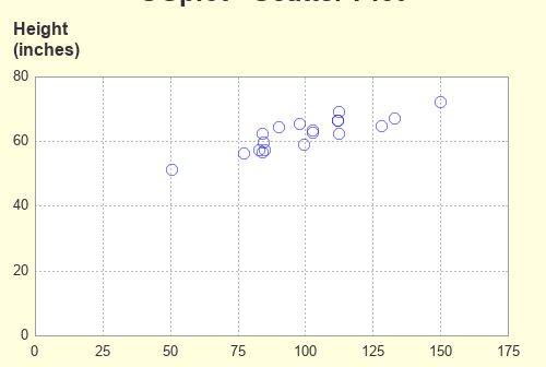
You've probably heard of the famousĀ Rosetta Stone. It had the same decree written on it in both ancient Egyptian and Greek, and was an essential key to help modern historians decipher and translate the ancient Egyptian hieroglyphs. To help the 'old timers' (like me) shift from using SAS/Graph to the
You've probably heard of the famous Rosetta Stone. It had the same decree written on it in both ancient Egyptian and Greek, and was an essential key to help modern historians decipher and translate the ancient Egyptian hieroglyphs. To help the 'old timers' (like me) shift from using SAS/Graph to
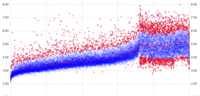
Marathons seem to be popular these days, therefore I decided to dive into some data and find a way to apply analytics. You might find this interesting if you're a fan of marathons - or if you like seeing the details behind cool graphing techniques! Before we get started, here's
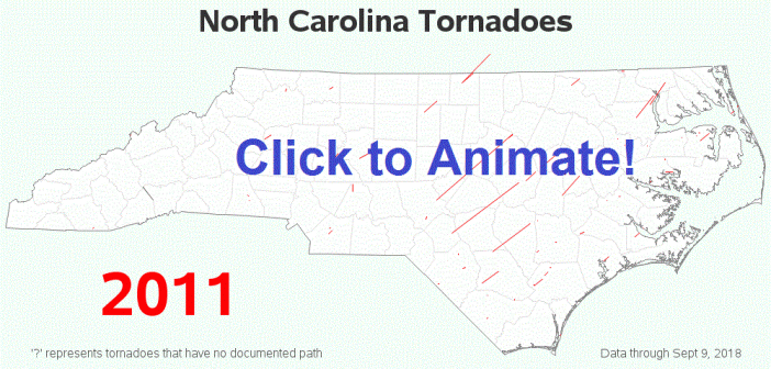
We recently had some severe storms come through North Carolina, which even spawned a tornado in Wake county (the county where I live and work). This got me wondering when and where we've had tornadoes in NC in the past ... and, of course, I had to create a map!