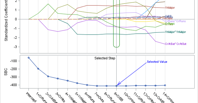
SG annotation is a powerful technique for adding text, lines, arrows, shapes, and images to graphs. This post provides a macro that can help you when you make a mistake in writing the annotations.

SG annotation is a powerful technique for adding text, lines, arrows, shapes, and images to graphs. This post provides a macro that can help you when you make a mistake in writing the annotations.
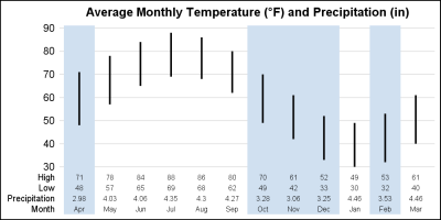
One key aspect of graphs used in the statistical or clinical research domains is the need to display numerical or textual information aligned with the data in the plot. Examples of such graphs are the Survival Plot or the Forest Plot. These graphs use the AXISTABLE statements available with SAS

In this post, I will review some of graphs from previous posts while concentrating on just the axes, grid lines, and reference lines. They might not be the most exciting parts of a graph, but there are multiple options that when properly used can turn a good graph into a great graph.
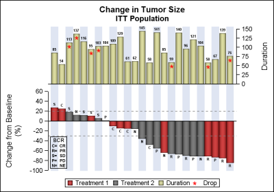
Waterfall plots have gained in popularity as a means to visualize the change in tumor size for subjects in a study. The graph displays the reduction in tumor size in ascending order with the subjects with the most reduction on the right. Each subject is represented by a bar classified by
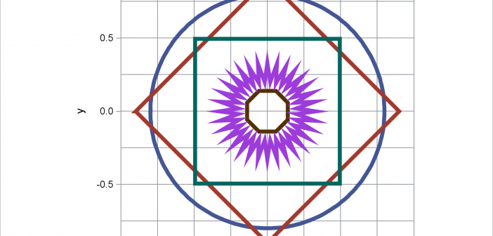
When displaying maps, geometric shapes (such as circles), or results of certain analyses, it is important to equate axes. This post illustrates options in PROC SGPLOT that enable you to equate axes.

Recently, while reading up on Wilkinson and Cleveland Dot plots, I saw this excellent article by Xan Gregg on the topic. I also saw some interesting examples of Lollipop Charts, kind of a dot plot with statistics along with a drop line, maybe more suitable for sparse data. I thought
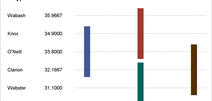
This post presents some basic aspects of ODS Graphics: enabling, selecting, and displaying graphs.
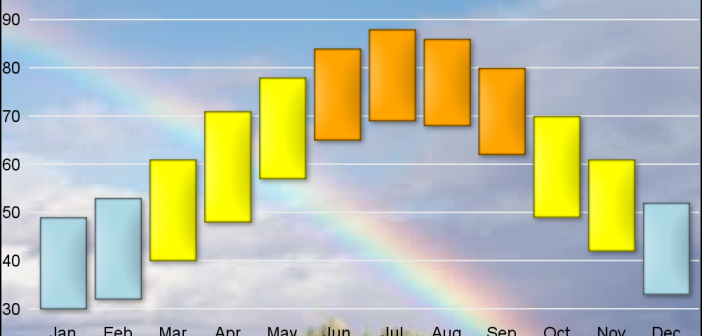
As many of the regular readers of this blog know, SGPLOT and GTL, provide extensive tools to build complex graphs by layering plot statements together. These plots work with axes, legends and attribute maps to create graphs that can scale easily to different data. There are, however, many instances where
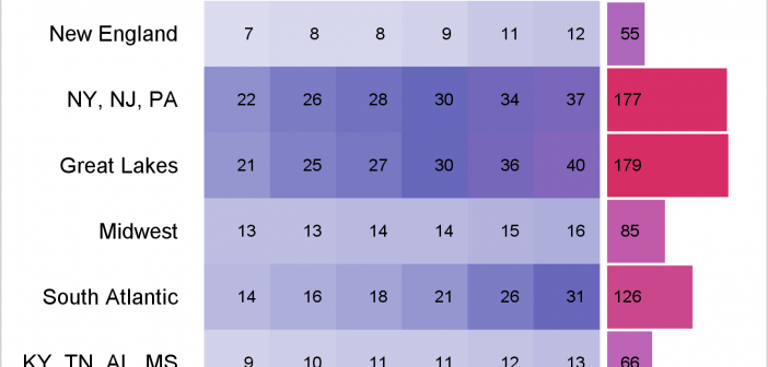
You can use a range attribute map to control the mapping of values in a continuous variable to colors. This post shows you how to use PROC SGPLOT to display multiple plots in the same graph and use range attribute maps.
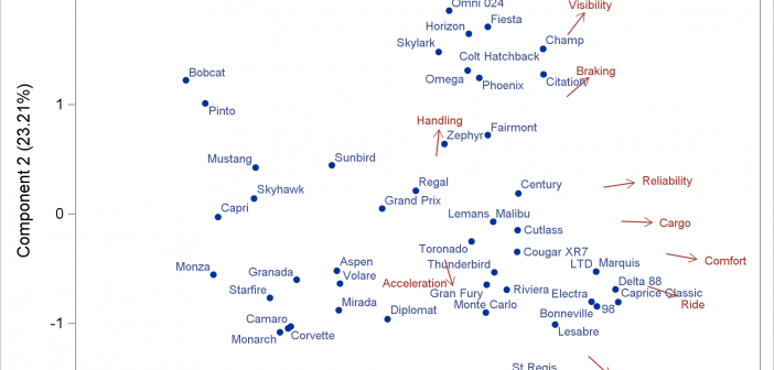
A vector plot draws a line from one point in a graph to another point. In this post, I will show you how to create short vectors instead of vectors that emanate from the origin. I also show how to modify the positions of the vector labels.