Tips and Tricks

Data Visualization
Sanjay Matange 0
Splines

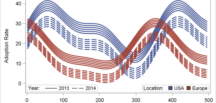
Many users of SGPLOT and GTL know how to mix and match various plot statements to create graphs, sometimes in ways not originally intended.  You are also aware that you can go a step beyond, and use these systems to create completely non-standard graphs such as the Spiral Plot, the Polar

Data Visualization
Sanjay Matange 0
PharmaSUG-China 2014

The Third PharmaSUG-China conference was held in Beijing last week, and I had the pleasure to attend this excellent conference along with a record number of attendees. On Thursday, I presented two 1/2 day seminars on ODS Graphics.  One titled "Advanced Topics in GTL" and another titled "Complex Clinical Graphs

Data Visualization
Sanjay Matange 6
Binary Response Graph

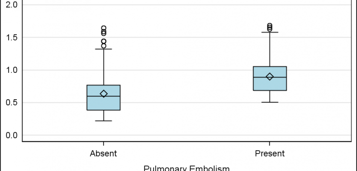
Often we need to plot the response values for binary cases of a classifier.  The graph below is created to simulate one seen at http://www.people.vcu.edu/ web site of the shock index for subjects with or without a pulmonary embolism.  In this case, the data is simulated for illustration purposes only. There

Data Visualization
Sanjay Matange 5
More on Spaghetti Plots

In her article Creating Spaghetti Plots Just got Easy, Lelia McConnell has provided us a glimpse into some new useful features in the SAS 9.4M2 release.  The term Spaghetti plots generally refers to cases where time series plots have to be  identified by multiple group classifications.  The support for the

Data Visualization
Sanjay Matange 1
Epidemic Curve Graph

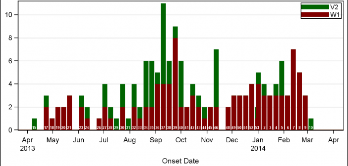
A few weeks back I wrote an article on Grouped Timeline for creating a stacked timeline for onset of different virus.  The idea in that article was to display a stacked needle on a time axis using a HighLow plot. Such graphs are also referred to as EPI or Epidemic Curve

1 19 20 21 22 23 35