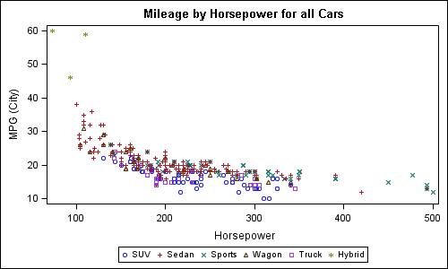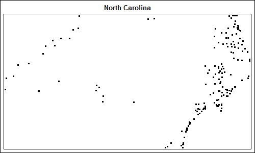
Charlie Huang recently posted an article on a new way to draw maps using SGPlot procedure. The basic idea is simple, just use the SCATTER statement to plot the (x, y) points from the data sets in the MAPS library. The GROUP option can be used to color the markers for each
Author
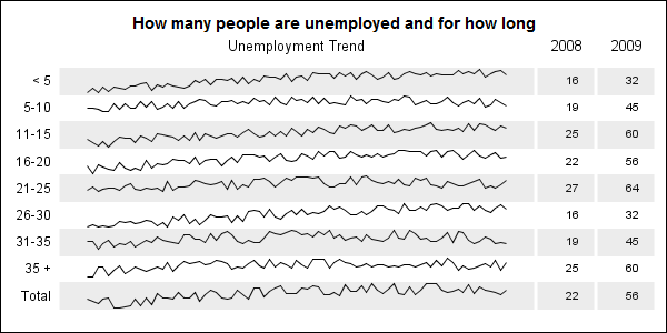
When viewing time series data, often we only want to see the trend in the data over time and we are not so concerned about the actual data values. With multiple time series plots, forecasting software can find clusters to help us view series with similar trends. Recently I saw a graph showing the trend of unemployment
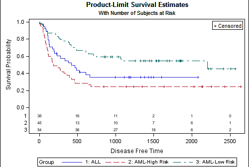
A frequently asked question about the Survival Plot is: "How can I display the 'At Risk' data outside the plot area?". The survival plot rendered by the LIFETEST procedure displays the at risk data inside the plot data area. The reason for this is the potential for varying number of treatment groups. Here
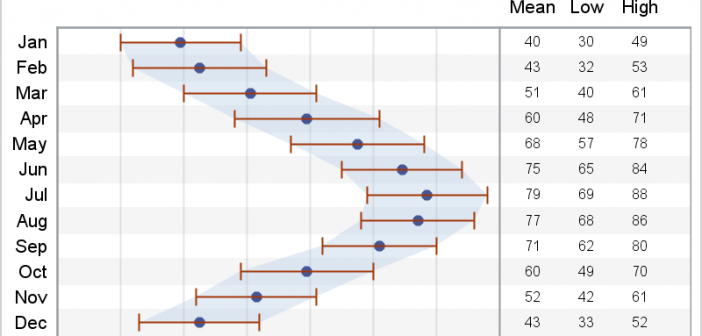
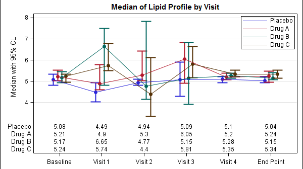
In a previous article we discussed how to add axis aligned statistics table to a Lipid graph using GTL. Other graphs such as the Survival Plot also utilize the same technique to display the "at risk" statistics aligned by time or visits along the X axis. Often, we also need to display
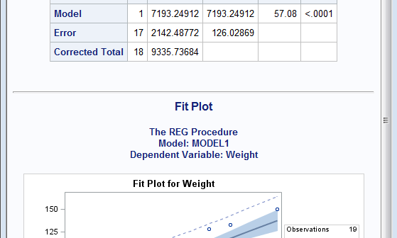
Rick Wicklin's blog post on using abbreviations provided a solution for a long standing pain. When writing a new GTL program for simple graph, often the bulk of the code is boiler plate. To create a simple scatter plot of weight by height, you need to type in the following program:
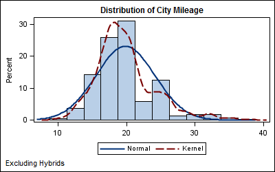
In this blog we will discuss many aspects of the SG Procedures. This article will cover some basic features and workings of the SGPLOT procedure to establish a baseline. The single-cell graph is the work horse for data visualization. From the simple bar chart to the complex patient profiles for clinical
The display of statistics, aligned with graphical plot of the data, is a common requirement for graphs, especially in the Clinical Research domain. In the previous post on Discrete Offset, I used an example of the Lipid Profile graph. Now, let us use the same example and add the display of statistics in
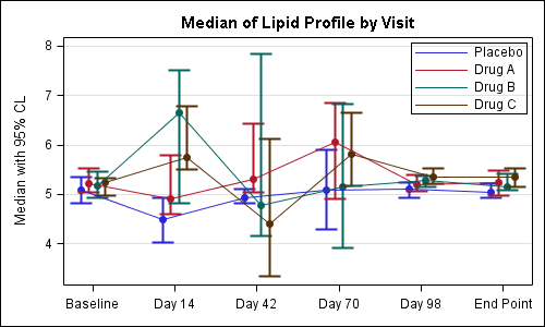
Often we have the need to display multiple columns of data in a graph, and we want to introduce some separation into their placement in the graph. Or, we want to display a bar chart of multiple response variables, and place the values side-by-side, like in a grouped bar chart. For both
Welcome to this new blog on data visualization at SAS. Our goal is to engage with you on a discussion about analytical and business graphics for reporting and interactive applications. Our primary focus will be on ODS Graphics and related topics, but we look forward to a lively discussion on all things