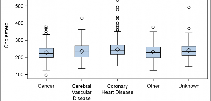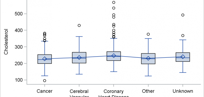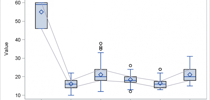
Last month I wrote an article on connecting multiple statistics by category in a box plot using SGPLOT. In the first article I described the way you can do this using overlaid SERIES on a VBOX using SAS 9.4, which allows such a combination. However, if you have SAS 9.3,
Author
Let us start the new year by taking a trip back in history to SAS 9.2, first released in 2008, and the first SAS release that included the new ODS Graphics software including GTL and SG procedures. While we have recently released the third maintenance on SAS 9.4 (SAS 9.40M3),
An interesting question came up recently, where a colleague wanted to create a bar line chart with Revenue on the Y axis and Profit on the Y2 axis. The Revenues were all positive, but the Profit had positive and negative values. Some data I generated is shown on the right. Creating this
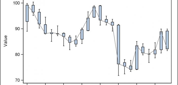
A Box Plot is very popular to view the distribution of an analysis variable with one or more classifiers. Also, everyone wants to customize the graph in different ways. One recent request was for creating a box plot by category and group along with the display of various statistics and overlaid
In the previous article I described a way to create a box plot with multiple connect lines using SAS 9.40M1 or later release . I created the graph using SGPLOT with VBOX and overlaid SERIES statements. Such an overlay of a basic plot on the VBOX statement is supported starting
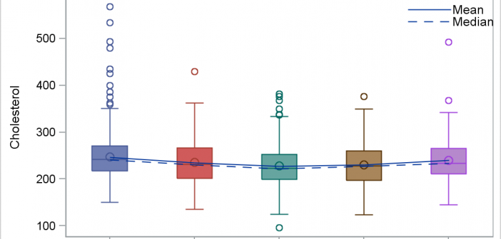
This blog post is motivated by a post by a user on the communities page about creating a box plot with colored boxes by category and multiple connect lines. Normally, a box plot can be drawn by category, with a single connect line for one of the statistical values of
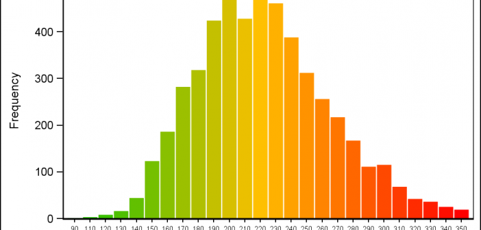
Recently a user posted a query on the SAS Communities page asking on how to create a histogram where the bins of the histogram are colored by the analysis variable using a three color ramp. Essentially, he wanted the bins to be colored from "Low" to "High" along the horizontal
Early last year I wrote an article on how to create the "Most Frequent Adverse Events Sorted by Relative Risk" graph using the SGPLOT procedure. The key issue here is that such a graph normally displays two plots side by side, a scatter plot of the proportion values by treatment
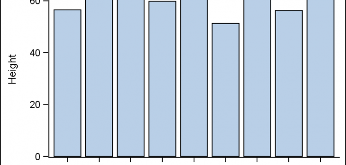
All axis customization features are always welcome. Especially since SGPLOT statements can often be used to create non standard graphs, having the ability to customize the axes is important. This article presents ways in which you can customize the discrete axes. By default, the x axis will try to display the
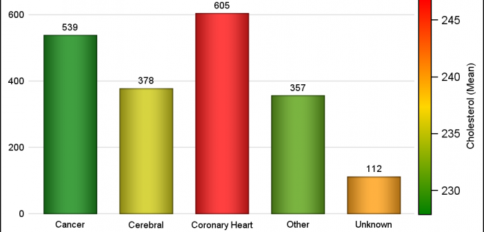
Often there is a need to display more than one response simultaneously for a bar chart, series plot or a vector plot. SAS 9.40M3 adds the options you need to get such results using two new options COLORRESPONSE and THICKRESPONSE where applicable. The Bar Chart on the right shows the frequency