Here in the US, the pipeline which supplies gasoline to North Caroline (and much of the southeast) was hacked, and had to be shut down for several days. This caused gasoline shortages, and long lines at the gas pumps (as shown in the picture below, by my friend Daniel). But exactly where does the Colonial Pipeline go? - Let's map it out!

The Pipeline Path Data
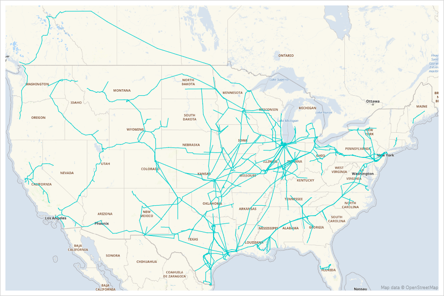
I looked around a bit, and found a shapefile on the Energy Information Administration website that contains the paths of the "Petroleum Product Pipelines". I downloaded it, and imported it into SAS with the following code:
proc mapimport
datafile='D:\Public\EIA\Pipelines_2020\PetroleumProduct_Pipelines_US_202001.shp'
out=pipelines;
run;
Preparing the Data to Plot
I can use SGmap's series statement to plot this x/y data as a line, but by default all the coordinates would be joined ... whereas we want to have breaks between the separate pipelines, and segments of pipelines, etc. One alternative would be to do a bit of tricky data step programming and insert 'missing' values between each pipeline segment. But an easier alternative is to create a unique 'id' value for each pipeline segment, and then use that as the group= in the series statement.
data pipelines; set pipelines;
length segment_id $100;
segment_id=trim(left(opername))||'_'||trim(left(pipename))||'_'||trim(left(shape_leng));
run;
Plotting the Pipelines on a Map
In the past, I have plotted pipeline data on a map by annotating it as lines using the older Proc Gmap. That's a bit tricky, because you have to make sure you're projecting your pipeline data exactly the same way you project the map data (so they'll line up correctly).
Now with the newer Proc SGmap, this is much simpler. SGmap takes care of all the projecting for you - therefore you can leave the data in the lat/long coordinates. And rather than creating a special dataset with the move/draw commands to annotate the pipeline, you can use SGmap's built-in series statement.
proc sgmap plotdata=pipelines noautolegend;
openstreetmap;
series x=x y=y / group=segment_id lineattrs=(color=cx00CDCD pattern=solid);
run;
Highlighting Colonial's Pipeline
It's interesting seeing all the pipelines ... but I'm specifically interested in the Colonial pipeline. Let's show it in a different color (red), and make the line a little thicker so it stands out more.
To accomplish that, I add an extra x/y pair to the data, which I only populate for the points that contain 'COLONIAL' by adding the following code in the above data step:
if index(opername,'COLONIAL')^=0 then do;
x_colonial=x;
y_colonial=y;
end;
And then add a second series statement to the SGmap, to plot that data as a thicker red line:
proc sgmap plotdata=pipelines noautolegend;
openstreetmap;
series x=x y=y / group=segment_id lineattrs=(color=cx00CDCD pattern=solid);
series x=x_colonial y=y_colonial / group=segment_id
lineattrs=(color=red pattern=solid thickness=2px);
run;
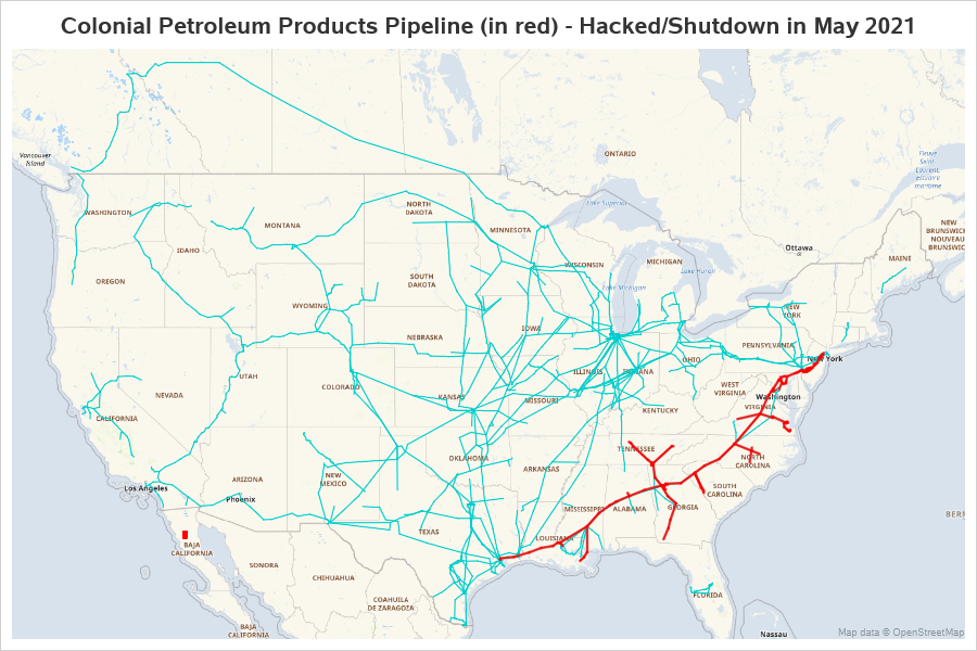
I'm pretty happy with the results, and it didn't require any tricky programming!
