As I was writing my previous post, Advanced ODS Graphics: Axis tables that contain special characters, I found that there are aspects of the axis table that I wanted to discuss, but they would have detracted from my main message. This post follows up on those topics.
Axis tables exist for two very different reasons. Most axis tables in Graphically Speaking are used to create forest plots, adverse event plots, or other similar plots. In these plots, there is a one-to-one correspondence between the rows in the data set and the rows in the axis table and the graph. Axis tables also exist to provide summarization. Rather than displaying the values in the data set in the axis table, PROC SGPLOT can display summary statistics such as sums, means, medians, and frequencies. I will illustrate both types of axis tables here and show you some pitfalls to avoid.
In CTSPedia Clinical Graphs - Subgrouped Forest Plot, Sanjay provides a nice example of a forest plot that consists of several axis tables (the columns of text and numbers) and a graph. The main body of the graph, which includes the axis tables, has 16 rows. The data set has 16 observations that correspond to those 16 rows. This data set actually has two additional observations. One adds the left arrow and 'PCI Better'; the other adds 'Therapy Better' and the right arrow. While the data and the rows are not precisely one-to-one, this is a one-to-one style axis table--there is no summarization. Multipage Adverse Event Reports Using PROC SGPLOT shows quite a different example of a one-to-one axis table. Again, there is no summarization, and the goal is to use axis tables to simply display in the graph variables from the input data set.
I imagine that the summarization option in axis tables is less well known. To introduce using an axis table for summarization, first consider some output from PROC MEANS along with some postprocessing.
proc means data=sashelp.class mean stackodsoutput; ods exclude summary; ods output summary=s; class age; run; proc transpose data=s out=s2(drop=_: where=(n(height, weight) eq 2)); by age; copy nobs; id variable; var mean; run; proc print noobs label split='-'; format height weight 6.2; label age='-Age' nobs='-Frequency' height='Mean-Height' weight='Mean-Weight'; run; |
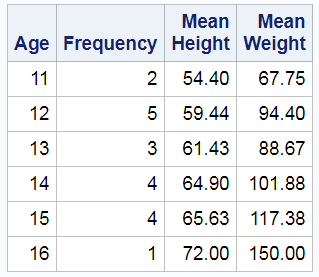
These steps create the following table. It shows the different values of the variable Age, the frequency of occurence for each age, and the average height and weight for each age group.
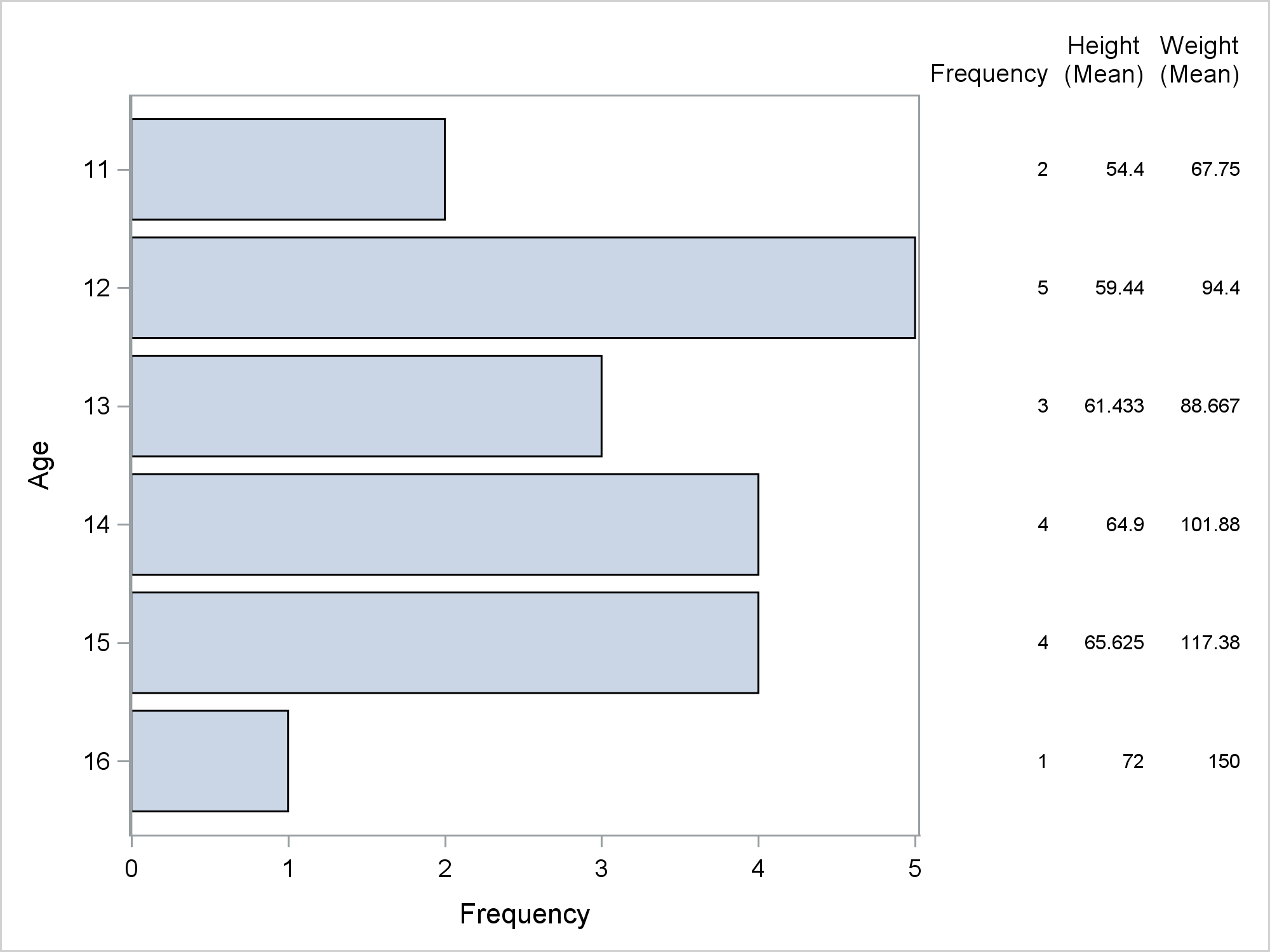
The following step uses PROC SGPLOT and a YAXISTABLE statement to display the same summarized results. The HBAR statement adds a bar chart. I deliberately specified as few options as I could for this first graph.
proc sgplot data=sashelp.class; yaxistable age height weight / stat=mean; hbar age; run; |
This axis table and the data set are clearly not one-to-one. The data set has 19 observations, which are summarized into six groups of varying sizes. It is important that you understand that the YAXISTABLE statement does not have a STAT=NONE option or some other mechanism to suppress summarization. It will always try to summarize if you give it an opportunity. STAT=SUM is the default. This will be illustrated in a later example, but first, you can specify some options to create a nicer display of the means and frequencies. The preceding PROC SGPLOT step prints a warning.
WARNING: Only the FREQ and PCT statistics can be used on the AXISTABLE when the chart's category variable is specified. Setting the statistic to FREQ.
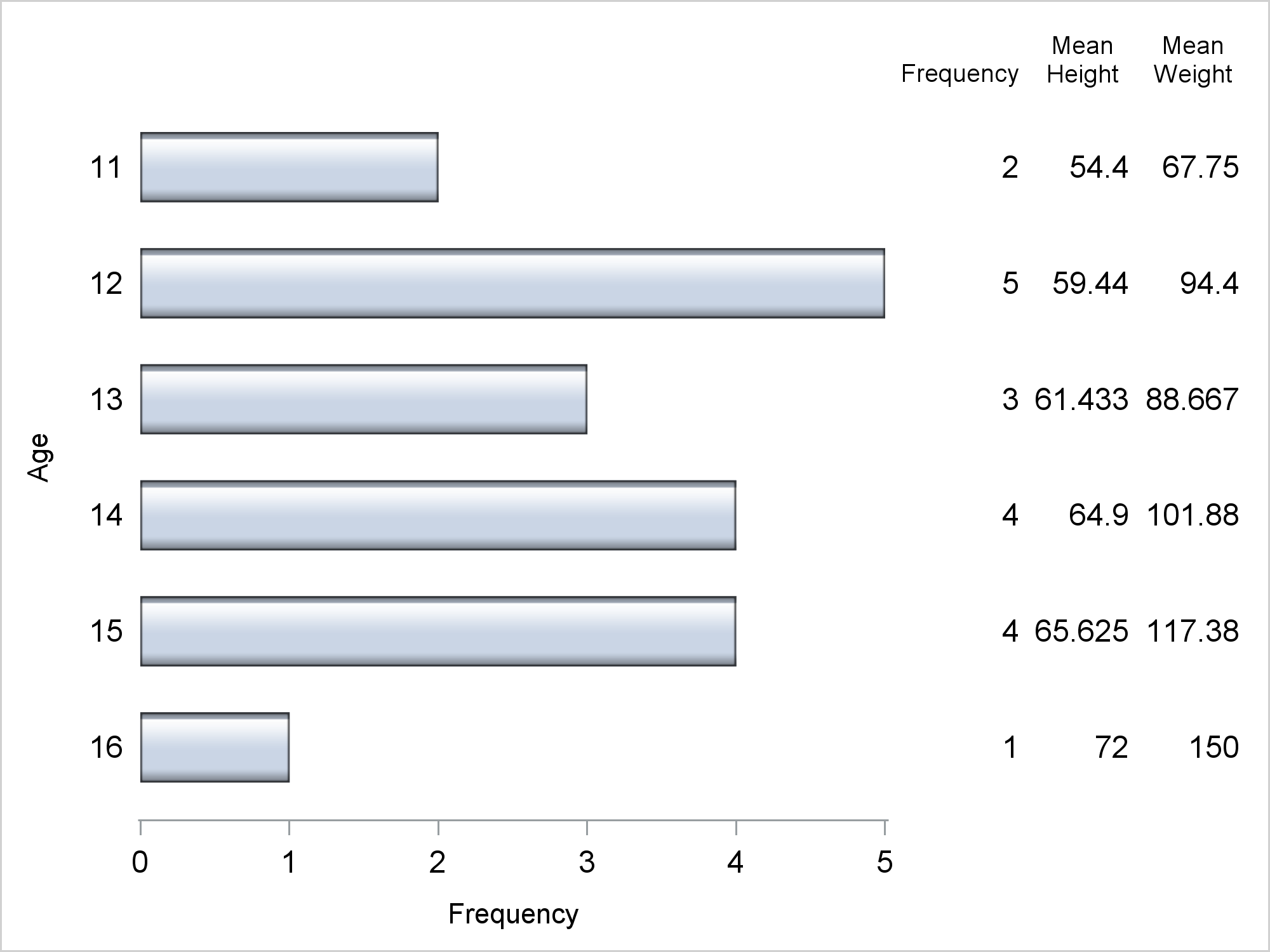
This is referring to the Age variable. It is the same variable that appears on the Y axis, so the YAXISTABLE will not compute statistics other than frequencies. The following step suppresses that warning by moving the Age variable to a separate YAXISTABLE statement and specifying the option STAT=FREQ. Additional options suppress axis components and set labels, formats, font sizes, data skins, and so on.
%let v = valueattrs=(size=11); proc sgplot data=sashelp.class noborder; yaxistable age / stat=freq &v; yaxistable height weight / stat=mean &v nostatlabel; hbar age / barwidth=0.6 baselineattrs=(thickness=0) dataskin=gloss; yaxis &v display=(noline noticks); xaxis &v; label age='Age' height='Mean Height' weight='Mean Weight'; run; |
As you can see, you can use the STAT= option to make nice summarizations of data. Now consider a simple and artificial one-to-one axis table.
data x;
   do y = 1 to 18;
      w = put(y, words20.);
      output;
   end;
run;

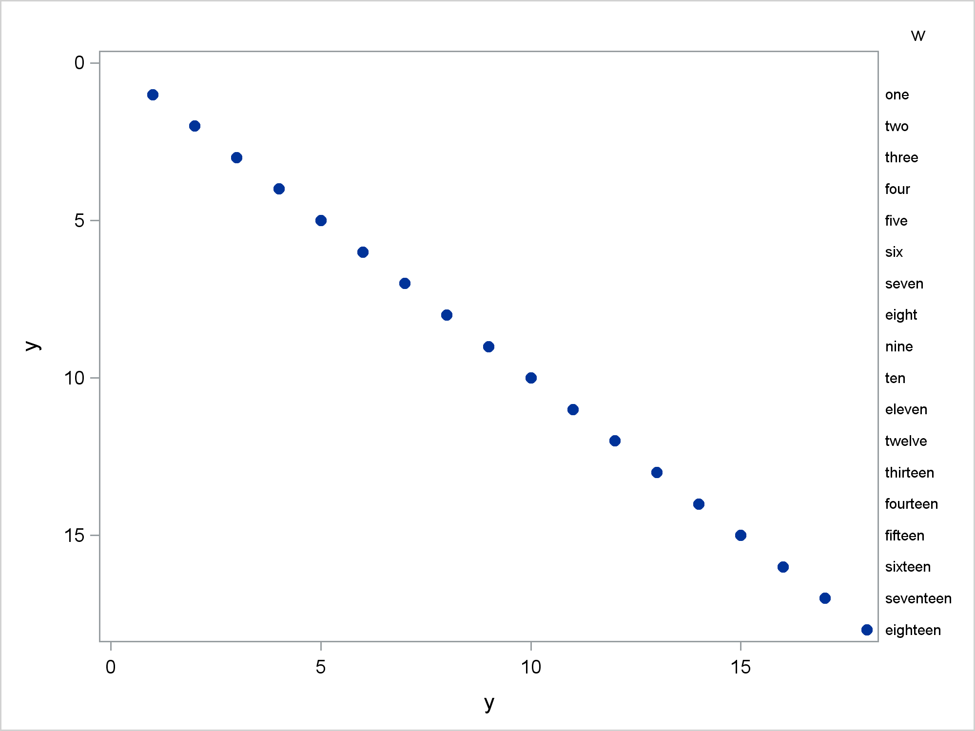
proc sgplot data=x;
   yaxistable w / y=w;
   scatter x=y y=w / markerattrs=(symbol=circlefilled);
   yaxis reverse;
run; |
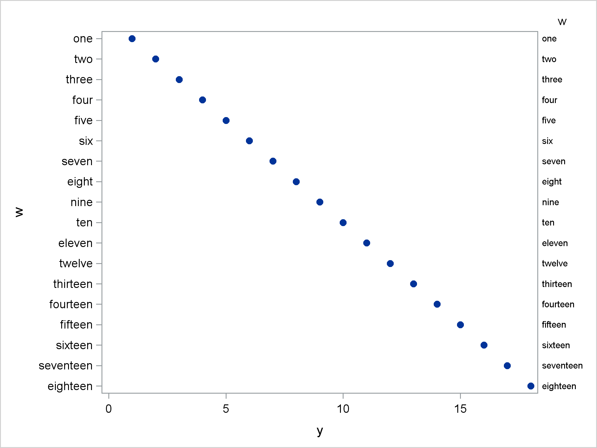
The Y axis variable, W, is a character variable so the Y axis is discrete and there is no possibility for any summarization such as means or sums. The axis table values match the tick values.
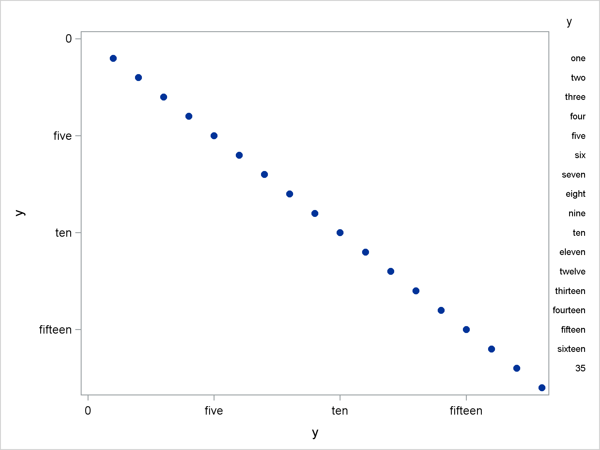
Now the Y axis variable, Y, is numeric.
proc sgplot data=x; yaxistable w / y=y; scatter x=y y=y / markerattrs=(symbol=circlefilled); yaxis reverse; run; |
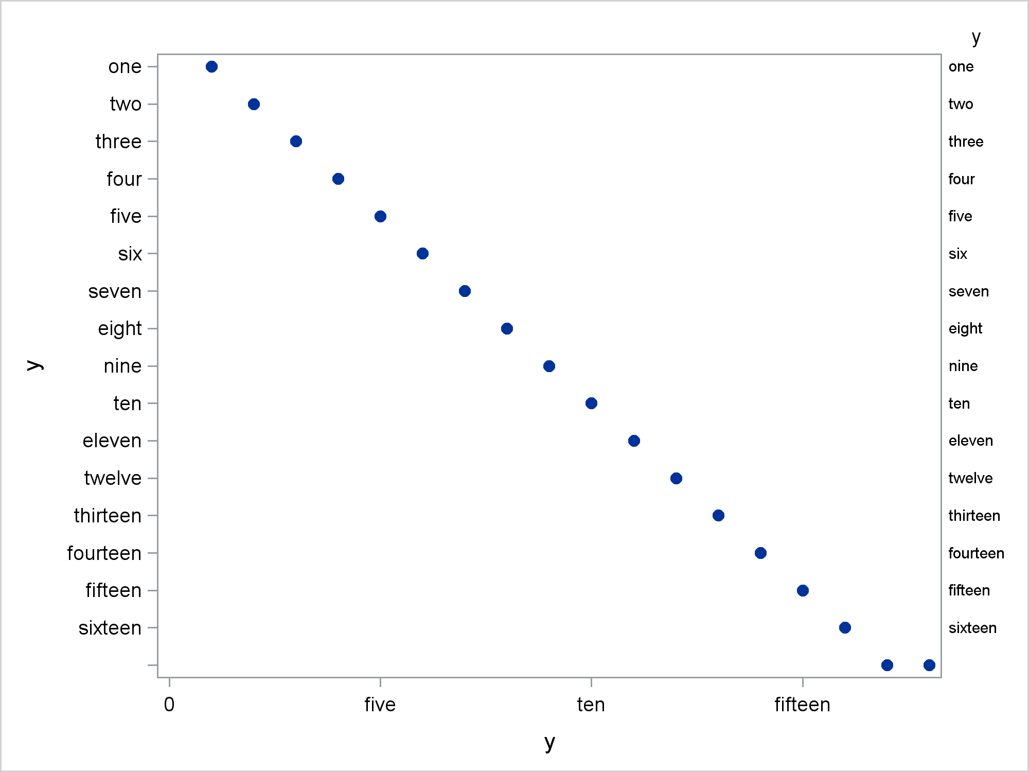
Besides the obvious change in the Y axis, there is a more subtle change. The Y axis table does not occupy the full vertical area of the graph. The rows of the axis table align with the Y axis values and do not occupy the Y=0 area since Y starts at 1. This next step is identical to the preceding step except that this one uses a discrete axis. The Y axis variable is still Y and numeric.
proc sgplot data=x; yaxistable w / y=y; scatter x=y y=y / markerattrs=(symbol=circlefilled); yaxis type=discrete; yaxis reverse; run; |
Now, all values are displayed on the axis and the axis table values occupy all of the vertical space.
The next steps create a user-defined format that maps the valus 1 to 16 to the words 'one' to 'sixteen'. The remaining values (17-18) are mapped to blank.
data cntlin(keep=Start Type Label FmtName)
         x2(drop=Start Type Label FmtName);
   retain Type 'n' FmtName 'MyFmt';
   set x;
   Start = y;
   Label = w;
   if y gt 16 then label = ' ';
run;

proc format cntlin=cntlin; quit;

proc print noobs data=x2; run;
proc print noobs data=cntlin; run;

proc sgplot data=x2;
   yaxistable y / y=y;
   scatter x=y y=y / markerattrs=(symbol=circlefilled);
   format y myfmt.;
   yaxis reverse;
run; |
Now you can see the effect of the default option STAT=SUM. There is a 35 in the bottom of the axis table. The first time this happened to me, I was baffled! 35!? Where is that coming from? There is no 35 in my data! Thirty-five is the STAT=SUM summarization of Y=17 and Y=18. It does not appear when you specify a discrete axis.
proc sgplot data=x2; yaxistable y / y=y valuejustify=left; scatter x=y y=y / markerattrs=(symbol=circlefilled); format y myfmt.; yaxis type=discrete reverse; run; |
Notice though that two Y values in the last row map to different X values.
The following step creates an example that while still artificial, is set up more realistically. The data set X3 has a numeric Y axis variable, ObsID. It is a zero-based row number. Two numeric variables Axis1 and Axis2 also correspond to row numbers. These are one-based, but that is not important. These numeric variables are used to construct the axis tables. Two character variables Value1 and Value2 contain the values that need to be displayed in the axis tables. Finally, the numeric variable Len is used to make the graph.
data x3;
   do ObsID = 0 to 10;
      Axis1  = obsid + 1;
      Axis2  = obsid + 1;
      Value1 = put(axis1     , roman20.);
      Value2 = put(axis2 * 10, roman20.);
      Len    = length(value2);
      output;
   end;
run;

proc print noobs; run; |
The following DATA step creates a format data set and a new DATA= data set.
data cntlin(keep=Start Type Label FmtName)
         x4(drop=Start Type Label FmtName value1 value2);
   retain Type 'n';
   set x3;
   Start = axis1;
   Label = value1;
   FmtName = 'My3Fmt';
   output x4 cntlin;
   Start = axis2;
   Label = value2;
   FmtName = 'My4Fmt';
   output cntlin;
run;

proc sort data=cntlin; by fmtname; run;

proc format cntlin=cntlin; quit; |
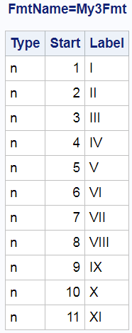
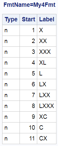
The following data set is used to make the two formats.
proc print noobs data=cntlin; by fmtname; run; |
This next step adds an additional observation to the DATA= data set.
data x5;
   set x4 end=eof;
   output;
   if eof then do;
      call missing(axis1, axis2, len);
      obsid + 1;
      x = 2;
      text = 'This graph has a footnote.';
      output;
   end;
run; |
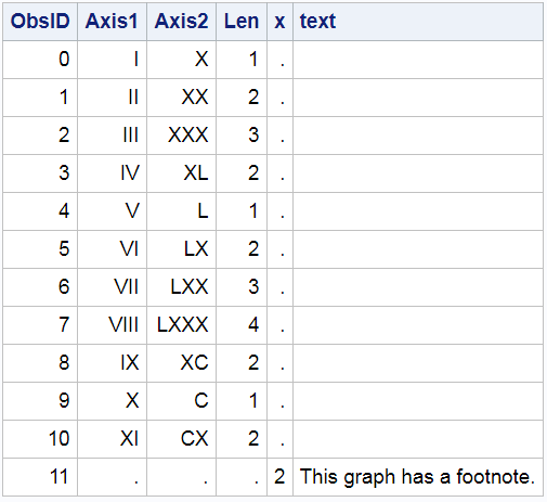
Here are the raw values that are in the data set.
proc print noobs data=x5; run; |
Here are the data including the formatted values.
proc print noobs data=x5; format axis1 my3fmt. axis2 my4fmt.; run; |
Now it is clear from the footnote observation that there is not a one-to-one correspondence between the graph, the axis table, and the data set, but the relationship is almost one-to-one. We do not want any summarization of the numeric values in the axis table variables that correspond to the footnote. Since the axis table variables have missing values for those observations and the axis is discrete, no "magic sums" appear in the graph.
options missing=' '; proc sgplot data=x5 noautolegend; yaxistable axis1 axis2 / position=left; format axis1 my3fmt. axis2 my4fmt.; hbarparm category=obsid response=len; text y=obsid x=x text=text; yaxis display=none type=discrete; xaxis label='Length' offsetmin=0; run; options missing='.'; |
You might be wondering why I made numeric variables and formats instead of simply working with character variables. My previous post shows why: Advanced ODS Graphics: Axis tables that contain special characters. When you have a numeric axis table variable, you can use formats to display special characters. You just need to ensure that you have things set up so that the default STAT=SUM option does not add any numbers to your plot.
In summary, you can use axis tables to summarize variables. I think this capability is not well known, so I wanted to show it. You can also use axis tables to display values in a data set with no summarization. You might need your axis table variables to be numeric so that you can display special values. When you do that, you need to ensure that your axis is discrete and your axis table values are not displayed when extra observations provide supplemental material.
