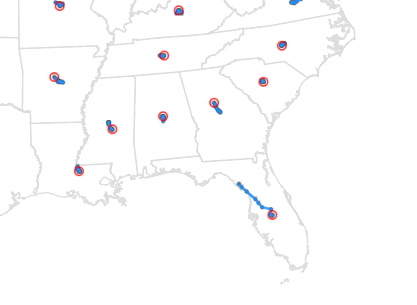
Here in the US, we've got the Thanksgiving holiday coming up soon. And the keystone of this holiday is a big dinner, with lots of traditional Thanksgiving foods. But where does all this food come from, and which farmers should we thank for which of the food items? I use SAS
Author
With a major election coming next year, I was wondering if there have been any shifts & changes in the voters in my state. This seems like an interesting opportunity for some data analysis, eh!?! To get you into the spirit of elections, here's an "I Voted" sticker from my friend
With over 1,000,000 words in the English language, why is it that we tend to use the same words over & over? This blog shows a hierarchical approach to help you branch out and choose more descriptive words. But first, to get you into the mood for a blog about
Analytics claim this is the 20th most used word in English writing. What word, you might ask? This word. Which one? This one right here! You might think I'm trying to lead into an Abbott & Costello-style comedy routine, but I literally mean this word ... the word 'this'! As you can
Endless Summer is both a surfing movie, and the idea that "if one had enough time and money it would be possible to follow the summer around the world, making it endless." Summer temperatures are fine if you're swimming & surfing, but I prefer slightly cooler temperatures - perhaps an
Choosing the perfect Halloween costume can be a tough decision ... especially when it comes to choosing between two awesome favorites like Superman & Batman!?! I think we're gonna need a bigger boat! (and by 'boat' I mean analytical software, of course!) Let's start with Superman. This character has been around since
As I continue to apply analytics to various aspects of Halloween, I turn my attention to planning my trick-or-treat route ... Random picture: Here's a shot of my friend Sara's trick-or-treat crew. With tiny legs, and huge loads of candy, having an efficient route is very important! :) I started by
Do you have fun being a computer geek, and programmatically creating holiday images? If so, then this blog's for you! In this example, I demonstrate how to take simple x/y coordinates, and create map polygons shaped like holiday images, that can be plotted using SAS/Graph's Proc GMap. Once you learn the
When I was a kid, I always found it difficult to pick a Halloween costume. Now that I'm older, perhaps I can use computers & analytics to make my decision (and yours) easier! ... There are several different schools of thought on Halloween costumes - for example, some like to
It's that time of year again - time to choose what Halloween candy to buy for the trick-or-treaters! This is always a tough decision that has me angsting in the candy aisle. And if selecting the perfect candy wasn't enough pressure, my city (Cary, NC) was recently recognized as #1 on
More and more of my friends seem to be eating less and less meat, for various reasons (such as religious, health, social conscience, weight loss, personal preference, cost savings, etc). So I thought I would put together a graph to help them find alternate sources of protein. While searching for
The #1 rule of any self-respecting hipster is to not claim to be a hipster. Therefore, can there even be such a thing as a hipster beard, or hipster beard data? I contemplated this perplexing question, as I stroked my pirate beard. Since fashion trends tend to be cyclical, perhaps
I remember being intrigued by the movie In Search of Noah's Ark, when I was a kid back in the 1970s. They claimed to have definitively found the ark ... but of course, since then several other people claim to have found it in other locations. Therefore I don't feel too
I hear a lot of talk about income inequality in the US ("the rich get richer..." and such) - especially as elections approach. I also see a lot of graphs, and they all seem to define their numbers slightly differently. I'm not in a position to improve the way income
Every year, Fortune magazine compiles a list of the 500 largest US corporations - called the Fortune 500. Their list was a bit difficult to digest in text-form, so I thought I'd try using some maps & graphs on the data ... For a map analysis, I thought it would
I get several requests and recommendations for analyzing sports data. I'm not a big sports fan ... but when did I ever let that stop me! When I find interesting data, I like to graph it! Before we get into the nitty-gritty data analysis, here is a picture of my friend Jennifer's daughter
My blog posts focus on visual data analysis, and many of them use geographical maps. Therefore I hope you will have fun with a quick geography quiz, which I created using SAS/Graph ... And what, you might
These days many devices (such as smart phone apps, Fitbits, Apple watches, dog tracking collars, car gps, hiking gps, teen/car trackers, etc) can track your location, and provide you with standard/canned ways to analyze the data. This blog post shows how I created a custom SAS map of the tracking
I just returned home from an expedition/adventure boat trip to Cuba, and Talk Like a Pirate day is coming up this Saturday - what a combination for an interesting blog! I hope you enjoy a few pictures, and a bit of data analysis on these topics! A couple of weeks ago,
I recently saw an article on washingtonpost.com showing what methods are used to generate electricity in each state. The data was interesting enough that I decided to try my hand at graphing and mapping it with our SAS software. Read along to see what I kept the same, and what
The Wall Street Journal recently published a study of the top 17 medical areas (or body parts) that venture capitalist investments are likely to benefit. They used graphs to summarize the results, but "the graph guy" in me just couldn't resist trying to improve them. Did my improvements help? -
There's a lot of buzz about Hadoop these days. I started checking into it, and there seemed to be a gazillion releases. So, being The Graph Guy, I decided to create a graph to make it a little easier to digest! During my search for Hadoop information, I found the
There's big money in professional sports these days - we're talking billions of dollars! Do you know which teams are the most valuable? The graphs in this blog will show you... I recently saw a bar chart on dadaviz.com showing the world's most valuable sports teams. It was the right kind
I've heard lots of people quote statistics about marriage & divorce, but the experts don't always agree on what the data means. So I decided to run the data through a SAS graphical analysis, and see what the numbers say ... Before we get into the numbers though, let's have a
I recently saw a cool graph showing the US import/export trade deficit. But after studying it a bit, I realized I was perceiving it wrong. Follow along in this blog, to find out what the problem was, and how I redesigned the graph to avoid it. I was looking through dadaviz.com
In my quest for interesting data to graph, I found some Drug Enforcement Administration (DEA) data on US domestic cannabis eradication. Does the data say anything interesting? Read on to find out! ... While doing some searches for other data, I happened across a table on the DEA website titled
There's been quite a bit of controversy about the number of undocumented immigrants in the US lately - for example, Ann Coulter claims that number is 30 million, whereas others claim it's about 11 million (readers of my blog are data-savvy, and would dig into the details of such claims,
I saw the dress photo as blue & black. If you're a female, even if we perceived the exact same color, you might might not have said 'blue & black'. That's because women have a larger color vocabulary than men, and you might have elaborated on exactly which blue and
When I was a kid, I remember a motivational poster on my dentist's wall that said "You don't have to brush all your teeth -- only the ones you want to keep." That poster really made me think, and brush my teeth! And now that I'm a data-analyst adult, I think
I recently came across some very interesting data on serial killings ... but it was in tabular/text form. This seemed like an invitation for me to create some graphs that make it easier to understand the data. It seems many people have a morbid curiosity about serial killers. For example, some