I remember being intrigued by the movie In Search of Noah's Ark, when I was a kid back in the 1970s. They claimed to have definitively found the ark ... but of course, since then several other people claim to have found it in other locations. Therefore I don't feel too bad about my unsubstantiated claim that it was recently sighted in South Carolina - they certainly had rains of 'biblical proportions' this past week, and could have definitely put an ark to use! This blog focuses on visualizing those rains...
First, let me try to describe what happened in South Carolina. Surprisingly, this was not Hurricane Joaquin (Joaquin didn't actually make landfall, but went well out into the Atlantic). It was a combination of weather systems that came together 'just right' to funnel heavy rains over South Carolina ... for several days. It was described as a '1000-year rainfall event' (see the PDS-based depth-duration-frequency curve).
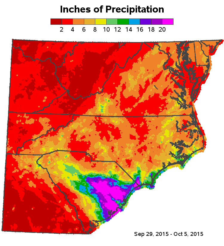
In simpler terms, almost all of South Carolina received over 10 inches of rain in just a few days. Here's a SAS map I created, using data from the National Weather Service Advanced Hydrologic Prediction Services website:
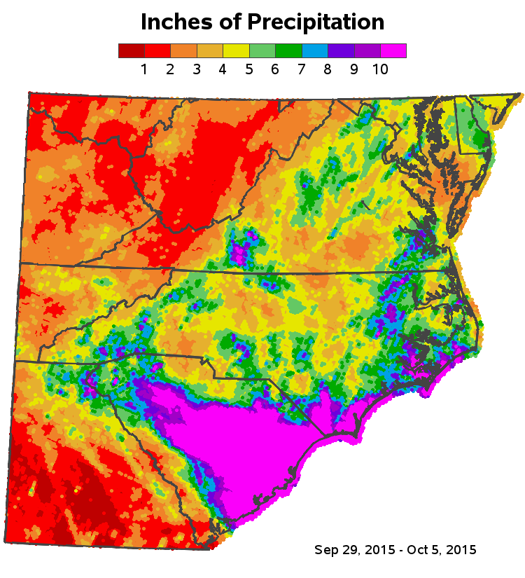
And as if 10 inches wasn't enough, many areas of the state actually received over 20 inches of rain. Think about that for a minute ... that's not a just a river rising 20 inches - that's all the land in a whole area of the state getting 20+ inches of water dumped down on it!
How'd he do that?...
For you SAS programmers out there, here are the technical details.
I downloaded the data from the National Weather Service website (selected shapefile, day, 2015 October 5, Last 7 Days, Observed). Extracted the zipped tar file. Used Proc Mapimport to import the ESRI shapefile into a SAS dataset containing the inches of rainfall at each lat/long in the US. Used where clauses to subset the point data to just the lat/long area I'm interested in. Used Proc Gproject to subset the county map to the same area. Used annotate to plot the point data as colored dots on the map (the dots are so dense that they form what looks like continuous shading on the map). Annotated the colored dots on top of the county map (therefore the county map is not visible ... but the html hover-text for the county names is still visible if you hover over the areas). I then created an annotated outline for the state borders, and annotated that on top of the colored dots. Here's the complete SAS code if you'd like to download it and create your own variations of the map!
What's the biggest rain/flooding event you've ever witnessed, and how does it compare to the South Carolina flood?


5 Comments
well..it's certainly taken forever for SAS to finally get some decent mapping procs! Been using SAS since 1976 and while the ancient gmap served..for a while i ended up buying my own copies of Arcview, Mapviewer, Surfer and Idrisi in the 90s in order to get serious mapping done. But better late than never!!
Thanks - glad you liked the map!
But an interesting side-note ... aside from Proc Mapimport (to import the point data out of the esri shape file), all the tools I used to draw the map and annotate the point data and state outlines have actually been in SAS/Graph for 10 or 20 (or more) years! It's all in the way you use them, I guess! :)
Right..SAS has always had very nicely organized state/county boundary files that, being in SAS dataset form, were always quite easy to modify. It's more that gmaps tended to be quite unattractive..esp. using their "old" set of default shading patterns. Though my wife's master thesis ~ 1980 did use gmap to show the changing distribution of Chinese immigrants in the US over ~ 120 yrs (largely as a function of different sets of restrictive immigration legislation that the senate saw fit to pass every 20-30 yrs it seemed. Are you old enough to remember Grady Meehan who did a bunch of the original work in helping to design gmap?
Never had the honor to meet Grady!
"... almost all of South Carolina received over 10 inches of rain in just a few days."
more than Texas!
Texas floods: Enough rain to cover entire state with 8 inches of water in May
http://fox2now.com/2015/05/30/texas-floods-enough-rain-to-cover-entire-state-with-8-inches-of-water-in-may/