When I was a kid, I always found it difficult to pick a Halloween costume. Now that I'm older, perhaps I can use computers & analytics to make my decision (and yours) easier! ...
There are several different schools of thought on Halloween costumes - for example, some like to dress in the most popular costume, while others like to dress in the most unique one. In this blog, I'll focus on the most popular costumes (because that's easiest to find data for).
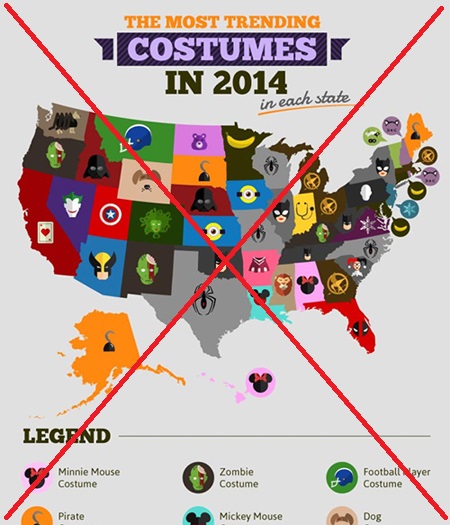
As I searched the Web for popular costumes, the following map from sumocoupon kept popping up. It's more of an infographic (with lots of images) than an analytic map, and it's about 3 times as tall as it is wide (which seems to be the trend these days with infographics - making them very tall). My biggest complaint is that the images/glyphs for the costumes often aren't intuitive, and I have to keep looking them up in the legend ... which means I have to keep scrolling up/down to see the legend (since it's way too tall to fit on one screen). Below is a screen-capture of the map, and 2 of the 11 rows of legend:
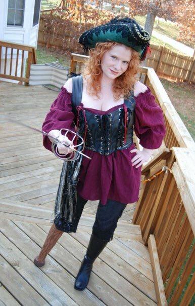
The most trending costume in 3 states was 'Pirate' - and you can't get much more Pirate-y than my friend Joy in this picture. Arrr!!!
Now it's my turn ...
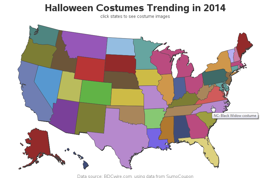
I like a good graphical challenge, but this one was very tough. Using a glyph/image legend didn't work well, as demonstrated above. If I just used a color legend instead of glyph/images, I don't think people would be able to easily discern 31 different colors (one rule-of-thumb suggests that 5 colors is about the maximum people can easily keep track of). And the text costume names would be a bit long and cluttered if I tried to add labels to each state.
So, rather than relying on the visual map itself, I opted for a more interactive approach. I added html hover-text to each state, so you can hover your mouse the state to see a text popup with the costume name (the hover-text only works on computers with a mouse - or if you enable VoiceOver on a smartphone, it can read the text to you). I also set up drilldowns, so you can click on each state to launch a Google image-search to see examples of that Halloween costume. I really like the Google image-search, because I didn't know what some of the costume names were before I saw the examples!
Below is a png screen-capture of my map ... you'll need to click on it to see the interactive version with the hover-text and drilldown links (for example, the screen-capture below shows that 'Black Widow costume' was trending in North Carolina):
I don't think I've come up with the "perfect map" yet ... but I think the combination of the 2 maps above provides an interesting look at the data :)
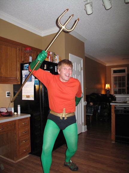
Here's a costume that didn't make it into the "most trending" map - Aquaman! My friend Erik makes a great Aquaman, but not just anybody can pull off this look!
So, did the map(s) give you any costume ideas? Do you think the data is wrong (or unlikely) for any of the states?


2 Comments
Pingback: How to scare up a few good graphs for Halloween - SAS Learning Post
Pingback: Superman -vs- Batman ... Halloween smackdown!