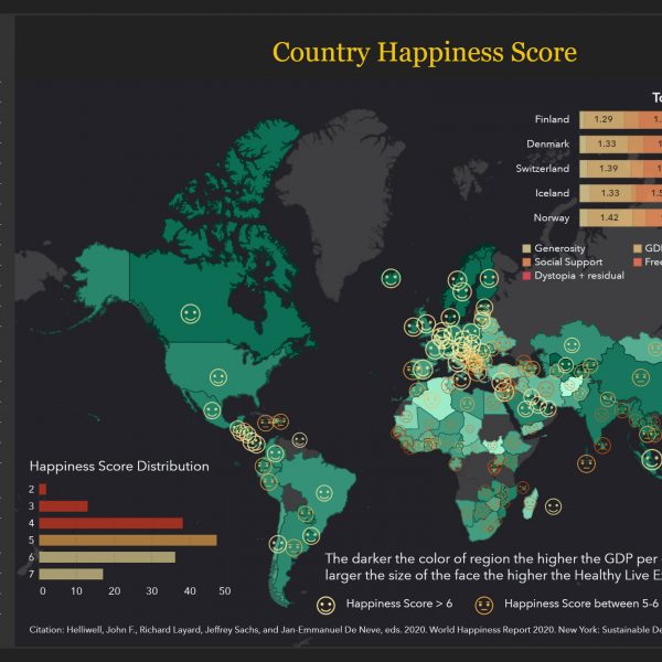
Remember back to your early school days, singing with all your classmates “If you’re happy and you know it clap your hands!” and then we’d all clap our hands. Being happy back then was so simple. Today, it’s hard to get away from all the negative headlines of 2020! It’s
Author
What is automated prediction? Automated prediction, in less than a minute, runs several analytic models (such as decision trees, gradient boosting, and logistic and linear regression) on a specific variable of your choice. Most of the remaining variables in your dataset are automatically analyzed as factors that might influence your specified variable. They are called underlying factors. SAS then chooses the one model (champion model) that most accurately predicts your target variable. The model prediction and the underlying factors are then displayed. You can adjust the values of the underlying factors to determine how the model prediction changes with each adjustment.
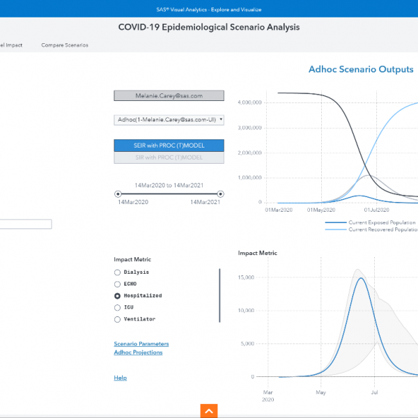
How have healthcare providers and governmental agencies predicted the fast-changing, potentially exponential increase in the need for medical services and equipment through the various stages of the COVID-19 pandemic? Mathematical techniques that attempt to model and understand the likely spread of the disease have been instrumental. The SEIR model is
Adverse outcomes, and the rapid spread of COVID-19, have accelerated research on all aspects of the disease. You may have found it overwhelming, and very time-consuming, to find relevant and specialized insights in all the scientific literature out there. To aid researchers in quickly identifying relevant literature about key topics
Have you ever wondered if love at first sight really exists? And if it exists, what qualities are people drawn too? Watch any romantic comedy and you’ll see this phenomenon play out on the big screen. Which begs the question, “If it can happen to them why not me?” Let’s
In the second of three posts on using automated analysis with SAS Visual Analytics, we used the automated analysis object to get a better understanding of our variable of interest, X-Sell and Up-sell Flag, and how it is influenced by other variables in our dataset. In this third and final
In the first of three posts on using automated analysis with SAS Visual Analytics, we explored a typical visualization designed to give telco customer care workers guidance on customers most receptive to upgrade their plans. While the analysis provided some insight, it lacked analytical depth -- and that increases the risk of wasting time, energy and
You're the operations director for a major telco's contact center. Your customer-care workers enjoy solving problems. Turning irate callers into fans makes their day. They also hate flying blind. They've been begging you for deeper insight into customer data to better serve their callers. They want to know which customers
Self-service BI applications make gaining insights and decision making faster. But they've also generated a greater need for governance, including understanding the data lifecycle. You can find out where your data comes from with SAS Lineage Viewer. The post tells you how.
As a resident of Northern California, I was interested in learning more about the causes of wildfires. My area has recently experienced large fires that caused many residents to evacuate their homes and some who have even lost their lives. Last October there were more than 170 fires that burned
Interactive reports with SAS Visual Analytics allow you to access the interface and product instantly. Simply choose a report to navigate and explore in our SAS Visual Analytics 8.2 viewer. There are reports for warranty analysis, retail insights, water consumption and quality, banking and risk and network performance.