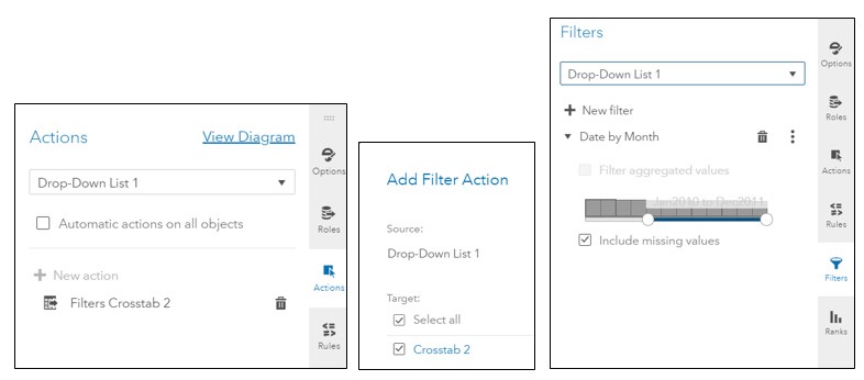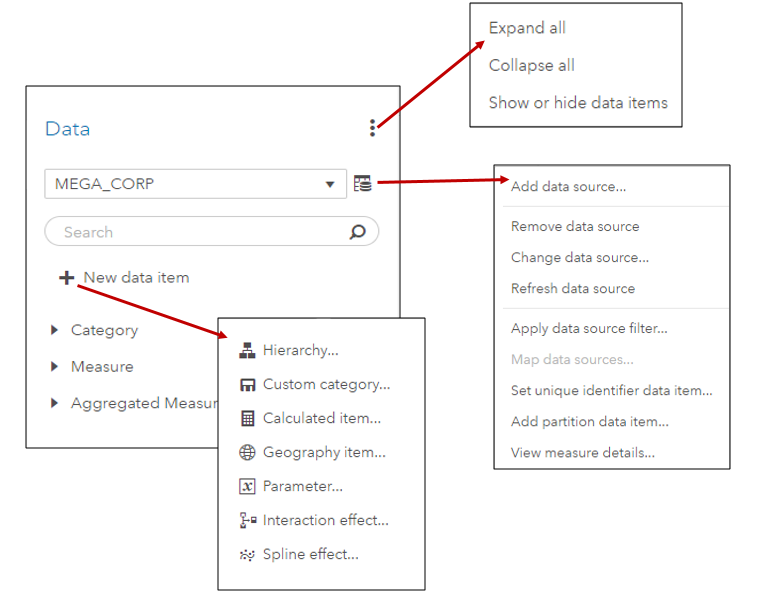
In SAS Visual Analytics 8.2 on Viya 3.3, there are a number of new data features available. I’ll cover a few of these new features including the new data plan and data item features in SAS Visual Analytics in this blog.
Author
SAS Visual Analytics filters in 7.4 and 8.2 enable you to improve the appearance of reports based on calculations that use periodic operators. Parameter settings also enable you to provide users with a prompt for choosing the data to display in a report, without having any effect on the calculations themselves.
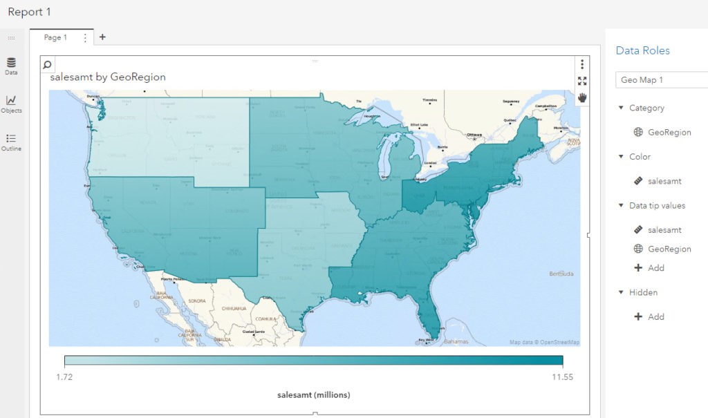
In my last article, I worked with an example of using custom polygon data to create a regional geo map in SAS Visual Analytics 7.4. In this article, I will use almost the same example to illustrate the ease of implementing custom polygons to produce the same regional map in
By default, SAS Visual Analytics 7.4 supports country and state level polygons for regional geomaps. In SAS Visual Analytics 7.4, custom shape files are now supported, as well. This means that if a site has their own custom polygon data that defines custom regions, it’s possible to create a region
In SAS Visual Analytics 8.1, report creators have the ability to include drive-distance and drive-time in their geographical maps, but only if their site has an Esri ArcGIS Online account and they have valid credentials for the account. In the user Settings for SAS Visual Analytics Geographic Mapping 8.1 release,
In my last blog, we examined the data pane in SAS Visual Analytics 8.1. That blog discussed how to have the data pane display the data items of your active data source, and how to perform tasks such as viewing measure details, changing data item properties, and creating geographic data items,
Refining your data for effective reports is even easier in the 8.1 release of SAS Visual Analytics. In this blog post, I’ll take a look at the data pane, how it displays data from your active data source, and a few tasks that you might want to perform, such as
You can expand on the functionality of SAS Visual Data Builder in SAS Visual Analytics by editing the query code, adding code for pre- and post-processing, or even writing your own query. You can process single tables or join multiple tables, writing the output to a LASR library, a SAS library, or a
Several months ago, I posted a blog about calculating moving averages for a measure in the Visual Analytics Designer. Soon after that, I was asked about calculating not only the average, but also the standard deviation over a period of months, when the data might consist of one or more
Analysts often use a simple moving average to get an idea of the trends in data. This is simply an average of a subset of time periods, and the size of the subset can differ depending on the application. The technique can be used with data based on time periods,
After posting a couple of blogs on the subject of dates and date formats in Visual Analytics Designer, I got a question from a user who wondered how to compare data for a selected date to data from the same day of the previous year. Here’s one way to do
Report designers often discover after aggregating data by groups in the Visual Analytics Designer that it would also be nice to see additional aggregations of the data, for example, a maximum or minimum of that sum across groups. This means creating an ‘aggregation of an aggregation.’ If you plan your report objectives in
In a previous blog, I discussed SAS date and time values, and how date and time formats can be used to your advantage in SAS Visual Analytics. That blog addressed some of the features provided for handling date information, like date formats, date hierarchies, and calculated data items based on time
You may have noticed that when using date information in SAS Visual Analytics, that the date data values can be displayed in a variety of ways. You may see your dates displayed like Jan1916, 03Jun1915, or 03/12/16, for example. In this blog I’ll help you understand SAS date and time
In SAS Visual Analytics 7.3, the usage reports accessed from the administrator includes a relationship report. This report provides very basic lineage and dependency information for selected object types. The data to populate this report comes from the middle-tier relationship service. Once you enable the collection and extraction of this
As of Visual Analytics 7.2, the home page is designed to serve as the entry point for not only Visual Analytics, but also additional SAS applications and solutions. To this end, the SAS Visual Analytics home page is documented in both the SAS Visual Analytics Administration Guide and the SAS Intelligence
New in the 7.3 release, SAS Visual Analytics now provides sample objects. During installation, the SAS Deployment Wizard prompts you to include sample reports by default. In addition to eight reports, an exploration and ten sample datasets are also included in the samples. These sample reports and datasets are available by industry
The new 7.3 release of SAS Visual Analytics not only uses the new HTML5 home page as the entry point to the Visual Analytics environment, but also introduces the new HTML5 viewer. The HTML5 home page interface features a personalized welcome message, tiles for content organization (Recent, Links, Favorites), icons to access