All Posts
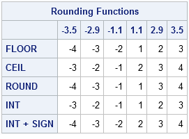

SAS has several ways to round a number to an integer. You can round a number up, round it down, or round it to the nearest integer. If your data contain both positive and negative values, you can also round numbers toward zero, or away from zero. The functions that

I used to get an email with a joke in it every Friday from my former boss, he called it Friday's Funnies. Some were really funny. Some - not so much. Well, I've decided to start my own Friday treat - a new series - called Friday's Innovation Inspiration. I'll be using

Filed under "Little changes that you probably didn't notice". When Microsoft introduced Windows 7 to the desktop, one of the many usability features that they added were "Jump Lists". Jump Lists serve as a sort of shortcut to not just open an application, but "jump right in" to a particular


Private sector vendors/suppliers seeking to conduct business with government often find frustration with the maze of policy and legislative hurdles encountered during the procurement process. As difficult as the experience may have been from the private sector perspective, take a moment to look at the other side of the procurement

Today, I came across this article that discusses how software users rarely change the settings in the applications that they use. Users assume that the software vendor sets the default values as they are for a reason, and who are they to set them otherwise? I'm a software developer (and
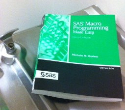

One of of my favorite reviewer quotes about Michele Burlew's book SAS Macro Programming Made Easy, Second Edition is" [ It ] helps eliminate the 'fear factor' often associated with using macros, while offering valuable insight to programmers with a broad range of experience." --Suson vonLehmden, RTI International I've worked with Michele Burlew

Over my 32 year career in local government as a city and county manager I was faced with many difficult decisions during budget deliberations. Setting tax and utility rates, adding head count, determining compensation and benefits, calculating the appropriate mix of debt and cash for funding capital projects…these were all

SAS programming is taught in schools all over the world, including in high schools. Occasionally, I receive questions via my blog such as this one: Can somebody help me on this? Write a short DATA _NULL_ step to determine the largest integer you can store on your computer in 3,

Student’s schedules are packed with activities these days but taking time out to attend a conference is always a great addition to any semester. For students who use SAS and want to attend a SAS Users Group conference, here are some tips to help you get the most out of

In 2009, SAFETEA-LU—the legislation that outlines federal transportation funding for the states—expired. Since then, members of Congress have been kicking the can down the road, passing funding extensions instead of passing legislation. The major impact of this failure to act is that the U.S. continues to slip further and further
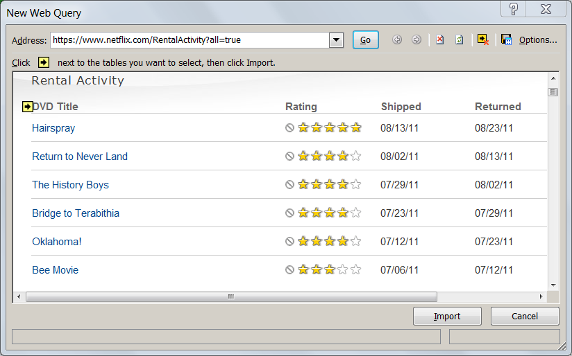
Like millions of other Americans, I recently was asked to make a decision of tremendous importance to my household -- a decision that would affect the welfare of everyone in my family. That decision, of course, was whether to continue to receive Netflix movies by mail, or opt for the
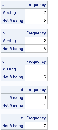
The other day I encountered a SAS Knowledge Base article that shows how to count the number of missing and nonmissing values for each variable in a data set. However, the code is a complicated macro that is difficult for a beginning SAS programmer to understand. (Well, it was hard


As schools across the country delve into a new year, I want to bring my readers back to teaching basics with Part 2 of my Three R’s series on Rigor, Relevance, and Relationships. Here's Part 1. As students flood our halls and classrooms, are they eager and excited for the challenging year ahead? Do

Metadata is data about data. For the purposes of his NESUG 2011 presentation, Frank DiIorio defined metadata more precisely as data about data and data that describes workflow objects and processes. DiIorio wrote his paper because organizations are challenged more and more today to do more with less. Metadata can
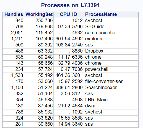
As I mentioned in my introductory post about Windows PowerShell, you can use PowerShell commands as a simple and concise method to collect data from your Windows systems -- information that is ripe for analysis within SAS. In this example, I'll show a technique for using a SAS program to