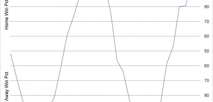
By using a format, you can change the tick values and create values that range from 100 to 50 to 100 to display the probable outcome of a sporting event.

By using a format, you can change the tick values and create values that range from 100 to 50 to 100 to display the probable outcome of a sporting event.
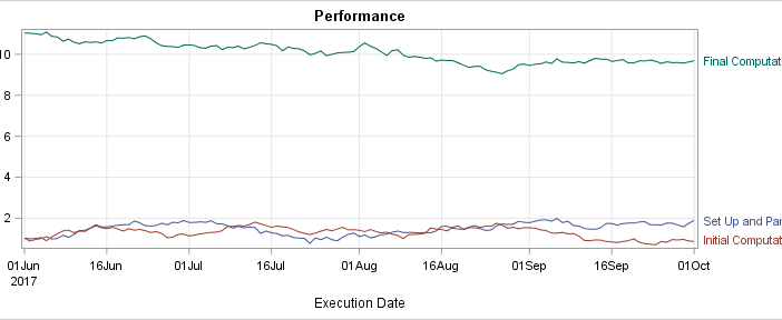
Curve labels in series plots can be positioned inside or outside the graph. Date variables can be specified as TYPE=LINEAR with a date format or more commonly as TYPE=DATE. Sometimes external curve labels might appear below or above the graph, particularly with TYPE=DATE axes. This post shows you ways to move them to the right of the graph.
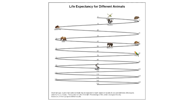
Last week I published an article on creating bar charts with visual category values. The idea was to use visual icons for the category values in a HBAR of age by animal. For the data, I referred to a visual from the 2010 Encyclopedia Britannica Inc. that I found on the

Browsing on the web, I ran into a simple but visually interesting graph of financial data. Really, it could be any data, but this one showed up under "Financial Graphs". I thought this would give me an opportunity to speak about an interesting new feature added to SERIES plot with
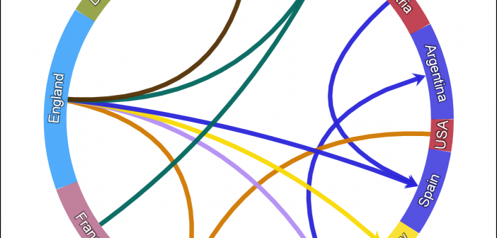
One request came in for the previous article on Circle link graph, for the addition of arrow heads to indicate the direction of the flow. Given that I am using a SERIES plot to render the links, it is relatively easy to add arrow heads to the links as the SERIES
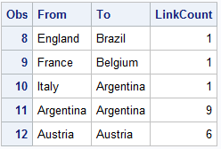
There has been some interest in "Circle Link Graph" diagrams where the nodes are laid out in a circle, with links going from one node in the circle to another. I recall seeing one diagram during the 2014 World Cup Soccer tournament, showing the number of players from one country that
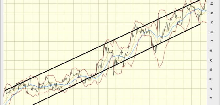
This weekend I was reviewing my portfolio of stocks as usual. Yes, I do have a small stock portfolio with a few stocks, and normally I use free stock charting software to review the stock plots. These sites allow you to view the daily stock prices along with many technical
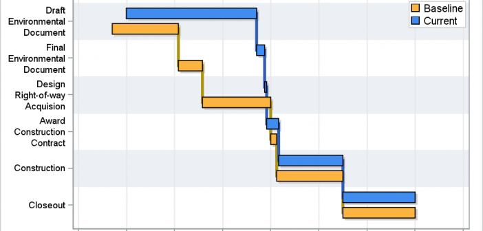
A couple of weeks back I described q way to create a Schedule Chart using the SGPLOT procedure. In that case, I used the HIGHLOW plot to draw bar segments, both for a single and grouped case. A natural extension is to create one with links between each segment. So,
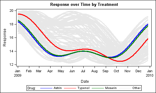
Last week I wrote about how you can use the Discrete Attributes Map to ensure that group values with specific names are represented in the graph with specific colors or other visual attributes such as marker symbol or line pattern. This attributes map also supports a special keyword "OTHER" which can be used to
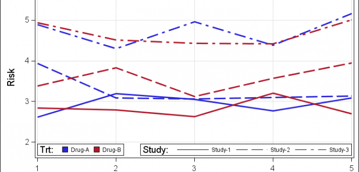
Often we have the need to see the data by two different classifiers at the same time, as requested by a recent query on the SAS Communities page. In this example I have simulated a response over time for patients by study and treatment. We want to create series plots