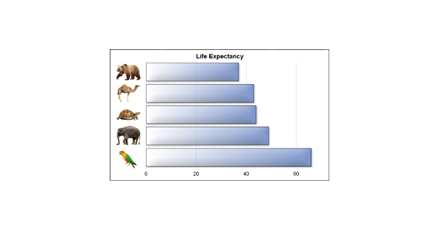
We often say a picture (or graph) is worth a thousand words. So, recursively, this could apply to other text in the graph. I thought it would be interesting to see if we can create a graph with visual categories. Another benefit is that such visual categories are inherently meaningful
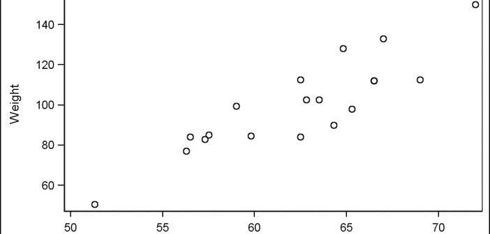
Tag: Scatter Plot
Last week I had the pleasure of presenting my paper "Graphs are Easy with SAS 9.4" at the Boston SAS Users Group meeting. The turn out was large and over 75% of the audience appeared to be using SAS 9.4 back home. This was good as my paper was focused on the cool new
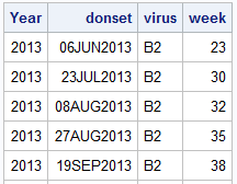
Recently, a user posed a question on how to plot stacked frequencies on a time axis. The data included frequencies of different viruses by week. The data is modified to preserve confidentiality and is shown below. The user's first instinct was to use a bar chart with stacked groups. This works for automatically computing frequencies
It was almost two weeks ago that I got started making a display for lab tests for a subject, based on a graph I saw on the web for an article on this blog. This graph is a part of a larger panel display of the lab values for a
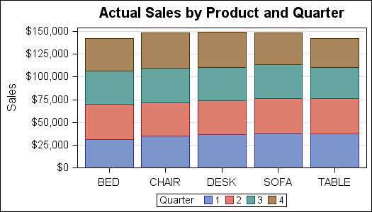
A couple of weeks back we had a question on how to make a bar chart with stacked and clustered groups. User also wanted to display the value for each stacked segment below the bars. The article Bar Charts with Stacked and Cluster Groups shows how to create such a
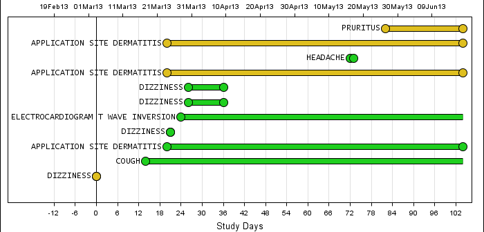
Back in February, I posted an article on creating Adverse Event Timeline Graph. In the SAS 9.2 version (first one), one item that was less than ideal was the way to position the AE names to the left of the event. The AE names are displayed using the scatter plot statement
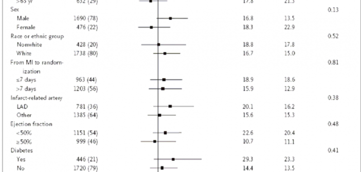
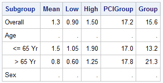
During SAS Global Forum 2012, I had conversations with many SAS users who wanted to create Forest Plots. However, there was one new twist. The study names were subgrouped by categories like 'Age', 'Sex', etc., with multiple entries under each subgroup. The name of each study within the subgrouped was indented
Forest plots come in many flavors. An example of a Forest plot using GTL is available on the SAS support web site. Simple forest plots can also be created using SGPLOT procedure by using the SCATTER statement with MARKERCHAR to display data aligned with the plot by study names. One issue
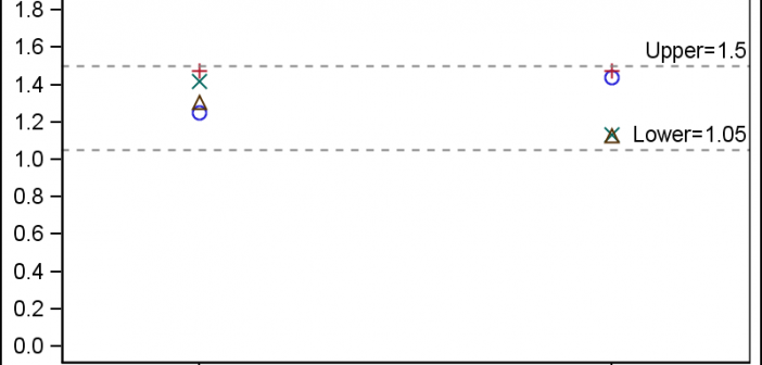
In the Clinical Research domain, there is often the need to display lab values by treatment or test and it is often useful to view this data along with reference lines showing the normal ranges. The obvious way is to use reference lines to denote the normal ranges. SGPLOT Code: proc sgplot data=band; scatter x=x y=y
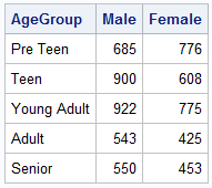
When comparing results by category and group, putting the items to be compared close together usually leads to a graph that is easier to decode. Take the case of the data (simulated) shown below. Here we have population by age group and sex. To compare the population by sex, it is