This article is motivated by a recent question on the Communities Web Site on creating a scatter plot with additional summary information. Recently, I described how to create a scatter plot with a box overlay. While such graphs have been discussed in earlier posts, this article provided a visual benefit
Tag: Scatter
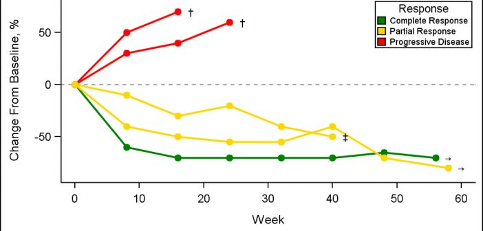
A Spider Plot is another way of presenting the Change from Baseline for tumors for each subject in a study by week. The plot can be classified by response and stage. Another way of displaying Tumor Response data was discussed earlier in the article on Swimmer Plot. This article is prompted
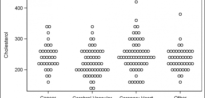
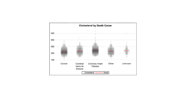
A Turnip Graph displays the distribution of an analysis variable. The graph displays markers with the same (or close) y coordinate by displaying the markers spread out over the x-axis range in a symmetric pattern. Recently, a question was posted on the SAS Communities page regarding such a graph. Here is an example of
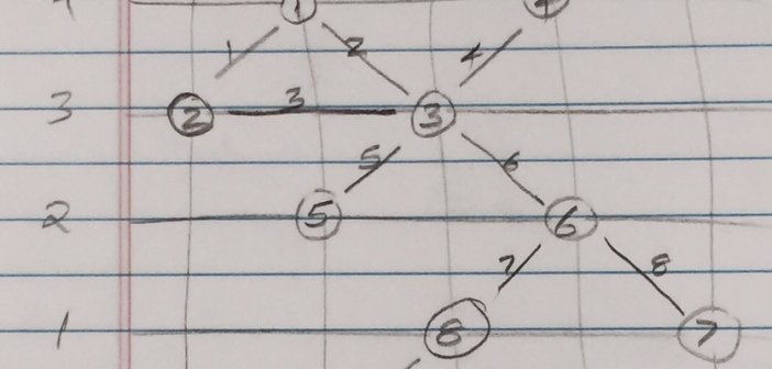
Let us continue with our journey beyond standard plots and charts. Often we need to create some simple diagrams to visualize the connections between different entities such as patients and providers or even a social network. Many of you may not have a custom tool to create diagrams. But you have Base SAS, so
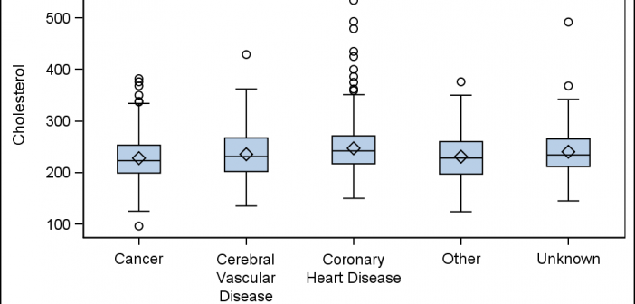
A Box Plot is very popular to view the distribution of an analysis variable with one or more classifiers. Also, everyone wants to customize the graph in different ways. One recent request was for creating a box plot by category and group along with the display of various statistics and overlaid
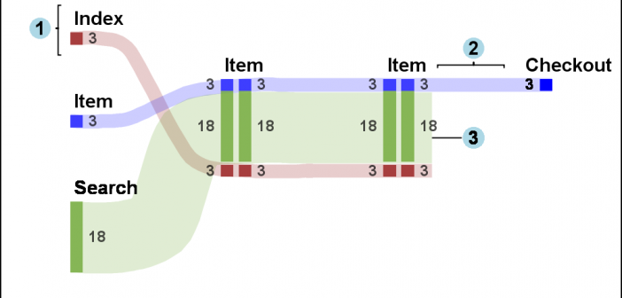
Sankey Diagrams have found increasing favor for visualization of data. This visualization tool has been around for a long time, traditionally used to visualize the flow of energy, or materials. . Now to be sure, GTL does have a statement design for a Sankey Diagram which was implemented only in Flex for use
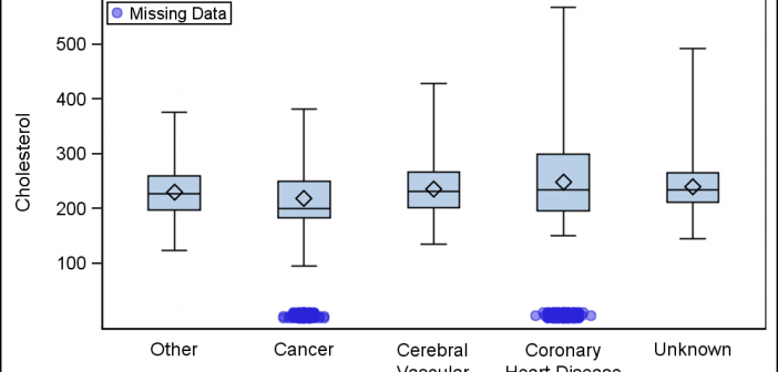
Last week a user wanted to view the distribution of data using a Box Plot. The issue was the presence of a lot of "bad" data. I got to thinking of ways such data can be visualized. I also discussed the matter with our resident expert Rick Wicklin who pointed
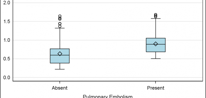
Often we need to plot the response values for binary cases of a classifier. The graph below is created to simulate one seen at http://www.people.vcu.edu/ web site of the shock index for subjects with or without a pulmonary embolism. In this case, the data is simulated for illustration purposes only. There
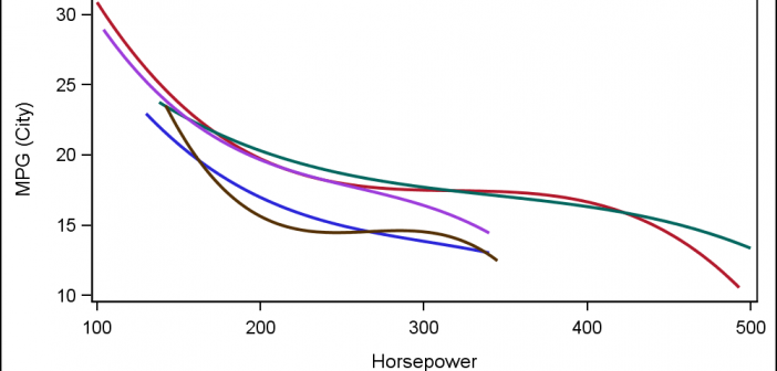
Often, the topic of an article is motivated by a question from a user. A satisfactory resolution of the situation is usually a good indication of a topic that may be of interest to other users. On such question was posed to me by a user this weekend. He wanted to display fit
A large variety of graphs fall in the category of what I call a "Single-Cell" graph. This type of graph consists of a single data region along with titles, footnotes, legends and other ancillary objects. Legends and text entries can be included in the data area. The data itself is displayed