Tag: Layout Overlay

Data Visualization
Sanjay Matange 8
Comparative Histograms

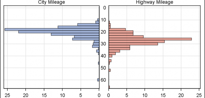
In reference to a previous article on Violin Plots, a reader asked about creating comparative mirrored histograms to compare propensity scores.  While I had my own understanding of "Mirrored Histograms", I also looked this up on the web.  Google showed many cases of two histograms back to back, either horizontally or vertically. 

Data Visualization
Sanjay Matange 4
Broken Y-Axis

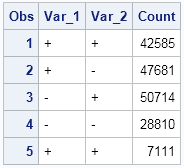
Often we want to display data as a bar chart where a few observations have large values compared to the rest.  Comparison between the smaller values becomes hard as the small bars are squeezed by the tall bars.  Here is an example data, and a bar chart showing the data. The large values

Data Visualization
Sanjay Matange 7
Nested graphs

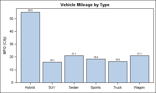
Here are a couple of bar charts showing the city mileage of cars by Type and Origin using the SGPLOT procedure from the sashelp.cars dataset. title 'Vehicle Mileage by Type'; proc sgplot data=cars; format mpg_city 4.1; vbar type / response=mpg_city stat=mean datalabel; xaxis display=(nolabel); run; title 'Counts by Country'; proc sgplot